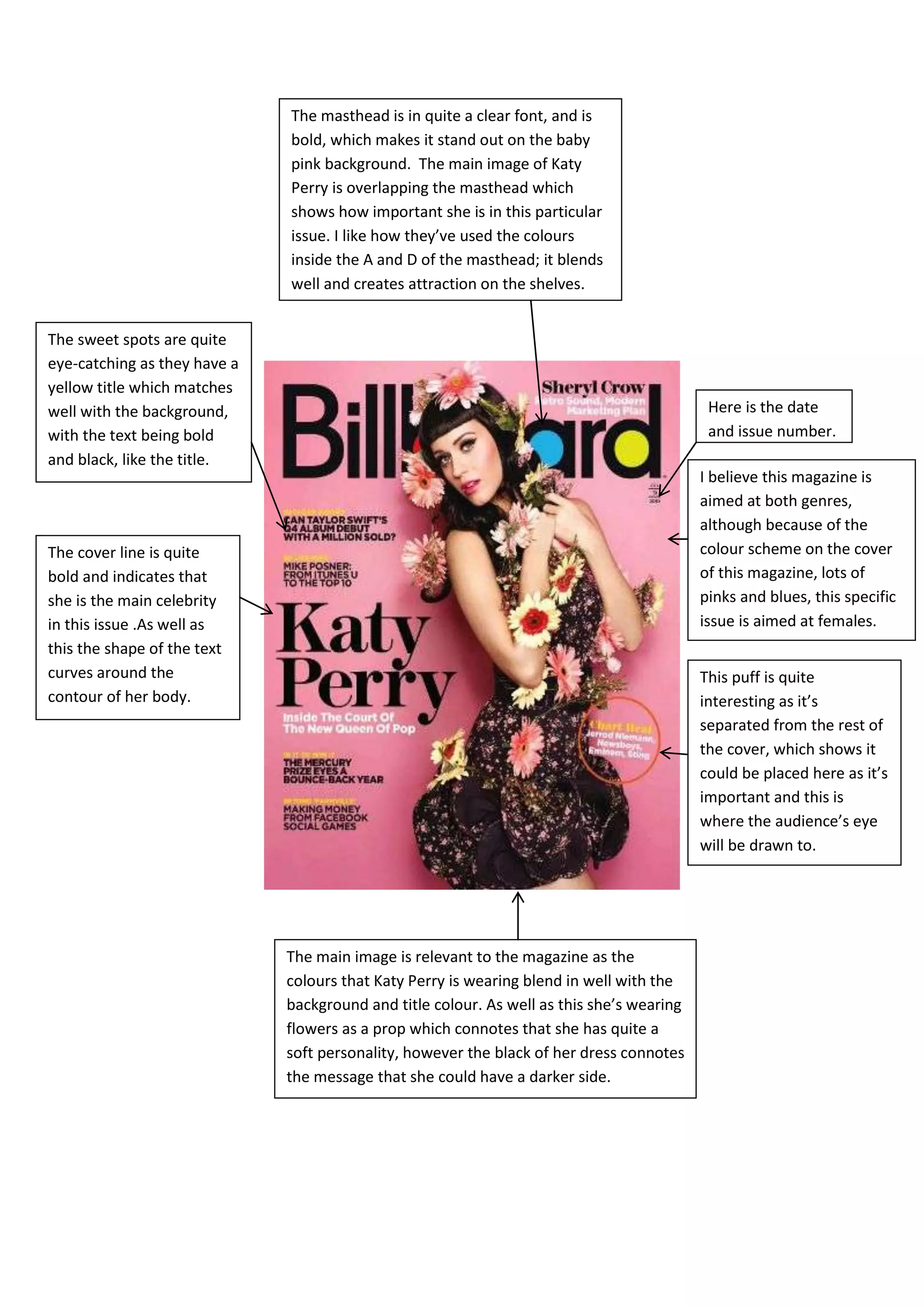
1. The masthead is in quite a clear font, and is
bold, which makes it stand out on the baby
pink background. The main image of Katy
Perry is overlapping the masthead which
shows how important she is in this particular
issue. I like how they’ve used the colours
inside the A and D of the masthead; it blends
well and creates attraction on the shelves.
The sweet spots are quite
eye-catching as they have a
yellow title which matches
well with the background, Here is the date
with the text being bold and issue number.
and black, like the title.
I believe this magazine is
aimed at both genres,
although because of the
The cover line is quite colour scheme on the cover
bold and indicates that of this magazine, lots of
she is the main celebrity pinks and blues, this specific
in this issue .As well as issue is aimed at females.
this the shape of the text
curves around the This puff is quite
contour of her body. interesting as it’s
separated from the rest of
the cover, which shows it
could be placed here as it’s
important and this is
where the audience’s eye
will be drawn to.
The main image is relevant to the magazine as the
colours that Katy Perry is wearing blend in well with the
background and title colour. As well as this she’s wearing
flowers as a prop which connotes that she has quite a
soft personality, however the black of her dress connotes
the message that she could have a darker side.