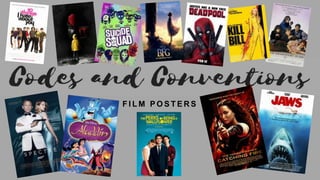
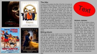
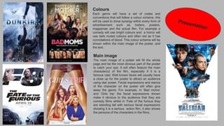
Film posters follow common conventions in their design and layout. The title is typically located at the bottom to initially draw the viewer's eyes elsewhere, such as to the names of prominent actors at the top if star power is being emphasized. Actors' names are usually lined up horizontally in similarly sized text. The billing block at the bottom provides credits and release details, with the date in the largest text. Color schemes match the genre, like bright colors for comedies and darker tones for horrors. The main image dominates the poster and features recognizable characters, often with facial expressions or stances that reveal clues to the genre.
7. The title:
In each of the posters the title of the film is located at
the bottom of the image, this tends to be the case for
the majority of film posters. This could be because
they want you to look at something else first , for
example, in the ‘Baywatch’ poster your eyes are
immediately averted to the names of the actors in
the film as the text is at the top of the page and is the
same size as the title. This shows that they want the
star power to attract you towards the film. The font of
the title can also suggest the genre of the film to the
audience, for example ‘Baywatch’ is in a sans serif
font which is bold showing that it is a blockbuster
comedy whereas ‘Beauty and the beast’ is in a serif
font giving of a more fantasy feeling. It is also often
in a colour that contrasts to the background, a dark
coloured title will be on a light background and vice
versa.
Actors names:
In 3 out of the 4 posters shown,
the actors names are located at
the top of each one, however,
Annabelle is most likely a first
release teaser poster which you
can tell as the release date is not
specific. With the exception of
‘Baywatch’ the actors names are
all in a relatively small text
suggesting that the star power is
not the main reason you should
see the films. This font will match
the colour scheme of the title and
other texts and be a similar size
to the release date of the film.
They are lined up horizontally and
are typically presented with all of
the first names on the top line and
surnames on the bottom line.
Billing block:
The billing block gives credit to all of the important
companies and people who worked on the film as
well as the platforms it is available on. This is
typically located at the very bottom of the poster in
the smallest text, however there are different sized
texts within this giving their names and their roles in
creating the film. In the billing block the release date
of the film is included, this is the biggest font within
the section of text so your eyes are instantly drawn
to it. In recent years, we are beginning to see the
formats and platforms available to watch the film in
at the cinema such as, 2D, 3D, Imax 3D, 4D and
4DX
8. Colours
Each genre will have a set of codes and
conventions that will follow a colour scheme, this
will be used to show synergy within every form of
advertisement such as, trailers, posters,
magazines and the actual film. For example a
comedy will use bright colours and a horror will
use dark muted colours and often red as it has
connotations of blood. This colour scheme will be
shown within the main image of the poster, and
the text.
Main image
The main image of a poster will fill the whole
page and be the most obvious part of the poster
to catch your eye. It will often feature the main
character(s) of the film, especially if it is a
famous cast. Well known faces will usually have
a close up for the poster to attract an audience
using star power. Facial expressions and stance
of the character on the poster will often give
away the genre. For example, in ‘Bad moms’
and ‘Girls trip’ the facial expressions shown
make it obvious to the audience that they are
comedy films whilst in ‘Fate of the furious they
are standing tall with serious facial expressions
showing it is a serious action film, it also shows
the persona of the characters in the films.