Web & Social Media Analytics Previous Year Question Paper.pdf
Contents page analysis 2
1. Categories divide
the list of content
into chunks of list,
making the text
more appealing to
the target audience
and more
manageable. These
categories would
make the target
audience more
interested in reading
the magazine
because they are
the type that would
like content to be
more visual, and
means they
wouldn’t have to
read pages of
information.
A variety of different size texts are used for titles and
descriptions. A variety of different coloured text is
used for page numbers, this helps the reader to know
what page to turn to without having to flick through
the magazine.
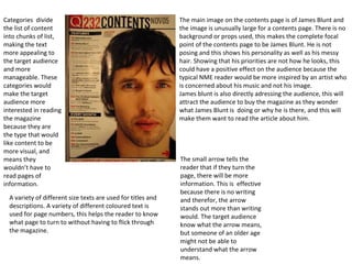
The main image on the contents page is of James Blunt and
the image is unusually large for a contents page. There is no
background or props used, this makes the complete focal
point of the contents page to be James Blunt. He is not
posing and this shows his personality as well as his messy
hair. Showing that his priorities are not how he looks, this
could have a positive effect on the audience because the
typical NME reader would be more inspired by an artist who
is concerned about his music and not his image.
James blunt is also directly adressing the audience, this will
attract the audience to buy the magazine as they wonder
what James Blunt is doing or why he is there, and this will
make them want to read the article about him.
The small arrow tells the
reader that if they turn the
page, there will be more
information. This is effective
because there is no writing
and therefor, the arrow
stands out more than writing
would. The target audience
know what the arrow means,
but someone of an older age
might not be able to
understand what the arrow
means.