
Recommended
More Related Content
What's hot
What's hot (20)
Similar to Conventions of Horror Trailers, Film Posters and Film Magazines
Similar to Conventions of Horror Trailers, Film Posters and Film Magazines (20)
Recently uploaded
Recently uploaded (20)
Conventions of Horror Trailers, Film Posters and Film Magazines
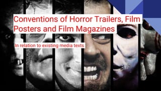
- 1. Conventions of Horror Trailers, Film Posters and Film Magazines In relation to existing media texts
- 2. Film Posters - Conventions Film posters are one of the main elements of promotion when promoting a new and upcoming film. They draw in the audience by using conventional features and horror iconography which helps to create an enigma code. Franchise films such as Saw use a symbiotic link in in order to encapsulate existing fans of the film. Film posters mostly follow a conventional structure which helps the audience to identify the sub genre. Teaser posters are equally as important as the film poster when marketing the film; they attract attention and build anticipation for the movie and give the audience an insight into the narrative, they also include minimal pieces of text such as a tagline or date, this helps to build a symbiotic link between each media piece. Colours such as red, black and grey are commonly featured on posters. Red is a more predominant colour than the others and therefore connotes aspects such as blood, danger and action. The dull colours may be associated with loneliness and fear, possibly representing some of the characters in the film. The characters who typically feature on the horror poster are usually either the protagonist or antagonist, the posters do not give away too much information about the narrative but based on facial expressions and clothing the audience can determine who the hero/villain is. Light coloured clothing can indicate purity and innocence, usually shown on the protagonist whereas an antagonist will be wearing dark colours relating to their personality.
- 3. The background of the poster is usually very dark, this is done so the audience are not able to clearly establish where the film is set, this creates even more of an enigma as the audience are searching for clues about the narrative. Masks and other pieces of horror iconography make the poster iconic in some way, for example on the poster for ‘Scream’ the mask in featured, this has now become an iconic image which allows the audience to identify what the film is based on a mask. By using a dark background the main image stands out to a further extent, this portrays the significance of the image. Extreme close ups of characters, especially their eyes create and unnatural and eerie look, as the colours are manipulated to reflect the mood, there is usually an insight into whether or not this character is good or bad. Villains generally have their eyes covered or blacked out, eyes are meant to be ‘the windows to the soul’, so this portrays how the villains have no soul. The eyes of the victims are usually brighter and widened emphasising the emotion of fear. The close zoom and crop only allows the audience to gain a small sense of the narrative, making the poster encapsulate them more.
- 4. Film Trailers - Conventions For a trailer to attract the attention of their target audience they need to include a unique selling point, this will make the film stand out from the rest. There is a general conventional guideline to follow when creating a horror movie trailer, even the speed of the editing and music is conventionally placed or edited in. Most trailers from the horror genre, supernatural sub-genres especially begin with long camera shots and minimal camera movement, this is when the equilibrium is at first being established. Once the trailer is mid way through shots may become shorter and quick cuts will be used to increase tension and create suspense; accompanied by music the audience will feel scared and drawn in as they want to find out how the problem is resolved. Trailers are able to entice an audience to watch the film. Attention is drawn to a new film through the use of promotional methods such as trailers and posters. A horror film should be partially realistic and therefore should begin with an equilibrium which will then be disrupted by an evil source. To increase tension, a conventional trailer should incorporate a hook or cliffhanger; for example trailers for a slasher movie may create an enigma code based on the mystery of who the killer will be, this entices the audience and makes them believe that the killer will not be found.
- 5. Directors do not tend to use very famous actors in horror movies as people may associate them with other movies that they have seen them in from a completely different genre, and not be able to see them playing that role. A sense of fear is lost and the footage seems more realistic if the characters are played by people who are not as well known. A sting is generally used just after the title of the film, it consists of one or a couple of shots, included in order to frighten to audience into watching the film. Diverse camera shots give the illusion that the narrative is real life; since some horror have taken a real life situation and adapted it for a film, the audience will believe that what they are watching is real, and the diversity of camera shots is able to reflect some of the ‘real life happenings’. Some of the more simplistic yet effective conventions incorporate mise en scene elements; isolated locations are stereotypically used throughout the horror genre contributing to the idea of a ‘haunted house’. Claude Levi Strauss’ theory based on binary opposites is evident in horror trailers, there is almost always good vs evil or male vs female represented, abiding by this theory. People of authority such as a policeman or a priest usually have some interference with the source of evil, this is conventional of a trailer to feature this as the audience can determine how the problem may be solved.
- 6. The protagonist who is first introduced in a trailer is usually the one to survive, conventionally death, blood and high pitched screaming is common throughout the trailer. Other elements of horror iconography involve knifes and other weapons including the iconic murder weapon used by who/whatever the killer is. Jumpscares are almost always used accompanied by intense music. Dramatic pauses, usually lasting a few seconds will be edited in, followed by complete silence or the sounds of characters breathing, after the suspense has been created there will be a sudden sighting of a ghost/spirit. Colours are used to emphasise the mood and feel of the narrative. There is a heavy use of red, black and grey, depicting the frightening feel of the movie. The actual lighting is low key and as only the best parts of the film are shown to entice an audience the most frightening scenes shown are generally dimly lit which portrays the nature of the trailer.
- 7. Magazine Cover - Conventions Magazine covers can be an effective promotional method for new and upcoming movies. They publicise the film and provide the audience with an insight into information about films, actors and events related to film. Total Film and Empire are some of the most popular film magazines, if a film is to feature in one of these magazines it must be of a high rating and worth watching. Conventional layouts include a masthead presented at the top of the front cover, in a bold font, evidently being the title of the magazine. The main image takes up the entire frame, allowing it to stand out. If the image was small it would not be as effective. A main sell line is used to coincide with the main image, this further entices the audience as they can determine a slink between the main image and features inside the magazine. Additional sell lines are placed usually to the left and right of the image, including information about what is inside. Smaller images are placed on the front cover to match with the content inside the magazine. Barcodes and price tags are also conventionally placed, generally in the bottom right hand corner, as it is the last thing that is relevant and therefore out the way of the audience's initial view of the front cover.