
Recommended
More Related Content
What's hot
What's hot (20)
Similar to Front cover analysis
Similar to Front cover analysis (20)
More from katiecreegan70
Recently uploaded
Recently uploaded (20)
Front cover analysis
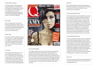
- 1. Target Audience and genre The ta rget audience for this edition of Q magazine will be fans of Amy Winehouse al so people from the age group 25 and over as the type face of the masthead is serif sans, inferring the theme is more sophisticated. The genre of this magazine can vary throughout different editions, this edi tion i s from the genre R&B/Soul Main Image The main image of Amy uses the rule of thi rds as every third Amy i s placed in. She i s al so positioned this way as the text then has space to be positioned without being placed over the main image ; in this case the mus ical artist Amy Winehouse. Model credit The model cre dit “New re velation a bout the voi ce of our time…” s upports the lead a rticle as i t suggests i t is new and unseen before information about Amy before she passed away. This also suggests the information won’t e ve r be seen i n another ma gazine or other sources. Lead article The lead article line i s One ye ar on… Amy new revelations about the voice of our ti me… a nd how we lost her” the word that s ta nds out most i s ‘AMY’ this is because the image also attracts an audience and her name is Amy. From the cover l ine we know that the article around Amy wi ll be big, this i s usually over at least a double page spread. Mas thead: The masthead is placed in the primary optical area as i t wi l l be the first thing to be seen by reader. The Masthead s tands out as the font used i s bold, which shows a formality for a formal audience. The Gutenberg Design Principle In the primary optical area and s trong fallow area; we see the masthead, an exclusive Amy Winehouse tribute and mus ic’s mightiest albums guide. This is used as a main focus point of the magazine; shown as the model credit has her hair covering the masthead to emphasise she is the main focus of the magazine. In the weak fallow area the re i s a s mall ci rcle with the words ‘i f your cd is missing, pl e ase tell your newsagent’ this means there would’ve been a cd in the weak fallow area. This is because the weak fallow area is usually bare, meaning the cd will attract the focus of the ta rget audience. In the terminal optical area the barcode is placed here, this is because people usually s top reading the front cover at this point Colours/Typefaces/House style The colour scheme that has been used for this magazine is cons istent the whole way through. The colour red and white has been used for the logo through out every i ssue of the magazine. The colours red, white and orange have al so been used on the front cover and throughout the magazine this is to make sure the audience and buyers are fami liar with his magazine. The type face that has been used is also consistent this is to make sure the readers can understand and read the text written on and in the magazine. This is the common house s tyle for Q magazine, enabling buyers to recognize the consistent design. Cover l ines The main cover line i s placed in the axis of orientation this i s because Amy Winehouse is the main are placed in the reading gravity this i s to Banners/Flashes/badges The badges and banners are used to tell the audience the content of the magazine and to also attract the audience to buy the magazine. For e xa mple the flashes that are used ‘exclusive’ next to the banner ‘Amy Wi ne house tri bute cd’ attracting the audience to buy the magazine. Also a fl a sh ‘ra re photos’ next to the cover l ine of the rolling s tones, meaning the flashes are used for well-known celebrities/artists. The badges that have been used are to inform the target market and potential buyers of what is ins ide the magazine. These are usually used to attract a wide range of audiences.