Recommended

Recommended
More Related Content
What's hot
What's hot (20)
Viewers also liked
Viewers also liked (16)
Similar to Annotation of an Existing Magazine Front Cover #1
Similar to Annotation of an Existing Magazine Front Cover #1 (20)
Recently uploaded
Recently uploaded (20)
Annotation of an Existing Magazine Front Cover #1
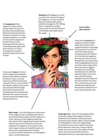
- 1. Masthead of the Magazine,which isusedfor the name or the logoof the magazine,itisveryimportant because itallowsaudiencesto identifythe magazine.The “Rolling Stone”mastheadisinbright colours(red) soit hasthe effectof immediatelycatchingthe eye of the reader. Anchorage Text – thisis the writingthatrelates to the mainimage of the magazine,whichis slatedtotell youwhatthe mainpicture (and sometimesmainarticle) isabout.Inthisexample of “RollingStone”,there isanimage of Katy Perrywithhername colour codedinblack;the phrase above hername says “conqueringthe world,one sinat a time”isalso codedina black colour,whichconveysthatthisphrase is affiliatedwiththe mainstoryaboutKatyPerry. Main image – thisisthe bigpicture inthe centre of the magazine thatisintendedtobe the first conventionthatthe readerssettheirsightson.It isthe mainfocusof the magazine and so the mainarticle of the magazine will alsobe tailored afterthe main picture.KatyPerryisthe main subjectof thismagazine,as herportrait isthe mainimage.Hereyesare fixatedforwardssoit portraysher as payingattentiontowards consumersandher redlipstickissomethingthat male’scouldfindattractive. These are the sell linesof a magazine,theytell readers aboutother articlesinthe magazinesthatare interesting. There purpose isto catch the eye of the readerand are usuallyplacedonthe bottom or on the side of a magazine. So inthe case of thisissue of RollingStone, the storyof Tom Pettyishighlightedasthe font size of hisname is bigand the white fontcoloursuggests that these are interesting secondarystories,while the blackfontcolour isthe main story.Anotherthingto highlightisthatthe subjectof the article follow’sthe name. Thisis so thatconsumerscan identifythe celebrityandif theylike the celebritythey’re more likelytobuythe issue. Issue number, date and price The choice of colour forPerry’s outfitisbrightand unorthodox because of the differentamount of coloursitmixes,itisused mainlyasan effecttoshowhow “colourful”Perryis,evenwithher hair (dyedinagreencolour) andit alsocoincideswiththe bright colourof the masthead.The contradictingcoloursof blackand white thatare usedforthe textis a prime example of abrightcolour and dull colourmix. The background of the magazine iswhite anditis usedto match the colourof the white textsandallowthe blacktextto be seenbecause the fontis reallythin.Itisalso usedbecause there is a variety of colouronthe magazine in the likesof Perry’shair, clothingandthe fontcolours, so white generally“goeswith all the colours”so it has a clearappearance and the aestheticqualityof the cover isto par.