
Recommended
More Related Content
What's hot
What's hot (20)
Viewers also liked
Similar to Colour schemes
Similar to Colour schemes (20)
More from francismelissa
More from francismelissa (15)
Recently uploaded
Recently uploaded (20)
Colour schemes
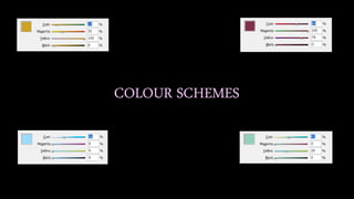
- 2. This was my chosen colour for my magazine alongside black and white. I finalised on this colour as in my survey created using the website Survey Monkey I asked my target audience what colour scheme they would prefer to see and this one had most votes. I believe it gives the overall magazine a sophisticated, professional appearance without taking the attention away from the content. By keeping the colour scheme simple I am following the conventions of a rock magazine as when looking at ones similar to mine, such as Mojo magazine I can see they use minimal colour and focus more on the content and images. Furthermore, if I did include a bigger range of colours as well as brighter ones which stand out it may not make it clear to the audience that this is a rock magazine, it may make it look more like a pop magazine which is not the genre I am portraying. Finally, I got inspiration for this colour from the classic song Gold by Spandau Ballet which is a hit song from 1983, therefore this would appeal to my older target audience and again represents the genre and target audience for my magazine.
- 3. Another colour scheme idea I had in mind was this burgundy colour. In my survey, this was the second most voted colour scheme and therefore was my second option to which I was going to use for my magazine. Using the software InDesign, I didn’t finalise with a normal red colour and instead I changed the tone of the red making this burgundy shade. I did this as I thought the red on its own was too bright for my magazine and was not conventional for a rock magazine however the final colour I achieved after adjusting the tone was one I was considering using. As well as this, I believe this colour would be suitable for my magazine as I am trying to give the overall look a more older appearance. This colour alongside the black and white created an eye-catching effect on my magazine but I did not decided to use it due to the gold standing out more and giving me more reasons to use that colour scheme rather than this one.
- 4. This was another colour I was considering using alongside black and white for my magazine. Similarly to the burgundy shade, this colour was found by adjusting the blue colour on the software InDesign to create this light, faded blue shade. This was my third option as it was least voted for in my survey taken by my target audience and therefore was not one of my chosen colour schemes. I do believe that this with black and white would have added a nice effect to my magazine however due to the colour of the background on my contents and double page spread, this colour simply did not stand out and merely blended in with the background. Also, this colour may have gender specified my magazine as the colour blue is usually associated with a male audience. But my magazine is not gender specified so I did not want to present my magazine in this way to make sure the target audience is made clear and I can gain as many readers as possible per month.
- 5. This was my last colour idea I was considering using for my magazine along side black and white. This mint green colour was developed from adjusting the tone of green using the software InDesign, I believed this colour would have looked appropriate from the magazine I wished to create however I did not finalise on using it. I decided to not use this colour as similarly to the blue, it blended in with the colour of my background and therefore did not stand out. Furthermore, this colour was considered for my magazine as I believed it did not represent my magazine to a certain gender audience. Unlike the blue, where it may come across as aimed at a male audience, this colour would have represented my magazine as a mixed gender magazine. This colour also did not feature on my survey as when adjusting other colours that were included on my survey I came across this colour and simply kept it as an idea because I liked the simple but sophisticated appearance it gave my magazine.