Digipak

Analysis of Kanye West – College
             Dropout
Front Cover
                                         There is a colour motif of gold and
The album cover could be described       brown on the front cover. Gold is
as unconventional not only for hip       often associated with royalty and
hop but for all album covers. Due to     wealth, and brown is often associated
the fact it does not have the artists    with something natural. The motif is
name on the front at all. The fact his   used as the colour gold suggests there
identity is concealed as well as not     is something special about the artist,
quoting his name on the front says       and the colour brown is used to give
something about the artists character.   the audience a more natural side of
He is not after fame and his album is    the artist.
all about the music and not the
image. This approach was rare in the
hip hop scene at this time, and
represents his individual approach to
genre that was receiving criticism
from governments for inciting hatred.
This appeals to a target audience who
are after an artist who stays true to
the music and doesn’t use their image
to sell music. There is a sense of
enigma surrounding the album cover,
due to the lack of information on the
front.
The ironic use of the mascot which is
often associated with happiness and
excitement is contradicting of the
mascots pose which is very lethargic
and sluggish.
Back Cover
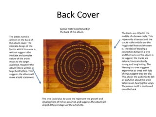
                                            Colour motif is continued on
                                            the back of the album.                         The tracks are titled in the
The artists name is                                                                        middle of a brown circle. This
written on the back of                                                                     represents a tree cut and the
the album cover. The                                                                       tracks in the middle are the
intricate design of the                                                                    rings to tell how old the tree
font in which his name is                                                                  is. The idea of drawing a
written suggests the                                                                       connection between a tree
intricate and complex                                                                      and the tracks on the album is
nature of the artists                                                                      to suggest, the tracks are
music to the target                                                                        natural, trees are sturdy,
audience. However the                                                                      strong and long lasting. The
album title is written in                                                                  likening to a tree suggests
large bold letters. This                                                                   experience as trees with lots
suggests the album will                                                                    of rings suggest they are old.
make a bold statement.                                                                     This allows the audience to tell
                                                                                           an awful lot about the artist
                                                                                           before even hearing the songs.
                                                                                           The colour motif is continued
                                                                                           onto the back.


                            The tree could also be used the represent the growth and
                            development of him as an artist, and suggests the album will
                            depict different stages of the artists life.
CD Cover
The album cover drops the colour                Juxtaposition. The use of the pink,
motif of gold and brown, and                    almost feminine CD is a form of
adopts the brighter colours of                  juxtaposition. Making the CD so
pink and yellow. These colours                  different from the album cover is an
are often associated with                       almost ironic, humorous move and
children's colours are girly                    allows the audience to draw upon
colours. I believe this has been                differences between the two.
done in an attempt for the artist
the challenge the forms and
conventions of typical hip hop
albums, which are often
associated with ideas of
masculinity. This is done in an
attempt to represent the artist as
one not afraid to challenge the
typical conventions of hip hop
music, and this is also portrayed
in his music.

Digipak analysis

  • 1.
    Digipak Analysis of KanyeWest – College Dropout
  • 2.
    Front Cover There is a colour motif of gold and The album cover could be described brown on the front cover. Gold is as unconventional not only for hip often associated with royalty and hop but for all album covers. Due to wealth, and brown is often associated the fact it does not have the artists with something natural. The motif is name on the front at all. The fact his used as the colour gold suggests there identity is concealed as well as not is something special about the artist, quoting his name on the front says and the colour brown is used to give something about the artists character. the audience a more natural side of He is not after fame and his album is the artist. all about the music and not the image. This approach was rare in the hip hop scene at this time, and represents his individual approach to genre that was receiving criticism from governments for inciting hatred. This appeals to a target audience who are after an artist who stays true to the music and doesn’t use their image to sell music. There is a sense of enigma surrounding the album cover, due to the lack of information on the front. The ironic use of the mascot which is often associated with happiness and excitement is contradicting of the mascots pose which is very lethargic and sluggish.
  • 3.
    Back Cover Colour motif is continued on the back of the album. The tracks are titled in the The artists name is middle of a brown circle. This written on the back of represents a tree cut and the the album cover. The tracks in the middle are the intricate design of the rings to tell how old the tree font in which his name is is. The idea of drawing a written suggests the connection between a tree intricate and complex and the tracks on the album is nature of the artists to suggest, the tracks are music to the target natural, trees are sturdy, audience. However the strong and long lasting. The album title is written in likening to a tree suggests large bold letters. This experience as trees with lots suggests the album will of rings suggest they are old. make a bold statement. This allows the audience to tell an awful lot about the artist before even hearing the songs. The colour motif is continued onto the back. The tree could also be used the represent the growth and development of him as an artist, and suggests the album will depict different stages of the artists life.
  • 4.
    CD Cover The albumcover drops the colour Juxtaposition. The use of the pink, motif of gold and brown, and almost feminine CD is a form of adopts the brighter colours of juxtaposition. Making the CD so pink and yellow. These colours different from the album cover is an are often associated with almost ironic, humorous move and children's colours are girly allows the audience to draw upon colours. I believe this has been differences between the two. done in an attempt for the artist the challenge the forms and conventions of typical hip hop albums, which are often associated with ideas of masculinity. This is done in an attempt to represent the artist as one not afraid to challenge the typical conventions of hip hop music, and this is also portrayed in his music.