
Recommended
More Related Content
What's hot
What's hot (19)
Viewers also liked
Viewers also liked (11)
Similar to Magazine research analysis
Similar to Magazine research analysis (20)
Magazine research analysis
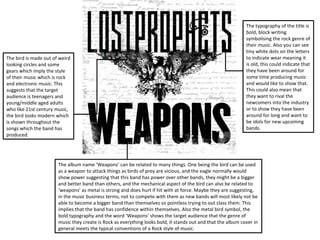
- 1. The typography of the title is bold, block writing symbolising the rock genre of their music. Also you can see tiny white dots on the letters The bird is made out of weird to indicate wear meaning it looking circles and some is old, this could indicate that gears which imply the style they have been around for of their music which is rock some time producing music and electronic music. This and would like to show that. suggests that the target This could also mean that audience is teenagers and they want to rival the young/middle aged adults newcomers into the industry who like 21st century music, or to show they have been the bird looks modern which around for long and want to is shown throughout the be idols for new upcoming songs which the band has bands. produced. The album name ‘Weapons’ can be related to many things. One being the bird can be used as a weapon to attack things as birds of prey are vicious, and the eagle normally would show power suggesting that this band has power over other bands, they might be a bigger and better band than others, and the mechanical aspect of the bird can also be related to ‘weapons’ as metal is strong and does hurt if hit with at force. Maybe they are suggesting, in the music business terms, not to compete with them as new bands will most likely not be able to become a bigger band than themselves so pointless trying to out class them. This implies that the band has confidence within themselves. Also the metal bird symbol, the bold typography and the word ‘Weapons’ shows the target audience that the genre of music they create is Rock as everything looks bold, it stands out and that the album cover in general meets the typical conventions of a Rock style of music.
- 2. The main image on the front of this album cover is very eye catching, which is good when The typography of this album selling the product. It is also a cover is plain and bold with a good choice as it is blatantly simple colour just like the other obvious that the genre of this album from ‘Lostprophets’. This band is Rock & Roll, the is done purposely as Rock bands explosiveness about the main normally portray their music as image suggests that theory as hard and with a deep sound, and Rock music has typically the typography suggests that explosive hardness about it. The theory of the rock genre as being old style American 80s car deep sounding and head implies that the music they banging. The typography is create is in the genre of Rock as simple but effective, and this can rock stars stereotypically drive relate to the bands songs, simple around in old 80s American style of music but typically Muscle cars as they have a deep effective when drawing in their sound, like the music. It also target audience of teens and shows the car launching from young adults. ramp which could suggest the band’s unpredictable side and The old retro style of the album (Looks The album name ‘All Or Nothing’ reflects back to the they take risks to become the grained as if it’s old) portrays their style of main image of stunt driving. It is portraying to the best they can be and the best the rock genre, there are different types of target audience that the band will take risks to produce ever. The fire also suggests the rock, one being electronic and modern, and something special for their fans, or the target audience dangerous side to the genre of the other being old school rock, or to potentially draw in new fans or keep the current rock. Also could imply they have alternative rock. fans interested in their music. It means that the band been trying very hard to get where they are today due to the are trying everything to produce good music for phrase ‘Fighting Fire’, as they entertainment purposes and that they have nothing to have worked very hard Being the lose in their fight to become the best band ever. This very best they can be. positive way of thinking creates what could be and idol for new bands trying to make their way into the music business, the album cover is sending out a message to fans to never give up.
- 3. The main image on the magazine of the The typography of the masthead is purposely genre 'Rock' shows the lead singer out made to have pieces missing and looks as if of the successful band 'Green Day' it's broken as if something had smashed into wearing dark, strong clothing which it, or the loud music could have caused a rock music is described as. This implies, crack in the title. Also it is bold and all in and is stereotypical of a Rock band, that capital letters shows the genre of music they they are more dedicated to create write about is rock as it stands out and music for their target audience and less attracts attention to the target audience. interested in making themselves stand Also could be due to the fact of contrasting out with bright colours, most successful colours of the masthead and the stock image. rock bands have black clothing as they The masthead connotes to the sound of an tend to focus solely on their music other electric guitar when played a simple chord, than their appearance Sometimes, rock and also relates to the loud music of the bands wear black T-shirts of other genre aimed at. Also the exclamation mark bands names. This could possibly show shows the target audience the music is loud. that the genre are in a community Kerrang use the same masthead so it then where all bands are in competition, but becomes recognisable to the target audience is friendly competition. The mise-en- and draws attention to fans scanning through scene looks as if the mid shot of Billie the magazine section of a shop. Joe Armstrong (Lead singer) is playing his electric guitar on stage. The spotlight The picture of the band 'Slipknot' draws in shinning on him indicates that he is very another set of target audience as they too important, also overlapping the could be appealing to the same target masthead indicates he is more audience. Or it could attract a new wave of important than the actual magazine. fans as they look like heavy metal rock band This means he is the main selling point and therefore drawing in fans of heavy of the magazine. The magazine uses The 'Kerrang' magazine sticks to a 3 colour-rule to metal. U&G theory of personal identity where make the magazine look less confusing to the target the target audience almost want to be audience when viewed and also this keeps the The aggressive nature of the magazine part of the rock social group that Billie magazine simple but still eye catching. You can implies that the magazine is aimed in the Joe is representing. The mid range clearly see all of the words and all of the rock genre. The 'WTF?!' cover line draws the camera shot, shows the passive body components of the front cover. target audience in as it almost forces the language Billie Joe playing his guitar reader to want to read more and see what’s indicate that rock can be slowed down Also Kerrang offers a USP which most other so surprising/weird about the article. and not all rock songs are head banging magazines cannot offer, and that is the exclusive Therefore buying the magazine and reading it songs, there are different types of rock content of band tours or interviews. to what's the story about. which Billie Joe is showing.
- 4. The main image of the rap artist 'Eminem' The masthead of this magazine is big portrays the typical conventions of a rap and bold to show the serious approach artist. The tattoo's back up my point as most to the magazine and music. Different to of them are stereotyped as “Gang material” 'Kerrang!' as it is big and bold rather and rap is generally stereotyped as gang than having a broken effect. This music. Most rap artists rap about gang crime, implies that 'Vibe' may be taking their and some artists actually have life music magazine more serious or that experiences in gang crime. The contrast this appeals more to their target between 'Vibe' rap genre and 'Kerrang!' rock audience. Similar to the 'Kerrang!' genre, is that the typical conventions of each magazine, Vibe has pull quote, plugs genre is completely contrasted. Rap artists and skylines all to try and draw other usually rap about gang crime and personal life potential target audiences to read the experiences, whereas rock artists sing about magazine so more money is being love, girls, marriage, life progression, their pumped into the bank of the publisher own careers etc. The posture and camera of the magazine. The Vibe masthead is shot all contribute to the hardness of the rap just positioned above Eminem's head genre and conveys that point as Eminem has which could suggest that Vibe kind of his arms folded and using direct address owns Eminem in a way that they can showing he is a mean character. Which is also get him to be the USP of the magazine. stereotypical of a rap artist. He also has the The contrast in institution between the cross chain around his neck indicating he is two magazines I think is that Vibe religious and may have previous life generally want to entertain their target experiences which made his life start out audience rather than inform, whereas horrible, as if his parents split up, family 'Kerrang!' is vice versa. The Vibe put in member died etc. The mise-en-scene of this …....and keeps the main focus point as the USP, this conversations between two massive particular magazine front cover looks as if is because Eminem can be viewed more clearly to rap artists to entertain the audience Eminem is in a studio which can indicate he the target audience. The contrast in colours makes which can be another USP as the fans may be the next big artist who is coming out it look bigger therefore eye catching. The would like to know how and why these of the amateur rap artist to the big shot artist. connotation of using the white background is that two massive rap artists communicate Compared to Billy Joe of Green Day, Vibe are the main image peaks and there is not too much for for the public. 'Kerrang!' chose one of indicating to the target audience to look out the target audience to take in at once. Eminem is the biggest bands around and uses for the raising star, this is the USP, and wearing a tank top to show off his tattoos which is them to boost sales with reviews on 'Kerrang!' want the target audience drawn in ironic as the cover line points out he is coming their tours and news on the latest to the already made big stars. Eminem takes clean, even though he is covered in tattoos. bands movements. Another similarity up most of the front cover indicating he is the Furthermore, he wears the tank top to show off his between the two is that Vibe also use main focus point. The plain background muscles which portrays him in the stereotypical rap the 3 colour code. (White) has the house style colours....... genre.
- 5. The website at the top of the page encourages the audience to listen to Green Day's music as it is the main focus point of the magazine being Billie Joe is on In the main image of Billie Joe, the mid the front cover and the contents page. shot captures him wearing a stereotypical The description of the picture is on there black leather jacket which suggests to the to shows the target audience what the target audience he is a rock star. The image is about. They chose the main, and content of this page have new news, the best, articles to be on the contents interviews and all sort of new stuff which page as it draws the target audience in has came out for fans to read about what is and forced to buy it to find out what the happening in the world of rock. The target main articles are about. This is essentially audience can relate to the news. Billy Joe is the USP of the magazine. The bold directly addressing the camera suggesting typography portrays the page to the he is confident that his music will entertain target audience that the genre of this his target audience. Also sticking his magazine is rock as it is sharp, stands out, tounge out indicates the style of music he draws in the audience and could also creates as they sound silly, but are mean that the style of music is loud just generally good. The mise-en-scene clearly like the music itself. shows the magazine of a rock genre. The simple black on white typography is simply so the reader can easily read the content and know exactly what the article is about. The red numbers stand out so the reader is drawn to the page number so they can skip to the article they are most interested in.
- 6. In the Kerrang! Magazines double page spread, they still stick to the 3 colour rule which they have implemented throughout the front page and the contents. Keeps the simple aspect and less childish look. The mise-en-scene shows the stereotypical rock genre as the dark colours show a mysterious or emo look which they rock genre creates in peoples head. The props the page uses (Axes) shows that the rock genre is dangerous when the target audience is listening to the songs which bands create, it implies the hardcore style of the genre. The contrasting colours forces the titles to the quotes used to catch the eye of the target audience, in this case, the viewer will see the quote first, think it sounds interesting the read the whole article to see how the story finishes or how it started. This is essentially the USP of the magazine. Also, the bold, bright title draws the target audience in as it is the first thing the viewer sees and the title needs to be something interesting to make the viewer want to read on. The main picture shows 4 band members, which shows the target audience that this band is dangerous and linking the main image to the title may suggest that the two bands are rivals and this band could be sending a message to the other band.
- 7. In this issue of the Vibe magazine, the man on the front in the main image, is smoking which is the stereotype of the rap genre, as rap is almost spoke rather than sang, meaning that maybe the artist does not really care about music as he is too laid back. Whereas the rock genre the artists always but everything into their songs showing that they are more influenced and take pride in their work creating music for their target audience. Vibe magazine uses almost two colours for the colour scheme which portrays that they only care about the written content of the article and are not worried on how the information is presented. This could be a negative as the titles do not really stand out and the article is definitely not eye catching for the target audience , and the viewer may just skip past this article. Compared to the Kerrang! Magazine, it looks dull and the Kerrang magazine uses colour and more exciting and upbeat colour scheme to present information which definitely is more enjoyable to read. So in this case, Kerrang is the better choice of magazine as it appeals to the target audience where the Vibe magazine does not really appeal to anyone.