Call Girls Service Bantala - Call 8250192130 Rs-3500 with A/C Room Cash on De...
Double page spread analysis
1. Double page Spread Analysis
The target audience of this
magazine is a mainstream
audience; it’s aimed at
different ages and different
genders, considering it plays
all different types of music.
The house style of the double
page spreads are always black
writing on white with red
writing somewhere and most
of the time with a giant letter
on the page. The giant letter is
usually either the first letter to
the artist’s name who the double page spread is about or the start to the
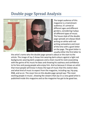
article. The image of Jay-Z shows him wearing dark colours against a light red
background, wearing dark sunglasses and a chain round his neck associating
with the genre of his music he does and showing his coolness and confidence
to his fans and young people who enjoy him. And so because it shows an artist
that most people will know it shows the type of music that this station does
and what kind of music to expect from the magazine, including rap, hip pop,
RNB, and so on. The cover line on this double page spread says ‘The most
exciting people in music’, showing the viewers that Jay-Z is a very good artist is
published inside this magazine and so the magazine has got to be good too.
2. The target audience of this
magazine is a mainstream
audience; it’s aimed at different
ages and genders of people.
People that mainly like rock
music, and different rock bands
and artists that do punk music.
The house style of this Double
page spread is mainly the
colours and imagery involved.
The colours are always dark on
double page spreads, black, red
and white. Black represents danger, darkness, and isolation and the red and
white stand out against it to the audience. Also the masthead is red and white
standing out against the black background in large bold writing saying, ‘WERE
BEING THE BEST MCR WE CAN BE!’ suggesting to the audience that they’re
going to be the best they can be for the audience to entertain them. The
images of the band show them on stage and working together wearing dark,
denim clothing which is mainly associated with rock bands, showing the
audience that this magazine is definitely going to have a lot of information
about rock bands, also their hair is quite long and dark and done in a certain
way to make the band look like an appropriate rock band which also helps the
audience like these types of bands, appearance is always important when it
comes to certain genres of music for the audience. Also the way the page is set
out is simple and neat, the images are straight as they always are in this
magazine which shows the audience its simple to understand and also shows
that this magazine is definitely only for rock band fans as the pages aren’t full
of different things which are trying to be fitted on because there’s that much
stuff about different genres of music to be added.
Comparisons and contrasting of Double
page Spread Covers
Both these Double page Spreads have some similarities including using the
people inside to gain its audience and using certain colours for certain social
groups and people, and also shows information about the artist/band they
enjoy. In the background is different which most likely associates with the
genre of music, the background in the Q magazine is white, which associates
with comfortable, rhythm music whereas the Kerrang cover is a black
3. background which associates with loud, shambolic music. Also Kerrang has a
lot more stuff laid out on the pages, mainly images and most likely because it’s
a band and so there has to be quite a few images to show everyone that is
involved whereas Jay-Z is an artist and so only needs one image of himself to
show the audience his importance and confidence. Furthermore in contrast
both magazine Double page Spreads they both show how different they are
targeting at certain audiences, by the colours and styles of quotes etc.