

Recommended
More Related Content
What's hot
What's hot (14)
Viewers also liked
Viewers also liked (14)
Similar to CD Cover Analysis
Similar to CD Cover Analysis (20)
CD Cover Analysis
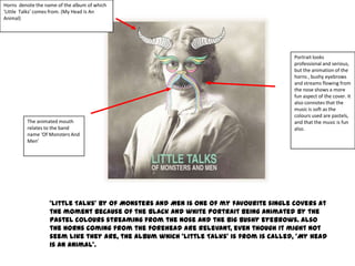
- 1. Horns denote the name of the album of which ‘Little Talks’ comes from. (My Head Is An Animal) Portrait looks professional and serious, but the animation of the horns , bushy eyebrows and streams flowing from the nose shows a more fun aspect of the cover. It also connotes that the music is soft as the colours used are pastels, The animated mouth and that the music is fun relates to the band also. name ‘Of Monsters And Men’ ‘Little Talks’ by Of Monsters And Men is one of my favourite single covers at the moment because of the black and white portrait being animated by the pastel colours streaming from the nose and the big bushy eyebrows. Also the horns coming from the forehead are relevant, even though it might not seem like they are, the album which ‘Little Talks’ is from is called, ‘My head is an animal’.
- 2. The fact that ‘Sex Pistols’ is written over the Queen’s mouth is controversial as the Sex Pistols are anti Royal Family, and with their album of which this song comes from being called ‘ Never Mind The Bollocks, Here’s The Sex Pistols’ wouldn’t be God Save The Queen’ by the Sex Pistols is an iconic single associated with the cover as the band are against the Royal Family, the date of Queen. release is also controversial as it was released during Queen Elizabeth’s Silver Jubilee. If this were to be sitting on a shop shelf, it would be easy to spot because of the Union Jack being brightly coloured and the black and white portrait of the Queen situated in the middle of the flag, it might have been the cover which made it to number 1 in the NME charts.
- 3. The artist herself is splitting up the font making an audience who haven’t heard of her before uncertain who she is and what her name is. Slang word is used, showing the artist as age appropriate and also appealing to a certain audience. I personally don’t like this single cover because the writing looks like it’s all over the place and has no organisation to it. The photograph of the artist splits up her name in writing, which could confuse the audience to what her name is. The single name is written in a font which would perhaps be linked to the audience of which this song is targeted for. Two different fonts are used on the cover, a fluent and bubbly one for the artist’s name, and a long, sharp font used for the singles name, which could be used to distinguish the artist from the song title.
- 4. ‘B’ has been turned back to front. The bands stance denotes the ‘rock’ genre. Long and untamed hair also denotes rock bands. Nickelback’s ‘Too Bad’ single cover is really good because it’s headlined by the bands name, but they’ve played around with it, and turned ‘B’ back to front, then underneath , the song title is stated in a smaller font, but so everyone is able to see it. However I think with a cover like this, if this were to be sitting on the shop in HMV, you’d be able to tell what song the CD is for if you’re a Nickelback fan. I also like this cover because the band are on the front, wearing relatively cheap items of clothing, because of this, their audience and young children could want to be them and would be able to achieve their look; the items of clothing denote that Nickelback are a rock band, what also denotes this, is their stance and Chad Kroeger’s long untamed hair.