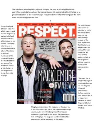
1. The masthead is the brightest coloured thing on the page as it is a bold red while
everything else is darker colours like black and grey. It is positioned right at the top so to
grab the attention of the reader straight away then to lead into other things on the front
cover like the image or cover line.
The central image
is the centre of
attention as it is in
the centre of the
page and is a
serious image
because of the
facial expressions
that Macklemore
& Ryan Lewis are
pulling. This is an
image that will
allow for the
readers to look at
the image then
without knowing
look at other
features on the
page.
The skyline has 8
different artist in it
which makes it look
like the magazine is
packed full of well
known artists but
all that could be on
them is a half page
interviews or a
review of a show or
album. The skyline
is near the
masthead so the
reader will look at
the masthead then
see some of the
more well-known
artists that are in
the magazine to
tempt them into
buying it.
The plugs are central on this magazine as the cover line
is blocking up the right side of the page where the plugs
usually go, the cover line being in a different place
makes the reader look further across the page so they
look at the plugs. The plugs are near the middle of the
page so they will be seen easily by the reader.
The cover line is
the third thing that
the reader focuses
on and they see
the word
Macklemore
before anything
else because it is in
a bigger font
because he is the
bigger and better
known artist out of
the two.