1. The interview asks Jessie questions that she will easily know the answers to and are based on her music
career as a new artist such as "how did you start your career?" and "has fame changed you?". This
interview was a good example for me to analyse as I may be conducting an interview with a 'new and
upcoming' artist so it would use similar questions to what Jessie J has been asked in this interview in
this Cosmopolitan magazine.
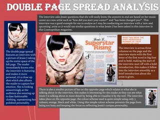
The double page spread
features an interview with
a picture of Jessie J taking
up the entire space of the
left page. The reader
immediately knows who
the interview is featuring
and makes it more
personal, it’s a close up
shot which also allures
the reader to capture her
emotion. She is looking
unswervingly at the
audience also wearing up
to date fashionable
clothing, representing her
polished personality.
The interview is across three
columns on the page and the
interview starts with the first
letter of the first word in big font
and in bold, making the start of
the interview start off with a bold
introduction, this makes it follow
into the interview smoothly as a
brief introduction about the
artist is given.
There is also a smaller picture of her on the opposite page which relates to what she is
talking about in the interview, this makes it interesting for the reader as they can see what
Jessie J is talking about in more detail by being able to visualise it by the reel. The interview
takes place on the opposite page, the colour scheme used is quite simple using only 3
colours, orange, black and white. Using this simple colour scheme prevents the page from
being too busy and keeping the focus on reflecting Jessie's unique personality.
2. This magazine presents Adele in a sophisticated way. With the page being in black and
white Adele looks much more elegant. The image of Adele takes up the majority of the two
pages, I do not like this feature however, I prefer when the article is spread over two pages as
it looks more interesting and the text doesn't look as squashed
I like the way the
heading is laid out of
the page, with one word
below the other. I think
this adds to the
sophistication of the
page and helps the page
look more unique and
interesting. Unlike the
previous double page
spread on Lily Allen, the
heading does not take
up more than half of the
page, I much prefer this.
The most intriguing part of the article is the over sized letter 'I' that begins the article. I
think that this gives the article something unique. The fact that Adele is looking away
from the camera and off the page it suggests that she is thinking about something and has
an interesting story to tell. Looking away from the camera subverts the usual conventions
of music magazines, however i think it works well with this particular example. Adele's
makeup is natural and simplistic, much like the page. I think that this is a look i would
like to follow when designing my own double page spread.