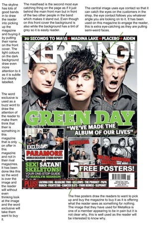
1. The skyline
has lots of
good bands
in to draw
the reader
into picking
up the
magazine
and buying it
by putting
their name
on the front
cover. The
light colours
on the dark
background
draw even
more
attention to it
as it is subtle
but clearly
labelled.
The word
exclusive is
used as a
buzz word to
draw the
attention of
the reader to
make them
think that
their is
something in
this
magazine
that is only
on offer in
this
magazine
and not in
their rival
magazines.
It has been
done like this
so the word
is over the
image and
the reader
will without
even
thinking look
at the image
and the word
exclusive will
take them
want to buy
it.
The masthead is the second most eye
catching thing on the page as if it just
behind the main front man but in front
of the two other people in the band
which makes it stand out. Even though
on this front cover the background is
also white the background has a tint of
grey so it is easily reader.
The central image uses eye contact so that it
can catch the eyes on the customers in the
shop, the eye contact follows you whatever
angle you are looking on to it. It has been
used on this magazine to engage the reader,
this is extra eye-catching as they are pulling
semi-weird faces.
The free posters draw the readers to want to pick
up and buy the magazine to buy it as it is offering
what the reader sees as something for nothing.
The image that they have used for Metallica is
one of a member appearing to be in pain but it is
not clear why, this is well used as the reader will
be interested to know why.