
Recommended
More Related Content
What's hot
What's hot (20)
Viewers also liked
Similar to Magazine Masthead, Cover Lines and Contents Page Formatting
Similar to Magazine Masthead, Cover Lines and Contents Page Formatting (20)
Recently uploaded
Recently uploaded (20)
Magazine Masthead, Cover Lines and Contents Page Formatting
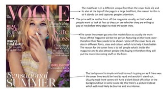
- 1. The masthead is in a different unique font than the cover lines are and its also at the top off the page in a large bold font, the reason for this is so it stands out and captures peoples attention. The cover lines never go onto the models face as usually the main focus off the magazine will be the person featuring on the front cover therefore their face needs to be shown. Some off the cover liens are also in different fonts, sizes and colours which is to help it look better. The reason for the cover lines is to tell people what's inside the magazine and to also attract people into buying it therefore they will put the more interesting stuff on the front. The background is simple and not to much is going on as if there was the cover lines would be hard to read and wouldn’t stand out. Usually most front covers will have a blank block off colour in the background but in some cases like this there's a picture instead which will most likely be blurred and less intense. The price will be on the front off the magazine usually, as that’s what people want to look at first so they can see whether they are willing to pay or not before they begin to read the cover lines.
- 2. The masthead is the centre off attention as its in large bold writing and a unique font, the reason most magazine companies have their own unique font is so that people who look at it will automatically know its Elle as soon as they see the font. The background is a block off colour instead off a picture. The reason for this is so the cover lines and masthead stand out and are clear and easy to read. On most magazine front covers if they feature a celebrity the name off the person will be in bold font. This is so people know who she and what she talks about as by doing this people might be more interested in buying It. In most cases the barcode will be at the bottom off the magazine cover but it can also be on the back.
- 3. The contents page will usually have the name off the magazine at the top off the page and contents written underneath. Some magazines just say contents but in this case it doesn’t. The reason for this is so that people know what it is. There will always be a picture on the contents page usually around the sides, some contents pages have several and some have just one. This specific one has a large imagine off a model and most likely the model who features in the magazine. The contents page will usually have sections about different features in the magazine for example beauty news, fashion features etc. this is so people can quickly find what they want easily instead off having to read it all to find what they want. The contents page will always have the issue number and the month the magazine was released on underneath contents.
- 4. On this specific contents page the name off the magazine is the main attention and is in the boldest font. Contents and the month off the magazine is written above it in smaller writing. There are two images on this specific contents page one larger imagine which is the main focus and one smaller one. The smaller image is about a gift which you will receive if you subscribe to vogue and pay £12 that’s why it is smaller than the other image.