
Recommended
More Related Content
What's hot
What's hot (20)
Similar to Contents page planning
Similar to Contents page planning (20)
More from jessica toledano
More from jessica toledano (20)
Recently uploaded
Recently uploaded (20)
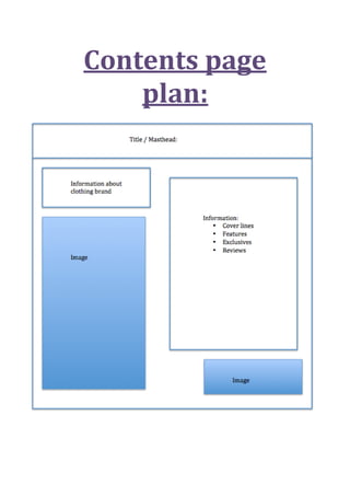
Contents page planning
- 3. This is my contents page. It’s a little bit different to the normal conventions for magazine covers. However some I have researched are similar to this. But I changed it to how I wanted it to look. These are taken from magazines “Q” and “Vibe “. They are more monotone than my magazine however the lay ought is similar. For the left hand sidethe image and writing is on different sides however it’s a similarlay ought of the boxes of information. And the right hand side the picture is on the left hand sideand information on the right however the lay ought is slightly different. The masthead for both magazines is different than mine.
- 4. I like the general design/structure of this substance page since it isn't grouped/occupied, which makes it simple to explore around. Also like that the main image of the contents page is a big size because it enables us to clearly see them image in a good amount of detail. I also like that the magazine has spilt its articles up into different sections and headings so that the certain articles come under a specific section. I will try to incorporate similar elements/features on my magazine contents page because I think it will help to make it looks ascetically pleasing therefore making it successful.