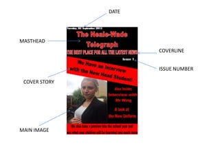
5. My final magazine is a lot better than my preliminary task. The masthead is a lot more clearer
and stands out. This gives the magazine a consistent house style. There is more range of
colours to attract the reader and to make it stand out. The use of the cover lines and pull
quotes make it more conventional and attracts the reader. The images are more conventional
due to the backgrounds and the mise-en-scene. The images are a higher quality and look like
images that you would see in a indie magazine. The main image also takes up a lot of the
page on my final product which is conventional and stylish. The magazine has the barcode
and the price which is conventional. The mode of address on my final product is a lot more
direct but on the preliminary magazine is hard to pick up. The use of the route of the eye on
the final product it clear and easy to read and everything is laid out. The preliminary
magazine isn’t very well laid out.
6. My final front cover is a lot better than preliminary task. The use of my masthead keeps the
identity and the heading is clear. The date is on the contents page which is conventional and
preliminary task doesn’t. The features and page numbers are easier to read and see and the
main articles and have an insight into the articles. The use of the images are more
conventional and are in conventional places. The final product has a subscription and is liad
out well and is clear and easy to see and read everything.