Azamgarh Call Girls WhatsApp Chat: 📞 8617370543 (24x7 ) Service Available Nea...
Contents page analysis
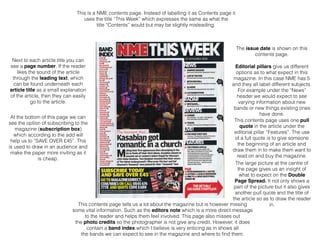
1. This is a NME contents page. Instead of labelling it as Contents page it
uses the title “This Week” which expresses the same as what the
title “Contents” would but may be slightly misleading.
The issue date is shown on this
contents page.
Editorial pillars give us different
options as to what expect in this
magazine. In this case NME has 5
and they all label different subjects.
For example under the “News”
header we would expect to see
varying information about new
bands or new things existing ones
have done.
This contents page uses one pull
quote in the article under the
editorial pillar “Features”. The use
of a full quote is to give someone
the beginning of an article and
draw them in to make them want to
read on and buy the magazine.
The large picture at the centre of
the page gives us an insight of
what to expect on the Double
Page Spread. It not only shows a
part of the picture but it also gives
another pull quote and the title of
the article so as to draw the reader
in.
Next to each article title you can
see a page number. If the reader
likes the sound of the article
through the leading text, which
can be found underneath each
article title as a small explanation
of the article, then they can easily
go to the article.
At the bottom of this page we can
see the option of subscribing to the
magazine (subscription box)
which according to the add will
help us to “SAVE OVER £45”. This
is used to draw in an audience and
make the paper more inviting as it
is cheap.
This contents page tells us a lot about the magazine but is however missing
some vital information. Such as the editors note which is a more direct message
to the reader and helps them feel involved. This page also misses out
the photo credits so the photographer is not give any credit. However, it does
contain a band index which I believe is very enticing as in shows all
the bands we can expect to see in the magazine and where to find them.
2. This NME magazine contents page follows a strict colour
scheme of red, black and white and as shown in my front
cover analysis, this is the same scheme of the front cover. I
personally believe that the page needs more pictures that
show different article as it will promote the magazine better as
people will expect more. Also leading text at the bottom of the
picture is too long as it is an extract from the actual article and
may lead a reader to get bored and not read on. However i do
like how the page is set out because it allows me to follow a
natural i flow of seeing all the editorial pictures and saving the
more important articles till the end in this case the picture.
3. The issue date is shown on this
contents page.
The editorial pillars seem to stand
out more in this contents page.
They are not only red whites a
brighter colour than the article
headings but are surrounding by a
bold frame making them more
inviting.
This is the contents page is for the magazine the Rolling Stone. It clearly shows
itself as the contents page and the font is easy and clear to read.
This page does not just contain
one picture but shows the
important and most enticing
articles in the magazine it may be
so that all the articles they are
representing take up a double
page spread.
Under each editorial pillar there is
a list of article titles that are under
this genre. This gives the reader a
better insight in what to expect to
see in this magazine.
As well as article titles this contents
page also has leading text which
shows what can be expected in
this article and who or what it is
about.
Following the article titles is also
the page numbers of said articles.
This allows the reader to have easy
access to their chosen article and
so making the magazine easy to
navigate.
At the bottom of the contents page
you can see a photo credits to the
photographer who took he picture
for the front cover and the artist/
band that stared in it.
This contents page includes most things but is missing an editors note which can
help to make the magazine more appealing as it talks about the idea for the magazine and the design.
4. This Rolling Stone magazine contents page follows a strict
colour scheme of red, black and white similar to the NME
magazine however in this case i feel the magazine does not
stand out as much as how the editors of NME have managed
to make theirs. I also believe that the pictures shown need
include some information as to what article they are connected
to and what that article may be about. However I do like the
amount of pictures that have been used on this page as it
gives us more of an insight in what to expect in the magazine
and makes it more engaging. This page also has a good
natural eye flow as it goes from the editorial pillars down and
then around to finally reaching the pictures.
5. The issue date is shown on this
contents page.
This is the contents page is for the magazine the Vintage Rock. It clearly shows
itself as the contents page and the font is easy and clear to read.
On this page we can see that the
editor has used only one editorial
pillar as it doesn't seem to be a
large magazine
This page has one large picture
which clearly shows the Rolling
Stones and prepares the audience
for what to expect on the article for
the double page spread.
Under the single editorial pillar
there is article titles which as in
the other two magazine show us
what to expect in the articles.
As well article titles we can also
find leading text under each
article title which shows us what to
expect in said article
6. Unlike the other two contents pages this magazine seems to
contain very little and doesn't have much to offer. The lack of
editorial pillars is already off putting even before i have
managed to read the article titles. Although the picture does
create a sense of want to read on as it shows a well known
band in its prime. As well as this the page is not bright and
inviting as the other two magazines and does not seem to
follow a strict colour scheme. Lastly it also doesn't have a
natural eye flow and the picture takes up too much of the page
and so your eye is always drawn to it.