
Recommended
More Related Content
What's hot
What's hot (16)
Similar to Shutter Island (Total Film) Magazine Cover Analysis
Similar to Shutter Island (Total Film) Magazine Cover Analysis (20)
More from harrevs
Recently uploaded
Recently uploaded (20)
Shutter Island (Total Film) Magazine Cover Analysis
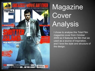
- 1. Magazine Cover Analysis I chose to analyse this Total Film magazine cover from October 2009 as it features the film that we used as a source of inspiration, and I love the style and structure of the design.
- 2. Masthead The Mashead of the magazine – „Total Film,‟ clearly identifies the genre of a film magazine, and also suggests that it covers a wide range of cinema from the inclusion of „Total.‟ The magazine features mainly films, from all genres, reviewing new and old releases as well as DVDs, video games and television shows. The font of the masthead is simple, easy to read and fits the composition of the magazine well. It does not specify a particular genre, suggesting that the magazine caters for all audiences. I will take this into account when making my own cover, however I would quite like my magazine to be targeted specifically at fans of psychological thrillers/horrors.
- 3. Main Image The main image used for the cover of the magazine is a full length body shot of actor Leonardo DiCaprio – the main actor in Shutter Island. The costume tells us a lot about the film – that it is set in the past, DiCaprio plays a police officer/detective and the gun suggests that it is a thriller, and that DiCaprio is in some sort of danger. By looking at this, I have realised how important lighting is, and how the appearance of the person(s) featured on the cover should give a basic overview of the film it is advertising.
- 4. Coverlines The main coverline, „Shutter Island,‟ references the film title, which is common on other film magazine covers (e.g. Man of Steel). The font works well, obviously suggesting the psychological thriller genre, and the blood red colour stands out well from the background image. The feature, „DiCaprio Exclusive,‟ works as a unique selling point, drawing in an audience that are fond of the actor. The line, „Leo takes over the asylum!‟ adds a more comedic and inviting aspect, as the frightening genre might not attract a mainstream audience. Again, the fonts and colours work well, following the red, white, black and blue colour scheme that excellently suggests the genre of Shutter Island. The line, „Inside Marty‟s Madhouse,‟ refers to director Martin Scorsese, promoting his new film. This also acts as a unique selling point, with fans of his previous films interested in seeing what he does next, as well as his adaptation of a film in a mental asylum.
- 5. The other coverline on the cover features a subsidiary image of a character from James Cameron‟s film, „Avatar.‟ The caption, „It‟s got everything! Cameron talks Avatar,‟ makes an interesting and intriguing coverline, drawing the audience in. The film was hyped up a lot, and would appeal to the mainstream audience. The design of the section follows the style of the rest of the cover, and remains conventional of a film magazine cover. Another feature of the magazine lists a few of the films that are reviewed in the issue. This is appealing as it showcases the range of films Featured in the magazine, and also suggests that the reader would get their money‟s worth! It is a conventional feature on film magazines, something that I am definitely going to include on my own.
- 6. The banner line featured at the top of the magazine is extremely conventional, and I have seen similar (in terms of structure/design/layout) on the masses of other covers that I have looked at. The text reads, „Greatest Movie Art Ever – Top filmmakers show us their sketchbooks!‟ This, in my opinion, would appeal to dedicated film fans/cinephiles, as well as those interested in the art behind cinema. It represents the idea that films/cinema is an art form, and that filmmakers smaller projects/planning are worth looking at and are extremely cherished in the film industry. The font and colours carry the theme of the magazine cover, and the subsidiary image is an example of the movie art featured inside of the magazine. The date, Issue Number, price and website are located in, what I thought was an unusual place (in the M of „Film‟) but is common on film magazines, as it is the same on covers of Empire Magazine.
- 7. The final feature of the magazine cover is the foot line at the bottom of the page. It lists more of the content inside the magazine, which would draw in the audience but have not been featured as a main story. The line conventionally reads, „Plus – Iron Man 2, Transformers 3, Whip It, Prince of Persia and… Are you a Robot?‟ “PLUS,” is something that is featured on most film magazine covers, and I will include it, as well as a list similar to this, on my own design. The bar code is also featured on the bottom right hand side of the page, which is something I will take into account. This magazine is going to be my main source for inspiration. From research, it is my favourite design and also features a film similar to our own project. It therefore seems like the ideal choice when looking for an existing text for reference.