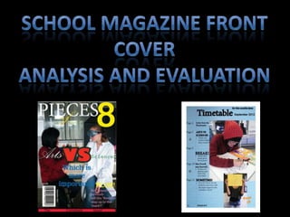
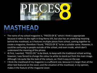
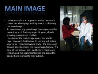
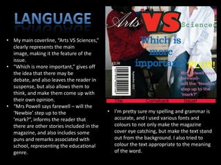
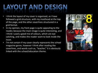
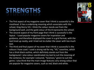
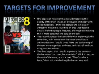
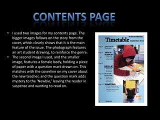
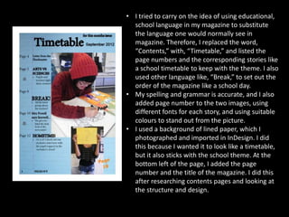
• The name of my school magazine is, “PIECES OF 8,” which I think is appropriate
  because it refers to the eight in King Henry VIII, but also has an underlying meaning
  behind the masthead, as it features multiple pieces from school, coming together to
  create a magazine, therefore I found, “PIECES OF 8,” to be a suitable name. However, it
  could be confusing to people outside of the school, and even inside, which don’t
  understand the meaning of the phrase.
• At first, I wanted, “PIECES OF,” to be black, to keep with the traditional school writing,
  however, I was forced to change the colour to white to stand out from the main image.
  Although I do quite like the look of the colours, as I find it easy on the eye.
• I think the masthead of my magazine is a sufficient size, because it is larger than all the
  other text featured on the cover, and the situation of the masthead, in my opinion,
  makes it the feature of the magazine cover.
• I think my main is an appropriate size, because it
  covers the whole page, making sure it is obviously
  the main image.
• In my opinion, my main image does represent the
  main story, as it features a specific pose, clearly
  showing tensions and conflict.
• I positioned the main image across the whole
  page, because I decided not to use any subsidiary
  images, as I thought it would clutter the cover, and
  distract attention from the main image/feature. The
  pose of the people, like I said before, represents
  tension, and the costumes/clothes and props the
  people have represents their subject.
• My main coverline, “Arts VS Sciences,”
  clearly represents the main
  image, making it the feature of the
  issue.
• “Which is more important,” gives off
  the idea that there may be
  debate, and also leaves the reader in
  suspense, but also allows them to
  think, and make them come up with
  their own opinion.
• “Mrs Powell says farewell – will the
  ‘Newbie’ step up to the                   • I’m pretty sure my spelling and grammar is
  ‘mark?”, informs the reader that            accurate, and I used various fonts and
  there are other stories included in the     colours to not only make the magazine
  magazine, and also includes some            cover eye catching, but make the text stand
  puns and remarks associated with            out from the background. I also tried to
  school, representing the educational        colour the text appropriate to the meaning
  genre.                                      of the word.
• I think the layout of my cover is organised, as I have
  followed a grid-structure, with my masthead at the top
  of the page, and the other coverlines structured in a
  grid format.
• In my opinion, my front page is quite appealing to the
  reader, because the main image is quite interesting, and
  I think I used a good mix of colours, which are eye
  catching, and makes the reader want to look inside the
  issue.
• I’m not certain if my cover clearly represents the school
  magazine genre, however I think after reading the
  coverlines, and words such as, “teacher,” it is obviously
  linked with the school/education theme.
• The first aspect of my magazine cover that I think is successful is the
  masthead. It has a underlying meaning which associates with the
  school, King Henry VIII. I think the colour stands out from the
  background well, and the gold colour of the 8 represents the school.
• The second aspect of my front page that I think is successful is the
  layout. I used popular magazine covers for inspiration and
  guidance, and therefore displayed the cover in a grid format, with the
  text lined up neatly, and I tried not to clutter the cover with too much
  text.
• The third and final aspect of my cover that I think is successful is the
  colours I have used. I used a strong red for my, “VS,” coverline, which
  has a thick black outline, which definitely stands out from the
  background. I also colour coordinated my text to suit the meaning of
  the sentence, for example I coloured, “Sciences,” green to suit the
  genre. I also think that the main image features very strong colour that
  are popular for magazine covers, such as red, black and white.
• One aspect of my cover that I could improve is the
  quality of the main image, as although I am happy with
  the composition, I think the background is not very
  attractive. Next time, I will find an area that doesn’t
  detract from the people featured, and maybe something
  that is more colourful and easy on the eye.
• The second aspect I think could do with improving is the
  coverlines, as in my opinion the cover looks like an
  amateur fanzine. I would try to make the positioning of
  the text more organised and neat, and also refrain from
  using amateur colours.
• The third aspect that I would improve is the banner at
  the bottom of the cover, because I don’t think it matches
  the rest of the cover, and the text, “The Comeback
  Issue,” does not stretch along the banner very well.
• I used two images for my contents page. The
  bigger images follows on the story from the
  cover, which clearly shows that it is the main
  feature of the issue. The photograph features
  an art student drawing, to reinforce the genre.
• The second image I used, and the smaller
  image, features a female body, holding a piece
  of paper with a question mark drawn on. This
  matches with the coverline on my cover about
  the new teacher, and the question mark adds
  mystery to the ‘Newbie,’ leaving the reader in
  suspense and wanting to read on.
• I tried to carry on the idea of using educational,
  school language in my magazine to substitute
  the language one would normally see in
  magazine. Therefore, I replaced the word,
  “Contents,” with, “Timetable,” and listed the
  page numbers and the corresponding stories like
  a school timetable to keep with the theme. I also
  used other language like, “Break,” to set out the
  order of the magazine like a school day.
• My spelling and grammar is accurate, and I also
  added page number to the two images, using
  different fonts for each story, and using suitable
  colours to stand out from the picture.
• I used a background of lined paper, which I
  photographed and imported in InDesign. I did
  this because I wanted it to look like a timetable,
  but it also sticks with the school theme. At the
  bottom left of the page, I added the page
  number and the title of the magazine. I did this
  after researching contents pages and looking at
  the structure and design.
• I think the strength of my contents page is the
  design, as I am very happy with the lined paper
  background, because it adds to the school
  effect, as well as the ‘Timetable,’ theme. I also
  think the colours are effective and appropriate
  for a school magazine.
• In my opinion, the weakness of my contents
  page is the quality of the images. Although I am
  pleased with the lined paper background, I
  think it would have been more effective to
  have scanned in paper, as this would have
  given the correct colour, as well as a more
  detailed image. I am please with the image of
  the art student, however, even though I like the
  idea behind the image of the ‘mystery’
  person, if I had more time I would have put
  more effort into the backdrop and the quality
  of the props. I am happy to have designed a
  school contents page and cover as practice for
  my music magazine, because I can use my
  mistakes and learn from them to create a
  better product next time.

School Magazine: Analysis and Evaluation

  • 2.
    • The nameof my school magazine is, “PIECES OF 8,” which I think is appropriate because it refers to the eight in King Henry VIII, but also has an underlying meaning behind the masthead, as it features multiple pieces from school, coming together to create a magazine, therefore I found, “PIECES OF 8,” to be a suitable name. However, it could be confusing to people outside of the school, and even inside, which don’t understand the meaning of the phrase. • At first, I wanted, “PIECES OF,” to be black, to keep with the traditional school writing, however, I was forced to change the colour to white to stand out from the main image. Although I do quite like the look of the colours, as I find it easy on the eye. • I think the masthead of my magazine is a sufficient size, because it is larger than all the other text featured on the cover, and the situation of the masthead, in my opinion, makes it the feature of the magazine cover.
  • 3.
    • I thinkmy main is an appropriate size, because it covers the whole page, making sure it is obviously the main image. • In my opinion, my main image does represent the main story, as it features a specific pose, clearly showing tensions and conflict. • I positioned the main image across the whole page, because I decided not to use any subsidiary images, as I thought it would clutter the cover, and distract attention from the main image/feature. The pose of the people, like I said before, represents tension, and the costumes/clothes and props the people have represents their subject.
  • 4.
    • My maincoverline, “Arts VS Sciences,” clearly represents the main image, making it the feature of the issue. • “Which is more important,” gives off the idea that there may be debate, and also leaves the reader in suspense, but also allows them to think, and make them come up with their own opinion. • “Mrs Powell says farewell – will the ‘Newbie’ step up to the • I’m pretty sure my spelling and grammar is ‘mark?”, informs the reader that accurate, and I used various fonts and there are other stories included in the colours to not only make the magazine magazine, and also includes some cover eye catching, but make the text stand puns and remarks associated with out from the background. I also tried to school, representing the educational colour the text appropriate to the meaning genre. of the word.
  • 5.
    • I thinkthe layout of my cover is organised, as I have followed a grid-structure, with my masthead at the top of the page, and the other coverlines structured in a grid format. • In my opinion, my front page is quite appealing to the reader, because the main image is quite interesting, and I think I used a good mix of colours, which are eye catching, and makes the reader want to look inside the issue. • I’m not certain if my cover clearly represents the school magazine genre, however I think after reading the coverlines, and words such as, “teacher,” it is obviously linked with the school/education theme.
  • 6.
    • The firstaspect of my magazine cover that I think is successful is the masthead. It has a underlying meaning which associates with the school, King Henry VIII. I think the colour stands out from the background well, and the gold colour of the 8 represents the school. • The second aspect of my front page that I think is successful is the layout. I used popular magazine covers for inspiration and guidance, and therefore displayed the cover in a grid format, with the text lined up neatly, and I tried not to clutter the cover with too much text. • The third and final aspect of my cover that I think is successful is the colours I have used. I used a strong red for my, “VS,” coverline, which has a thick black outline, which definitely stands out from the background. I also colour coordinated my text to suit the meaning of the sentence, for example I coloured, “Sciences,” green to suit the genre. I also think that the main image features very strong colour that are popular for magazine covers, such as red, black and white.
  • 7.
    • One aspectof my cover that I could improve is the quality of the main image, as although I am happy with the composition, I think the background is not very attractive. Next time, I will find an area that doesn’t detract from the people featured, and maybe something that is more colourful and easy on the eye. • The second aspect I think could do with improving is the coverlines, as in my opinion the cover looks like an amateur fanzine. I would try to make the positioning of the text more organised and neat, and also refrain from using amateur colours. • The third aspect that I would improve is the banner at the bottom of the cover, because I don’t think it matches the rest of the cover, and the text, “The Comeback Issue,” does not stretch along the banner very well.
  • 8.
    • I usedtwo images for my contents page. The bigger images follows on the story from the cover, which clearly shows that it is the main feature of the issue. The photograph features an art student drawing, to reinforce the genre. • The second image I used, and the smaller image, features a female body, holding a piece of paper with a question mark drawn on. This matches with the coverline on my cover about the new teacher, and the question mark adds mystery to the ‘Newbie,’ leaving the reader in suspense and wanting to read on.
  • 9.
    • I triedto carry on the idea of using educational, school language in my magazine to substitute the language one would normally see in magazine. Therefore, I replaced the word, “Contents,” with, “Timetable,” and listed the page numbers and the corresponding stories like a school timetable to keep with the theme. I also used other language like, “Break,” to set out the order of the magazine like a school day. • My spelling and grammar is accurate, and I also added page number to the two images, using different fonts for each story, and using suitable colours to stand out from the picture. • I used a background of lined paper, which I photographed and imported in InDesign. I did this because I wanted it to look like a timetable, but it also sticks with the school theme. At the bottom left of the page, I added the page number and the title of the magazine. I did this after researching contents pages and looking at the structure and design.
  • 10.
    • I thinkthe strength of my contents page is the design, as I am very happy with the lined paper background, because it adds to the school effect, as well as the ‘Timetable,’ theme. I also think the colours are effective and appropriate for a school magazine. • In my opinion, the weakness of my contents page is the quality of the images. Although I am pleased with the lined paper background, I think it would have been more effective to have scanned in paper, as this would have given the correct colour, as well as a more detailed image. I am please with the image of the art student, however, even though I like the idea behind the image of the ‘mystery’ person, if I had more time I would have put more effort into the backdrop and the quality of the props. I am happy to have designed a school contents page and cover as practice for my music magazine, because I can use my mistakes and learn from them to create a better product next time.