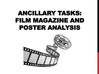
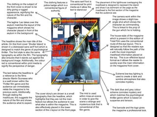
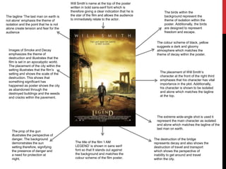
ANCILLARY TASKS:
FILM MAGAZINE AND
POSTER ANALYSIS
ANCILLARY TASK 1
MAGAZINE FRONT
COVER ANALYSIS
The subject of the film is shown in the
centre third of the magazine cover and
is shot using a medium long shot. This
is designed to show the character as
revealed and open.
The subject is shown holding the
prop of the gun which
conventionally is used to signify
danger and threat. However, he is
shown to be holding the prop
casually showing that he is used
to it and his facial expression
shows that his concentration is
elsewhere.
The clothing of the subject is shown to
be smart therefore, showing his
professional background. This could be
designed to represent the character to
have a business and serious
personality. Additionally, the colour
scheme the image uses dark colour
which connote mystery and
sophistication and does not reveal
much about the characters personality.
The masthead is shown in bold red
sans serif font. The red colour
scheme is designed to connote
passion or danger, which matches
with the thriller film genre.
The route of the eye layout format
is used within the magazine front
cover which is used to draw the
audience’s attention across the
magazine. This is a conventional
magazine format that is a house
style of Empire magazine.
The strapline is featured on the
front cover of the magazine which
is designed make the magazine
look appealing to the audience.
The typography of the
magazine uses Empire
house style and features
bold sans-serif font so
that it quickly catches the
audiences attention.
The cover lines on the
magazine are shown as set
back, which shows that they
are less important than the
main cover story.
The format of the magazine is
effective in representing the cover
story as the main magazine feature.
Through describing the
film as the matrix
meets 007 this means
that the audience can
immediately relate to
the successful films
The complete Hitchcock
guide is shown in the left
third of the page which is
the main magazine
section and captures the
audiences attention.
The colour scheme and
layout of the magazine is
more suited to a male target
market which is Empire
magazine’s main style
The barcode and issue
number gives the front cover
a professional look
The front cover makes a clear reference to
Christopher Nolan who is the successful
director of the dark knight trilogy which is
linked to the line above the masthead
The house-style of the magazine
which is present in this edition of
Total Film uses the conventional
route-of-the-eye layout. This is
designed so that the readers eye
will naturally follow the path of the
z with the most important
masthead information placed at
the top. This is an effective layout
format as it allows the reader to
quickly scan the main information
on the magazine front cover.
The headline shows the main title of the
article. On this front cover ‘Shutter Island’ is
shown in a distressed sans serif font which is
designed to match the genre of psychological
thriller. The font style is also the same
typography as within the film. The typography
also ensures that it stands out against the
background image. Additionally, the colour
red is conventional within print media to
signify the perspective of danger.
The dark blue and grey colour
scheme connotes mystery and
which matches the psychological
thriller genre which is based on
suspense and tension.
Extreme low-key lighting is
used to create a dark and
sombre atmosphere that also
connotes mystery.
The text below the headline is
a reference to the films
director Martin Scorsese who
is a well known within the
Thriller film genre and the
audience can immediately
relate the magazine to his
previous work. Additionally,
through stating the
madhouse, this suggests the
nature of the film and shows
the audience what to expect.
The mist is used
within mise-en-scene
in order to give the
scene a strange and
mysterious look that is
conventional of the
film genre.
The tagline ‘Leo takes over the
asylum matches the layout of the
magazine which shows his
character placed in front of the
asylum in the background
The cover story's are shown is a small
typography than the headline, which
highlights that they are not the main
feature but allows the audience to see
what else is within the magazine. This is
also effectively placed in the lower
section of the z layout on the front page.
The camera work within the
image shows a slight low-
angle shot which shows the
character as commanding.
This is linked to the prop of
the gun which he is holding.
The clothing on the subject of
the front cover is shown to be
dirty giving a rugged
appearance, signifying the
nature of the film and his
character.
The clothing features a
police badge which is a
conventional figure of
authority.
The placement of the lighthouse overlapping the
masthead is designed to represent the island
and show it as dominant on the page as the
masthead is the first section of the magazine
that the audience see.
The barcode and the logo gives
the magazine a professional look.
The sans serif font is
conventional for print
media as it allow the
text to stand-out
ANCILLARY TASK 2: FILM
POSTER ANALYSIS
Images of Smoke and Decay
emphasizes the theme of
destruction and illustrates that the
film is set in an apocalyptic world.
The placement of the city within the
setting illustrates that the film’s
setting and shows the scale of the
destruction. This shows that
something significant has
happened as poster shows the city
as abandoned through the
destroyed buildings and the weeds
and cracks within the pavement.
The placement of Will Smith’s
character at the front of the right third
emphases that his character has vital
importance in the plot. Additionally,
his character is shown to be isolated
and alone which matches the tagline
at the top.
Will Smith’s name at the top of the poster
written in bold sans-serif font which is
therefore giving a clear indication that he is
the star of the film and allows the audience
to immediately relate to the actor.
The tagline ‘The last man on earth is
not alone’ emphasis the theme of
isolation and the point that he is not
alone create tension and fear for the
audience
The colour scheme of black, yellow
suggests a dark and gloomy
atmosphere which matches the
theme of decay within the poster.
The extreme wide-angle shot is used ti
represent the main character as isolated
and alone which matches the tagline of the
last man on earth.
The birds within the
background represent the
theme of isolation within the
poster. Additionally, the birds
are designed to represent
freedom and escape.
The prop of the gun
illustrates the perspective of
danger. The background
demonstrates the sun
setting therefore, signifying
the presence of danger and
a need for protection at
night.
The destruction of the bridge
represents decay and also shows the
destruction of travel and transport
which shows the perspective of
inability to get around and travel
within the city.
The title of the film ‘I AM
LEGEND’ is shown in sans serif
font so that It stands out against
the background and matches the
colour scheme of the film poster.
The colour scheme of the poster
is shown as black, grey and
white in order to give a
mysterious appearance to the
poster.
Taylor Lautner’s name is shown at the top of the poster in a bold sans serif
font . This signifies that he is the main character within the film and allows
the audience to immediately relate the poster to the history of the actor. In
this case this matches the films target audience as they can relate to his
previous films which were aimed to a similar audience.
The poster uses the tagline ‘the
fight for the truth will be the fight
for his life’ captures the
audiences attention. This is also
conventional of the thriller film
genre which creates suspense
and tension in order to draw in
the audiences attention.
The release date of the film is shown in a
bold white font in order to stand-out
against the background and allows the
audience to identify when the film will be
released.
The helicopter is shown in the sky
behind the subject of the poster. The
placement of this suggests that he is
trying to escape from something .
The mise-en-scene feature of the
broken glass signifies danger and the
presence of threat.
The prop of the gun within the poster
represents jeopardy and danger.
Additionally, the character is not shown
as used to the gun and his age makes
the audience wonder what has
happened for him to need a gun which
matches the tagline creating mystery
and suspense.
The character is wearing dark
coloured clothing which signifies
mystery. However, his clothes
are quite casual which represent
his character as a normal
everyday person. This is a
conventional feature of thriller
films which works on creating the
surprise element in its
productions.
The poster uses the conventional
route-of-the-eye layout. This is
designed so that the readers eye
will naturally follow the path of the
z with the most important
information placed at the top. This
is an effective layout format as it
allows the reader to quickly scan
the main information on the poster
and the additional information such
as other stars of the film and the
release date place in the bottom
third.
The camera work uses a low-
angle shot which shows the
character as important and
dominant.
The character on his own
represents the theme of isolation
which is conventional within the
thriller film format.
I have researched film magazine front covers and film posters for the genre of film which I intend to produce a trailer,
magazine front cover and a poster for. This has allowed me to identify the conventions of the form and genre of the
formats. This can be specifically seen within factors such as the colour scheme on all four of the products which I have
research which all feature dark and gloomy colours which match the trailers which I have previously researched which
feature points such as extreme low-key lighting. Therefore, allowing me to find key points that I will ensure I feature
when I am making the trailer, magazine front cover and the film poster.
RESEARCH

Media A2 Ancillary Tasks

  • 1.
    ANCILLARY TASKS: FILM MAGAZINEAND POSTER ANALYSIS
  • 2.
    ANCILLARY TASK 1 MAGAZINEFRONT COVER ANALYSIS
  • 3.
    The subject ofthe film is shown in the centre third of the magazine cover and is shot using a medium long shot. This is designed to show the character as revealed and open. The subject is shown holding the prop of the gun which conventionally is used to signify danger and threat. However, he is shown to be holding the prop casually showing that he is used to it and his facial expression shows that his concentration is elsewhere. The clothing of the subject is shown to be smart therefore, showing his professional background. This could be designed to represent the character to have a business and serious personality. Additionally, the colour scheme the image uses dark colour which connote mystery and sophistication and does not reveal much about the characters personality. The masthead is shown in bold red sans serif font. The red colour scheme is designed to connote passion or danger, which matches with the thriller film genre. The route of the eye layout format is used within the magazine front cover which is used to draw the audience’s attention across the magazine. This is a conventional magazine format that is a house style of Empire magazine. The strapline is featured on the front cover of the magazine which is designed make the magazine look appealing to the audience. The typography of the magazine uses Empire house style and features bold sans-serif font so that it quickly catches the audiences attention. The cover lines on the magazine are shown as set back, which shows that they are less important than the main cover story. The format of the magazine is effective in representing the cover story as the main magazine feature. Through describing the film as the matrix meets 007 this means that the audience can immediately relate to the successful films The complete Hitchcock guide is shown in the left third of the page which is the main magazine section and captures the audiences attention. The colour scheme and layout of the magazine is more suited to a male target market which is Empire magazine’s main style The barcode and issue number gives the front cover a professional look The front cover makes a clear reference to Christopher Nolan who is the successful director of the dark knight trilogy which is linked to the line above the masthead
  • 4.
    The house-style ofthe magazine which is present in this edition of Total Film uses the conventional route-of-the-eye layout. This is designed so that the readers eye will naturally follow the path of the z with the most important masthead information placed at the top. This is an effective layout format as it allows the reader to quickly scan the main information on the magazine front cover. The headline shows the main title of the article. On this front cover ‘Shutter Island’ is shown in a distressed sans serif font which is designed to match the genre of psychological thriller. The font style is also the same typography as within the film. The typography also ensures that it stands out against the background image. Additionally, the colour red is conventional within print media to signify the perspective of danger. The dark blue and grey colour scheme connotes mystery and which matches the psychological thriller genre which is based on suspense and tension. Extreme low-key lighting is used to create a dark and sombre atmosphere that also connotes mystery. The text below the headline is a reference to the films director Martin Scorsese who is a well known within the Thriller film genre and the audience can immediately relate the magazine to his previous work. Additionally, through stating the madhouse, this suggests the nature of the film and shows the audience what to expect. The mist is used within mise-en-scene in order to give the scene a strange and mysterious look that is conventional of the film genre. The tagline ‘Leo takes over the asylum matches the layout of the magazine which shows his character placed in front of the asylum in the background The cover story's are shown is a small typography than the headline, which highlights that they are not the main feature but allows the audience to see what else is within the magazine. This is also effectively placed in the lower section of the z layout on the front page. The camera work within the image shows a slight low- angle shot which shows the character as commanding. This is linked to the prop of the gun which he is holding. The clothing on the subject of the front cover is shown to be dirty giving a rugged appearance, signifying the nature of the film and his character. The clothing features a police badge which is a conventional figure of authority. The placement of the lighthouse overlapping the masthead is designed to represent the island and show it as dominant on the page as the masthead is the first section of the magazine that the audience see. The barcode and the logo gives the magazine a professional look. The sans serif font is conventional for print media as it allow the text to stand-out
  • 5.
    ANCILLARY TASK 2:FILM POSTER ANALYSIS
  • 6.
    Images of Smokeand Decay emphasizes the theme of destruction and illustrates that the film is set in an apocalyptic world. The placement of the city within the setting illustrates that the film’s setting and shows the scale of the destruction. This shows that something significant has happened as poster shows the city as abandoned through the destroyed buildings and the weeds and cracks within the pavement. The placement of Will Smith’s character at the front of the right third emphases that his character has vital importance in the plot. Additionally, his character is shown to be isolated and alone which matches the tagline at the top. Will Smith’s name at the top of the poster written in bold sans-serif font which is therefore giving a clear indication that he is the star of the film and allows the audience to immediately relate to the actor. The tagline ‘The last man on earth is not alone’ emphasis the theme of isolation and the point that he is not alone create tension and fear for the audience The colour scheme of black, yellow suggests a dark and gloomy atmosphere which matches the theme of decay within the poster. The extreme wide-angle shot is used ti represent the main character as isolated and alone which matches the tagline of the last man on earth. The birds within the background represent the theme of isolation within the poster. Additionally, the birds are designed to represent freedom and escape. The prop of the gun illustrates the perspective of danger. The background demonstrates the sun setting therefore, signifying the presence of danger and a need for protection at night. The destruction of the bridge represents decay and also shows the destruction of travel and transport which shows the perspective of inability to get around and travel within the city. The title of the film ‘I AM LEGEND’ is shown in sans serif font so that It stands out against the background and matches the colour scheme of the film poster.
  • 7.
    The colour schemeof the poster is shown as black, grey and white in order to give a mysterious appearance to the poster. Taylor Lautner’s name is shown at the top of the poster in a bold sans serif font . This signifies that he is the main character within the film and allows the audience to immediately relate the poster to the history of the actor. In this case this matches the films target audience as they can relate to his previous films which were aimed to a similar audience. The poster uses the tagline ‘the fight for the truth will be the fight for his life’ captures the audiences attention. This is also conventional of the thriller film genre which creates suspense and tension in order to draw in the audiences attention. The release date of the film is shown in a bold white font in order to stand-out against the background and allows the audience to identify when the film will be released. The helicopter is shown in the sky behind the subject of the poster. The placement of this suggests that he is trying to escape from something . The mise-en-scene feature of the broken glass signifies danger and the presence of threat. The prop of the gun within the poster represents jeopardy and danger. Additionally, the character is not shown as used to the gun and his age makes the audience wonder what has happened for him to need a gun which matches the tagline creating mystery and suspense. The character is wearing dark coloured clothing which signifies mystery. However, his clothes are quite casual which represent his character as a normal everyday person. This is a conventional feature of thriller films which works on creating the surprise element in its productions. The poster uses the conventional route-of-the-eye layout. This is designed so that the readers eye will naturally follow the path of the z with the most important information placed at the top. This is an effective layout format as it allows the reader to quickly scan the main information on the poster and the additional information such as other stars of the film and the release date place in the bottom third. The camera work uses a low- angle shot which shows the character as important and dominant. The character on his own represents the theme of isolation which is conventional within the thriller film format.
  • 8.
    I have researchedfilm magazine front covers and film posters for the genre of film which I intend to produce a trailer, magazine front cover and a poster for. This has allowed me to identify the conventions of the form and genre of the formats. This can be specifically seen within factors such as the colour scheme on all four of the products which I have research which all feature dark and gloomy colours which match the trailers which I have previously researched which feature points such as extreme low-key lighting. Therefore, allowing me to find key points that I will ensure I feature when I am making the trailer, magazine front cover and the film poster. RESEARCH