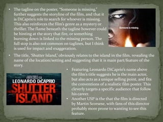
Poster Analysis
This is the full poster for Martin
Scorsese’s film, Shutter Island. This
film has many similarities with ours,
which is the reason why we often
referred to the film’s trailer, but why I
also deemed it important to look at
the poster.
Medium shot of a troubled patient
– similar to the ideas we have for
our own project, and hope to
recreate in a similar style.
• The colours used in the poster are
extremely conventional, dominated by
black, white and red. There is also a
hint of orange from the flame, that
has reference to the film’s storyline.
• The flame very cleverly lights up the
DiCaprio’s character’s face, obviously
revealing that he is the main character
(and perhaps a unique selling point
that would attract a certain audience
when viewing the poster) but also
suggests the idea that he is searching,
implying the island below. The
expression on his face also represents
a confused look, as if he is looking for
something or investigating this island.
• The cinematic shot of the island
below gives a teaser at the film
stylistically, with the rain and crashing
waves adding to the effect of a
psychological thriller/horror.
• The tagline on the poster, “Someone is missing,”
further suggests the storyline of the film, and that it
is DiCaprio’s role to search for whoever is missing.
This also reinforces the film’s genre as a mystery or
thriller. The flame beneath the tagline however could
be hinting at the story that fire, or something
burning down is linked to the missing person. The
full stop is also not common on taglines, but I think
is used for impact and exaggeration.
• The title, ‘Shutter Island,’ obviously relates to the island in the film, revealing the
name of the location/setting and suggesting that it is main part/feature of the
story.
• Featuring Leonardo DiCaprio’s name above
the film’s title suggests he is the main actor,
but also acts as a unique selling point, and fits
the conventions of a realistic film poster. This
cleverly targets a specific audience that follow
his career.
• Another USP is the that the film is directed
by Martin Scorsese, with fans of this director
probably more prone to wanting to see this
feature.
• Like I said previously, the emphasis on crediting Martin Scorsese acts more as a
promotional technique, targeting a specific audience that enjoy his films, as
well as acting as a unique selling point.
• Obviously quite an early poster, as there is no specific date, but just the month
of release. It is also featured in a different colour to attract away from the
credits but also stand out from the background, drawing the viewer in.
• The billing block,
which I am going to
refer to when creating
my own.
• The film company logo as well as the film’s
website are all codes that I will need to
include on my creation, however I think I will
draw from similar ideas as this poster.

Shutter Island - Poster Analysis

  • 1.
  • 2.
    This is thefull poster for Martin Scorsese’s film, Shutter Island. This film has many similarities with ours, which is the reason why we often referred to the film’s trailer, but why I also deemed it important to look at the poster. Medium shot of a troubled patient – similar to the ideas we have for our own project, and hope to recreate in a similar style.
  • 3.
    • The coloursused in the poster are extremely conventional, dominated by black, white and red. There is also a hint of orange from the flame, that has reference to the film’s storyline. • The flame very cleverly lights up the DiCaprio’s character’s face, obviously revealing that he is the main character (and perhaps a unique selling point that would attract a certain audience when viewing the poster) but also suggests the idea that he is searching, implying the island below. The expression on his face also represents a confused look, as if he is looking for something or investigating this island. • The cinematic shot of the island below gives a teaser at the film stylistically, with the rain and crashing waves adding to the effect of a psychological thriller/horror.
  • 4.
    • The taglineon the poster, “Someone is missing,” further suggests the storyline of the film, and that it is DiCaprio’s role to search for whoever is missing. This also reinforces the film’s genre as a mystery or thriller. The flame beneath the tagline however could be hinting at the story that fire, or something burning down is linked to the missing person. The full stop is also not common on taglines, but I think is used for impact and exaggeration. • The title, ‘Shutter Island,’ obviously relates to the island in the film, revealing the name of the location/setting and suggesting that it is main part/feature of the story. • Featuring Leonardo DiCaprio’s name above the film’s title suggests he is the main actor, but also acts as a unique selling point, and fits the conventions of a realistic film poster. This cleverly targets a specific audience that follow his career. • Another USP is the that the film is directed by Martin Scorsese, with fans of this director probably more prone to wanting to see this feature.
  • 5.
    • Like Isaid previously, the emphasis on crediting Martin Scorsese acts more as a promotional technique, targeting a specific audience that enjoy his films, as well as acting as a unique selling point. • Obviously quite an early poster, as there is no specific date, but just the month of release. It is also featured in a different colour to attract away from the credits but also stand out from the background, drawing the viewer in. • The billing block, which I am going to refer to when creating my own. • The film company logo as well as the film’s website are all codes that I will need to include on my creation, however I think I will draw from similar ideas as this poster.