SlideShare a Scribd company logo
1 of 2
The main image of the film consists of a long
wide shot of the leading actor Leonardo Di
Caprio posed as his character Teddy Daniels.
He is standing on a rock empowered by the
fog around him, looking downwards; behind
him is an island with a lighthouse built onto
it. The image instantly relates to the film
title. We are shown straight away that this is
where our narrative will take place. The sellline above the film title reads “Leo takes over
the asylum!” This gives us another indication
of that film’s narrative. We can picture that
the island in which Di Caprio’s character is on
is some sort of mental asylum. We can
further develop out idea of the narrative as
Di Caprio has a police badge on his belt and a
gun in his hand. This shows that Teddy
Daniels is some sort of police officer who is
investigating the asylum. The gun represents
that there is some sort of threat existing on
the island. The mist that surrounds the island
represents an unknown element. This could
mean that there is some sort of mystery
involved in the island. This would imply that
the Shutter Island narrative falls under the
crime/thriller genre. We therefore are able to establish a target audience for our film. The main
image is able to sell itself to the target audience as they would be interested in this sort of narrative.
Leonardo Di Caprio is however the main selling point of this film. As the film was a one off film, at
the time of the release no one would have known as much on the film as perhaps a film which had a
prequel, for example Harry Potter. Because Di Caprio is a massive Hollywood actor he is regarded a
top rated actor. This brings in a number of audiences as people will want to go see this film because
he features in it. The film title that appears on this front cover is the similar to the one which is on
the film’s poster. The blocked and bold red colours which appear in both this front cover and the
film poster create a resemblance in which the readers may be able to identify with. In the film poster
the island appears again. You can establish that it is the same island as the distinctive lighthouse
appears in both. This creates a symbiotic link between these two promotional media texts as people
will be able to distinguish the film. If people are constantly reminded of the film they are more likely
to take an interest and go watch it. Leonardo is featured in the film poster as well, emphasising that
he is an important and unique selling point for the film.
The magazine’s masthead is in huge upper case letters and is placed at the top of the front cover,
conventionally so. The white colouring stands out against the dark blue setting of the main image,
allowing it become striking in view. The “Total” in the masthead uses the background of the main
image to allow it to stand out against the white text, a smart method used. Despite Leonardo Di
Caprio’s covering up some part of the masthead, it is still recognisable as the masthead’s font never
changes throughout every edition released. The masthead is the key aspect of the brand identity, so
no matter what main image there is or if it is covering the masthead, readers will know what
magazine it is. The lighthouse in the main image mirrors the same shape as the “M” on Film, so again
despite the letter being partially covered; you can easily establish the name of the magazine. The
masthead’s font is big and bold resembling big blockbuster films, which Total Film magazine
promotes in their front covers, appealing to the target readership who is obviously interested in
films, particularly blockbusters.

The first sell-line that I was attracted to what was the Shutter Island, this is mainly because it is the
biggest sell-line and it partially runs across the front cover. This sell-line takes up the largest amount
of space out of all them because it is the main sell-line promoting the film in the main image. The
blocked red text grabs reader's attention as it stands out clearly against the main image. Above this
piece of text reads Dicaprio Exclusive. This line of text is highlighted in red and has a similar printed
style to the font used for the wording of Shutter Island. This creates a link between the two, to show
that they are part of the same sell line. Below this reads “Leo takes over the asylum!” this is an
obvious link to the shutter island film and gives the target audience some indication the narrative.
Finally underneath the large “Shutter Island” text reads “Inside Marty’s madhouse”. This again
coincides with the Shutter Island film. It most likely a regard to the director or producer of the film
and attracts target audiences who may already be aware of this person. They will be more incline
into read about it. The colour red runs throughout the front cover. Below the main sell-line are three
different films that are reviewed in this edition of the magazine. These texts also highlighted in red,
attracting reader’s attention to these sections. They may be new films that the target audience is
interested in finding out about. At the very bottom of the front cover is a section of other films that
are included in the magazine. The “Plus” at the beginning of this section is in red, pulling readers
eyes into this section. This is needed to be done as the bottom of a media text is usually neglected.
The final word of this section reads “Are you a robot?” Asking a rhetorical question directly to
readers, it develops a relationship between magazine and reader. On the right hand section there is
only one sell-line, this is because the right hand side of the page is usually the last thing looked at. In
order to attract readers to this part of the page however, editors have used an image of the
blockbusting film Avatar. This pulls in film lovers as this was an iconic film representing the
modernisation of technology. Again this sell-line has red highlighting to it, further attracting
audiences to this section. At the very top of the page is a sell-line which will engage real film
enthusiasts. The sell-line is in regards to sketchbooks of films which have been made available by top
filmmakers. There is also an image in relation to this feature of the magazine. This will attract film
lovers and artists who would love the chance to look at the imaginations and creative ideas of these
filmmakers.

More Related Content

What's hot

Ancillary Task
Ancillary TaskAncillary Task
Ancillary Tasklp198
 
Film poster study and analysis
Film poster study and analysisFilm poster study and analysis
Film poster study and analysis05lewis
 
Codes and conventions of a film poster (2)
Codes and conventions of a film poster (2)Codes and conventions of a film poster (2)
Codes and conventions of a film poster (2)lucyrose01
 
Film posters terminology and features
Film posters terminology and featuresFilm posters terminology and features
Film posters terminology and featuresMollie Green
 
Question 1 Print Work
Question 1 Print WorkQuestion 1 Print Work
Question 1 Print Workalfie16
 
Generic Conventions of a Film Poster
Generic Conventions of a Film PosterGeneric Conventions of a Film Poster
Generic Conventions of a Film PosterAlicemartinxo
 
Magazine front cover analysis one
Magazine front cover analysis oneMagazine front cover analysis one
Magazine front cover analysis onerebeccadahl98
 
Media Semiotic Film Poster Analysis
Media Semiotic Film Poster AnalysisMedia Semiotic Film Poster Analysis
Media Semiotic Film Poster AnalysisAshton Parker
 
Front cover analysis
Front cover analysisFront cover analysis
Front cover analysissana0001
 
Spectre cover analysis
Spectre cover analysisSpectre cover analysis
Spectre cover analysissarahlouise12
 
Shutter 2010
Shutter 2010Shutter 2010
Shutter 2010shanneal
 
Film Poster Analysis
Film Poster AnalysisFilm Poster Analysis
Film Poster Analysiskymberlyjadet
 
Inception powerpoint
Inception powerpointInception powerpoint
Inception powerpointcsullivans05
 
Analysis of film poster titanic
Analysis of film poster titanicAnalysis of film poster titanic
Analysis of film poster titanictebsin
 

What's hot (20)

Question 1
Question 1Question 1
Question 1
 
Ancillary Task
Ancillary TaskAncillary Task
Ancillary Task
 
Film poster study and analysis
Film poster study and analysisFilm poster study and analysis
Film poster study and analysis
 
Codes and conventions of a film poster (2)
Codes and conventions of a film poster (2)Codes and conventions of a film poster (2)
Codes and conventions of a film poster (2)
 
Film posters terminology and features
Film posters terminology and featuresFilm posters terminology and features
Film posters terminology and features
 
Magazine analysis
Magazine analysisMagazine analysis
Magazine analysis
 
Question 1 Print Work
Question 1 Print WorkQuestion 1 Print Work
Question 1 Print Work
 
Magazine analysis 2
Magazine analysis 2Magazine analysis 2
Magazine analysis 2
 
Generic Conventions of a Film Poster
Generic Conventions of a Film PosterGeneric Conventions of a Film Poster
Generic Conventions of a Film Poster
 
Magazine front cover analysis one
Magazine front cover analysis oneMagazine front cover analysis one
Magazine front cover analysis one
 
Media Semiotic Film Poster Analysis
Media Semiotic Film Poster AnalysisMedia Semiotic Film Poster Analysis
Media Semiotic Film Poster Analysis
 
Front cover analysis
Front cover analysisFront cover analysis
Front cover analysis
 
Poster Analysis
Poster AnalysisPoster Analysis
Poster Analysis
 
Spectre cover analysis
Spectre cover analysisSpectre cover analysis
Spectre cover analysis
 
Research Into Film Posters
Research Into Film PostersResearch Into Film Posters
Research Into Film Posters
 
Inception
InceptionInception
Inception
 
Shutter 2010
Shutter 2010Shutter 2010
Shutter 2010
 
Film Poster Analysis
Film Poster AnalysisFilm Poster Analysis
Film Poster Analysis
 
Inception powerpoint
Inception powerpointInception powerpoint
Inception powerpoint
 
Analysis of film poster titanic
Analysis of film poster titanicAnalysis of film poster titanic
Analysis of film poster titanic
 

Viewers also liked

Shooting Schedule
Shooting ScheduleShooting Schedule
Shooting Scheduleebmedia96
 
Scream 4 magazine analysis
Scream 4 magazine analysisScream 4 magazine analysis
Scream 4 magazine analysissjyoulton
 
Mapa concep , trastornos estado del animo
Mapa concep , trastornos estado del animoMapa concep , trastornos estado del animo
Mapa concep , trastornos estado del animoGrecia Marion
 
Headford m&a teaser document ref 6554 v02
Headford m&a teaser document   ref 6554 v02Headford m&a teaser document   ref 6554 v02
Headford m&a teaser document ref 6554 v02Craig Headford
 

Viewers also liked (6)

Calculating es fs
Calculating es fsCalculating es fs
Calculating es fs
 
Shooting Schedule
Shooting ScheduleShooting Schedule
Shooting Schedule
 
Scream 4 magazine analysis
Scream 4 magazine analysisScream 4 magazine analysis
Scream 4 magazine analysis
 
BBFC
BBFCBBFC
BBFC
 
Mapa concep , trastornos estado del animo
Mapa concep , trastornos estado del animoMapa concep , trastornos estado del animo
Mapa concep , trastornos estado del animo
 
Headford m&a teaser document ref 6554 v02
Headford m&a teaser document   ref 6554 v02Headford m&a teaser document   ref 6554 v02
Headford m&a teaser document ref 6554 v02
 

Similar to Di Caprio Thriller Promoted on Total Film Cover

Magazine cover analysis v2
Magazine cover analysis v2Magazine cover analysis v2
Magazine cover analysis v2PhillLecorgne
 
Shutter island magazine cover analysis
Shutter island magazine cover analysisShutter island magazine cover analysis
Shutter island magazine cover analysisjuliajulia97
 
Shutter island magazine cover analysis 1
Shutter island magazine cover analysis 1Shutter island magazine cover analysis 1
Shutter island magazine cover analysis 1juliajulia97
 
Analysis of 3 (Ancillary Product 2)
Analysis of 3 (Ancillary Product 2) Analysis of 3 (Ancillary Product 2)
Analysis of 3 (Ancillary Product 2) alltimejas
 
Media magazines and posters
Media magazines and postersMedia magazines and posters
Media magazines and postersscottlucymedia
 
POST CARD ANALYSIS
POST CARD ANALYSIS POST CARD ANALYSIS
POST CARD ANALYSIS Fatimawaqar
 
Empire magazine film analysis
Empire magazine film  analysisEmpire magazine film  analysis
Empire magazine film analysisleahwatts
 
Empire magazine film analysis
Empire magazine film  analysisEmpire magazine film  analysis
Empire magazine film analysisleahwatts
 
Shutter Island (Total Film) Magazine Cover Analysis
Shutter Island (Total Film) Magazine Cover AnalysisShutter Island (Total Film) Magazine Cover Analysis
Shutter Island (Total Film) Magazine Cover Analysisharrevs
 
Horror poster analysis
Horror poster analysisHorror poster analysis
Horror poster analysiskatie_li
 
Media radials
Media radialsMedia radials
Media radialsGreenshaw
 
Media Radials
Media RadialsMedia Radials
Media RadialsGreenshaw
 
Media Radials
Media RadialsMedia Radials
Media RadialsGreenshaw
 
Magazine Front Cover Analysis
Magazine Front Cover AnalysisMagazine Front Cover Analysis
Magazine Front Cover Analysisjamiedawsonvyners
 
Codes and conventions of film posters and magazines
Codes and conventions of film posters and magazinesCodes and conventions of film posters and magazines
Codes and conventions of film posters and magazinespelmes11
 
Magazine overview
Magazine overviewMagazine overview
Magazine overviewtonym17
 
Detailed Film Poster Analysis
Detailed Film Poster Analysis Detailed Film Poster Analysis
Detailed Film Poster Analysis Emily Cooke
 
Magazine analysis
Magazine analysisMagazine analysis
Magazine analysisZainab1311
 

Similar to Di Caprio Thriller Promoted on Total Film Cover (20)

Magazine cover analysis v2
Magazine cover analysis v2Magazine cover analysis v2
Magazine cover analysis v2
 
Shutter island magazine cover analysis
Shutter island magazine cover analysisShutter island magazine cover analysis
Shutter island magazine cover analysis
 
Shutter island magazine cover analysis 1
Shutter island magazine cover analysis 1Shutter island magazine cover analysis 1
Shutter island magazine cover analysis 1
 
Analysis of 3 (Ancillary Product 2)
Analysis of 3 (Ancillary Product 2) Analysis of 3 (Ancillary Product 2)
Analysis of 3 (Ancillary Product 2)
 
Magazine analysis
Magazine analysisMagazine analysis
Magazine analysis
 
Media magazines and posters
Media magazines and postersMedia magazines and posters
Media magazines and posters
 
POST CARD ANALYSIS
POST CARD ANALYSIS POST CARD ANALYSIS
POST CARD ANALYSIS
 
Empire magazine film analysis
Empire magazine film  analysisEmpire magazine film  analysis
Empire magazine film analysis
 
Empire magazine film analysis
Empire magazine film  analysisEmpire magazine film  analysis
Empire magazine film analysis
 
Shutter Island (Total Film) Magazine Cover Analysis
Shutter Island (Total Film) Magazine Cover AnalysisShutter Island (Total Film) Magazine Cover Analysis
Shutter Island (Total Film) Magazine Cover Analysis
 
Horror poster analysis
Horror poster analysisHorror poster analysis
Horror poster analysis
 
Media radials
Media radialsMedia radials
Media radials
 
Media Radials
Media RadialsMedia Radials
Media Radials
 
Media Radials
Media RadialsMedia Radials
Media Radials
 
Magazine Front Cover Analysis
Magazine Front Cover AnalysisMagazine Front Cover Analysis
Magazine Front Cover Analysis
 
Codes and conventions of film posters and magazines
Codes and conventions of film posters and magazinesCodes and conventions of film posters and magazines
Codes and conventions of film posters and magazines
 
Magg
MaggMagg
Magg
 
Magazine overview
Magazine overviewMagazine overview
Magazine overview
 
Detailed Film Poster Analysis
Detailed Film Poster Analysis Detailed Film Poster Analysis
Detailed Film Poster Analysis
 
Magazine analysis
Magazine analysisMagazine analysis
Magazine analysis
 

Di Caprio Thriller Promoted on Total Film Cover

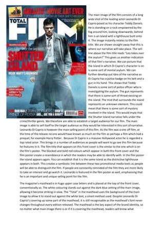
  • 1. The main image of the film consists of a long wide shot of the leading actor Leonardo Di Caprio posed as his character Teddy Daniels. He is standing on a rock empowered by the fog around him, looking downwards; behind him is an island with a lighthouse built onto it. The image instantly relates to the film title. We are shown straight away that this is where our narrative will take place. The sellline above the film title reads “Leo takes over the asylum!” This gives us another indication of that film’s narrative. We can picture that the island in which Di Caprio’s character is on is some sort of mental asylum. We can further develop out idea of the narrative as Di Caprio has a police badge on his belt and a gun in his hand. This shows that Teddy Daniels is some sort of police officer who is investigating the asylum. The gun represents that there is some sort of threat existing on the island. The mist that surrounds the island represents an unknown element. This could mean that there is some sort of mystery involved in the island. This would imply that the Shutter Island narrative falls under the crime/thriller genre. We therefore are able to establish a target audience for our film. The main image is able to sell itself to the target audience as they would be interested in this sort of narrative. Leonardo Di Caprio is however the main selling point of this film. As the film was a one off film, at the time of the release no one would have known as much on the film as perhaps a film which had a prequel, for example Harry Potter. Because Di Caprio is a massive Hollywood actor he is regarded a top rated actor. This brings in a number of audiences as people will want to go see this film because he features in it. The film title that appears on this front cover is the similar to the one which is on the film’s poster. The blocked and bold red colours which appear in both this front cover and the film poster create a resemblance in which the readers may be able to identify with. In the film poster the island appears again. You can establish that it is the same island as the distinctive lighthouse appears in both. This creates a symbiotic link between these two promotional media texts as people will be able to distinguish the film. If people are constantly reminded of the film they are more likely to take an interest and go watch it. Leonardo is featured in the film poster as well, emphasising that he is an important and unique selling point for the film. The magazine’s masthead is in huge upper case letters and is placed at the top of the front cover, conventionally so. The white colouring stands out against the dark blue setting of the main image, allowing it become striking in view. The “Total” in the masthead uses the background of the main image to allow it to stand out against the white text, a smart method used. Despite Leonardo Di Caprio’s covering up some part of the masthead, it is still recognisable as the masthead’s font never changes throughout every edition released. The masthead is the key aspect of the brand identity, so no matter what main image there is or if it is covering the masthead, readers will know what
  • 2. magazine it is. The lighthouse in the main image mirrors the same shape as the “M” on Film, so again despite the letter being partially covered; you can easily establish the name of the magazine. The masthead’s font is big and bold resembling big blockbuster films, which Total Film magazine promotes in their front covers, appealing to the target readership who is obviously interested in films, particularly blockbusters. The first sell-line that I was attracted to what was the Shutter Island, this is mainly because it is the biggest sell-line and it partially runs across the front cover. This sell-line takes up the largest amount of space out of all them because it is the main sell-line promoting the film in the main image. The blocked red text grabs reader's attention as it stands out clearly against the main image. Above this piece of text reads Dicaprio Exclusive. This line of text is highlighted in red and has a similar printed style to the font used for the wording of Shutter Island. This creates a link between the two, to show that they are part of the same sell line. Below this reads “Leo takes over the asylum!” this is an obvious link to the shutter island film and gives the target audience some indication the narrative. Finally underneath the large “Shutter Island” text reads “Inside Marty’s madhouse”. This again coincides with the Shutter Island film. It most likely a regard to the director or producer of the film and attracts target audiences who may already be aware of this person. They will be more incline into read about it. The colour red runs throughout the front cover. Below the main sell-line are three different films that are reviewed in this edition of the magazine. These texts also highlighted in red, attracting reader’s attention to these sections. They may be new films that the target audience is interested in finding out about. At the very bottom of the front cover is a section of other films that are included in the magazine. The “Plus” at the beginning of this section is in red, pulling readers eyes into this section. This is needed to be done as the bottom of a media text is usually neglected. The final word of this section reads “Are you a robot?” Asking a rhetorical question directly to readers, it develops a relationship between magazine and reader. On the right hand section there is only one sell-line, this is because the right hand side of the page is usually the last thing looked at. In order to attract readers to this part of the page however, editors have used an image of the blockbusting film Avatar. This pulls in film lovers as this was an iconic film representing the modernisation of technology. Again this sell-line has red highlighting to it, further attracting audiences to this section. At the very top of the page is a sell-line which will engage real film enthusiasts. The sell-line is in regards to sketchbooks of films which have been made available by top filmmakers. There is also an image in relation to this feature of the magazine. This will attract film lovers and artists who would love the chance to look at the imaginations and creative ideas of these filmmakers.