Model Call Girl in Tilak Nagar Delhi reach out to us at 🔝9953056974🔝
All 3 cover analysis
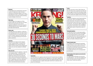
1. Colour–
Kerrang’s usual colour scheme is Black, White and
Red. All of these colours complement each other well
and also suggest rock and roll as red proposes danger
as does rock music. This Cover also has strong uses of
the colour yellow which suggests optimism and pride.
Masthead–
On this magazine the masthead (title) is Kerrang! It
is written in a bright red to make it more eye
catching the red symbolises danger or in the music
sense being rock or punk. It is also written in a block
font that looks as if it has been smashed extending
my point of danger and rock music.
Typefaces The majority of typefaces used are big and bold fonts
in block colour. There is one typeface that looks
almost hand written. This may be to make the story
seem personal as it says “Jared Leto’s most revealing
interview ever”. All of the text is typed in capitals and
many of them use exclamation marks to exaggerate
the excitement, this also gives a sense of exclusivity
suggesting the readers can only find out about it in
Kerrang.
Main image–
The main image on this magazine is of Thirty
Seconds to Mars front man Jared Leto. He is shown
with his fists closed and his arms in the air
suggesting a celebration or that he has conquered
something. Behind him there is golden yellow sun
like image representing hope.
Model credit–
The model credit for this magazine is “Jared Leto’s
most revealing interview ever” this makes it clear to
the audience that this is an interview that could be
a once in a lifetime thing and can only been seen
there. It is also obviously going to go into personal
detail on Jared’s life.
Photography Lighting–
The right side of his face is lit with high key lighting
whereas the other side is low key this could suggest
he is overcoming his demons or show his health
coming back which links in with the quoted cover line
that says “every day I was coughing up blood”.it is
shown as if the light is taking over the dark.
Coverlines Coverlines for this magazine for this magazine
include “6 awesome posters” “Kerrang! VS the
westboro Baptists church and they review the
singles!” all of the coverlines used are aligned away
from the cover stars face making him completely
visible.
Main cover line–
The main cover line for this magazine is ‘ ”every day
I was coughing up blood…” 30 Seconds to Mars
Jared Leto’s most revealing interview ever’. The
publisher has used this cover line to entice the
reader in with a shocking story that will grab the
audience’s attention. It is written in 3 ways’ the first
part is in bright yellow, the second is white with a
black outline on a red banner and the third is in
white in a text that almost looks hand written.
Design Principles Used –
This magazine cover has followed the Guttenberg
design principle as its cover image has taken up the
central space; the barcode and price are all in the
terminal area. All of the text is clear to read and all of
the images are easy to see. All of the text is
surrounding Jared’s face so he is not being blocked
out of the cover.
House Style The house style for this magazine is black white and red. This extends the rock magazine
feel and seems like a typical style for music magazines as it is also used for magazines like
’Q’. Even the look on Jared’s face matches the feel of the magazine although he looks like
he is celebrating and there is a golden yellow pattern behind him his expression seems
serious if not emotionless.
How the design of the magazine cover attracts the
target audience–
The target audience of Kerrang is rock music fans
most likely aged 13+. The cover of the magazine also
pushes that target audience through things like its
colour scheme, content and coverlines.
2. Target audience:
The target audience of NME is music fans
possibly aged 13+. The main genres they cater for
is rock.
Main image –
The main image on this magazine is a photo of
alternative singer Lana Del Rey. She is stood with
her hands on her hips and her tongue out which
complements the model credit quote “I’m a
psycho” she is also stood behind a American flag
showing her patriotism and the image of
American rock and roll which juxtaposes with the
main cover line.
Model credit The model credit on this magazine says “Lana Del
Rey the true face of a modern American icon.
This is written in light blue and black in a large
bold font that stands out. The model credit also
matches the photograph and what is written will
entice the reader into buying the magazine and
reading the rest of the article.
Coverlines –
The Coverlines on this issuer of ‘NME’ include
“Enter Shikari its time for revolution” and Noel
Gallagher I am a genius like god, find out why
inside” this once again encourages the reader to
want to read the rest of the article.
Main cover line –
The main cover line on this magazine is “I’m a
psycho! Lana Del Rey”. This is extending the point
that Lana Del Rey is on the cover of their
magazine and giving a sneak peek into what she’s
saying inside.
Colour –
The main colours of this magazine are white, black
and a bright light blue. All of the colours
complement the house style and stand out.
Typefaces All typefaces used are large bold san serif type
fonts that are clear and easy to read. This font also
makes a statement and stands out off the page.
Photography Lighting –
The lighting in this photo is high key suggesting
purity juxtaposing the expression on Lana’s face
and main cover line which gives the idea that looks
can be deceiving. The lighting may also be dream
like suggesting the American dream.
Masthead –
This magazine is named ‘NME’. The masthead is
written in a large bold font typed in white
suggesting purity or innocence but by looking at
the Coverlines and photograph of Lana Del Rey it is
clear that may not be the case.
Design Principles Used NME has followed the Gutenberg design principle
as its masthead is in the primary optical area and
the barcode and purchasing information in the
bottom corner of the terminal area. The whole
design goes along with the reading gravity and axis
of orientation.
House Style –
The house style of this magazine is white, black
and light blue which complements the photo and
background. The main font used is a bold, easy to
read large font. All of the Coverlines are aligned
around Lana’s face.
3. Masthead –
The Masthead of this issue of Billboard magazine is
different to its usual design of white with blocks of
bright colour within the letters however to continue the
house style of the magazine it is in a soft white colour
and in a smaller size emphasizing Katy Perry as the
cover model.
Main Image –
The main image on the cover of this magazine is of Katy
Perry. The image shows Katy walking through a Heaven
like meadow surrounded with flowers and butterflies
making it look beautifully picturesque. She has a very
natural looking in the photograph with her hair let down
and minimal makeup with a loose nude coloured dress.
All of the information above gives a sense of her music
genre being pop rock. The cover is also quite girly which
also gives a sense of her music as people often refer to it
as bubble gum pop because of its girly sweetness.
Model Credit The model credit on this cover is “Katy see’s the light”
The word Katy is written larger than the rest of the text
however her last name is not written as she is an
instantly recognisable star. The words “Sees the light”
are written smaller than her name the draws the
attention to Katy one again. The Model credit on a
whole complements the picture very well as it is set
outdoors and looks natural suggesting she has natural
talent. “Sees the light” can also suggest her troubles are
finished with.
Coverlines This magazine has no Coverlines other than a small
description of Katy Perry’s latest achievements. This
once again emphasises how proud billboard magazine is
that Katy is on the cover.
Target audience –
The target audience of billboard magazine is
mainstream music fans, ages 16-25, both male and
female.
Colour –
The main colour used on the cover of this magazine is
white. This gives connotations of purity and new
beginnings which continues the idea of concurring
troubles. There are also some uses of warm yellow, pink
and orange colours on the flowers as well as the light
blue sky and high green grass.
Type face The typefaces used on the cover of this magazine all
vary in size however they are all in bold sans serif style
fonts and all typed in white. An unusual thing about this
cover is that the Model credit is typed larger than the
Masthead which once again emphasises that it is Katy
Perry on the cover.
Photography Lighting The lighting on this magazine is very high key. This
continues the connotations of purity and shows warmth
as in this case it may represent the sun which once again
represents nature and a new day.
Design principles used This magazine continues the use of the Guttenberg
design principle and the rule of thirds as all of the text is
away from Katy’s face and all of the important
information is within the primary optical area and the
strong fallow area.
House style The house style of this magazine is natural scenes and white. This creates a feel of purity and innocence. Unlike rock magazine covers that come
across very dull in the stereotypical colours like red, black and white. Even the lighting on the image suggests innocence as it is very high key. The
whole style of the magazine gives feelings of happiness and childhood.