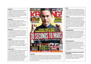
1. Colour–
Kerrang’s usual colour scheme is Black, White and
Red. All of these colours complement each other well
and also suggest rock and roll as red proposes danger
as does rock music. This Cover also has strong uses of
the colour yellow which suggests optimism and pride.
Masthead–
On this magazine the masthead (title) is Kerrang! It
is written in a bright red to make it more eye
catching the red symbolises danger or in the music
sense being rock or punk. It is also written in a block
font that looks as if it has been smashed extending
my point of danger and rock music.
Typefaces The majority of typefaces used are big and bold fonts
in block colour. There is one typeface that looks
almost hand written. This may be to make the story
seem personal as it says “Jared Leto’s most revealing
interview ever”. All of the text is typed in capitals and
many of them use exclamation marks to exaggerate
the excitement, this also gives a sense of exclusivity
suggesting the readers can only find out about it in
Kerrang.
Main image–
The main image on this magazine is of Thirty
Seconds to Mars front man Jared Leto. He is shown
with his fists closed and his arms in the air
suggesting a celebration or that he has conquered
something. Behind him there is golden yellow sun
like image representing hope.
Model credit–
The model credit for this magazine is “Jared Leto’s
most revealing interview ever” this makes it clear to
the audience that this is an interview that could be
a once in a lifetime thing and can only been seen
there. It is also obviously going to go into personal
detail on Jared’s life.
Photography Lighting–
The right side of his face is lit with high key lighting
whereas the other side is low key this could suggest
he is overcoming his demons or show his health
coming back which links in with the quoted cover line
that says “every day I was coughing up blood”.it is
shown as if the light is taking over the dark.
Coverlines Coverlines for this magazine for this magazine
include “6 awesome posters” “Kerrang! VS the
westboro Baptists church and they review the
singles!” all of the coverlines used are aligned away
from the cover stars face making him completely
visible.
Main cover line–
The main cover line for this magazine is ‘ ”every day
I was coughing up blood…” 30 Seconds to Mars
Jared Leto’s most revealing interview ever’. The
publisher has used this cover line to entice the
reader in with a shocking story that will grab the
audience’s attention. It is written in 3 ways’ the first
part is in bright yellow, the second is white with a
black outline on a red banner and the third is in
white in a text that almost looks hand written.
Design Principles Used –
This magazine cover has followed the Guttenberg
design principle as its cover image has taken up the
central space; the barcode and price are all in the
terminal area. All of the text is clear to read and all of
the images are easy to see. All of the text is
surrounding Jared’s face so he is not being blocked
out of the cover.
House Style The house style for this magazine is black white and red. This extends the rock magazine
feel and seems like a typical style for music magazines as it is also used for magazines like
’Q’. Even the look on Jared’s face matches the feel of the magazine although he looks like
he is celebrating and there is a golden yellow pattern behind him his expression seems
serious if not emotionless.
How the design of the magazine cover attracts the
target audience–
The target audience of Kerrang is rock music fans
most likely aged 13+. The cover of the magazine also
pushes that target audience through things like its
colour scheme, content and coverlines.