
Recommended
More Related Content
What's hot
What's hot (20)
Viewers also liked
Viewers also liked (15)
Similar to Analysis of music magazines
Similar to Analysis of music magazines (20)
Recently uploaded
Recently uploaded (20)
Analysis of music magazines
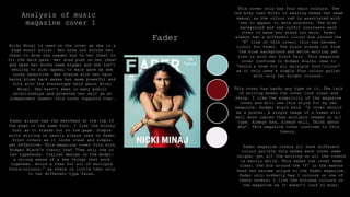
- 1. Analysis of music magazine cover 1 Fader This cover only has four main colours. The red body that Nicki is wearing makes her seem sexual as the colour red is associated with sex to appeal to male audience. The blue background and red outfit contrasts each other to make her stand out more. Fader always has a different colour box around the ‘F’ like on this cover; this has become iconic for Fader. The black stands out from the blue background and white writing yet ties in with her black hair. This magazine cover conforms to Rodger Blacks idea to “avoid a free for all multiple font/colour” as it only uses a simple four colour pallet with only two bright colours. This cover has hardy any type on it. The lack of writing makes the cover look clean and sharp. I like the simplicity of the magazine cover and will use this style for my own magazine. Rodger Black said “a cover should be a poster. A single image of a human will sell more copies than multiple images or all type. Always has, always will. Think about why”. This magazine cover conforms to this theory. Fader always has the masthead at the top of the page in the same font. I like the blocky font as it stands out on the page. Simple write writing is nearly always used on Fader front covers as it looks clean and simple yet effective. This magazine cover fits with Rodger Black’s theory that “Use only one or two typefaces. Italian design is the model: a strong sense of a few things that work together. Avoid a free for all of multiple fonts/colours.” as there is little text only in two different type faces. Nicki Minaj is used on the cover as she is a huge music artist. Her arms are across her chest to draw the reader eye to her chest to fit the male gaze. Her arms push on her chest and make her boobs seem bigger and she isn’t smiling to also appeal to male gaze as she looks seductive Her stance with her hair being blown back makes her seem powerful and fits with the stereotype held about Nicki Minaj. She hasn’t been in many public relationships and promotes her self as an independent women; this cover supports that. Fader magazine covers all have different colour pallets this makes each cover seem unique, yet all the writing on all the covers is mainly white. This makes the cover seem clean. The box around the ‘f’ in the master head has become unique to the fader magazine. Fader only normally has 3 colours on one of there covers; I like the minimum colours on the magazine as it doesn’t look to busy.
- 2. Analysis of music magazine cover 2 Billboard This cover only has four main colours yet all the colours are bold and bright colours. These colours make the cover stand out in shops and fit the theme of the magazine. Most of billboards covers are bright like this one. However this cover doesn’t conform to Rodger Blacks theory to “Avoid a free for all of multiple fonts/colours.” by using four different colours. On the other head Colin Wheildon said “editors and designer are the missing link between the ape world and man” yet this cover brings in nature by having Katy Perry covered in flowers. Chris Frost's idea was to “Emphasise your entry point, with larger intro type, bold faces, drop letters, etc. Choose your entry point with care, and make it the focal point of the page.” This Billboard cover conforms to this idea as Katy Perry's name is in a large and bold type face in the middle of the page to entice the reader to buy and read that magazine. Katy Perry's head covers part of the masthead, however because billboard has been around for 122 years there type face has become iconic meaning people recognize the magazine with out having to see the whole masthead. The masthead and font face for billboard is always bold and blocky meaning it is easily seen in shops and easy to read the masthead with out seeing the whole title. Katy Perry is used on the cover as she is a global music artist and billboard is a music magazine. She is stood covered in flowers to make her seem sweet and innocent yet sexual because of the for posture. Her arms are in front of her chest which draws the readers eye to her chest. Pops of the colour red also make it seem sexual as the colour red is associated with sex. This is to appeal to the male gaze. Billboards master head is always in a different colour on each cover, the master head normally contracts the background to help the master head stand pout in shops. I like having a brighter master head that sticks pout so people know what magazine it is.
- 3. Analysis of music magazine cover 3 Rolling stones Rolling stones magazine usually has natural colours part from the masthead which is always in red to make it stand out in shops. The red colour of the masthead has become iconic to the magazine. Both the background and the writing is in light colours to highlight Adele's face. I like this colour pallet as the readers eye is drawn to the red first and the masthead. Rodger Black theory is that designers should use “White for background, black for text, red for accent and excitement. These three colours are the best.”. Although is magazine cover doesn’t have a white background or black text; red is used for accent in the masthead to draw attention to the title of the magazine. Adele is used on the cover of this magazine as the main selling point as she is a global artist. Adele's face and hair fills most of the cover. She has a straight face to make her seem powerful yet sexual as her lips are parted. Her hair is a little messy which also makes her seem sexual yet Adele is known for promoting a realist image of woman as she has spoken out about her weight and insecurities. Her imperfect hair shows her exceptions of not being perfect as well as promoting that its okay to not be perfect to other young women. Rolling stones is traditionally aimed at men, this may be why they have used a woman on the cover to appeal to the male gaze. Adele's name is in a large font size across the bottom of the page as well as having a close up shot of her face, this is because she is a selling point of the magazine. Chris frost said “emphasise your entry point, with larger intro type, bold face, drop letters ect.” This magazine complies to this theory by using Adele's name. The layout of the magazine is similar to most other magazines with the masthead at the top and writing down the sides. Rolling's stone magazine always sticks to a layout like this. The masthead being at the top of the page in a bright red means its obvious to the reader and use to see when the magazine is stacked on a shelf in a shop. The rolling stones masthead has become iconic because of its type face and the layout on the page. Like Kerrang, Rolling Stones have a colour pallet that they often use on there covers which is black, white and red. This colour pallet is used on many magazine covers. I like these colours as they work well together and the red stands out.
- 4. Analysis of music magazine contents page 1 Billboard This magazine only has four main colours, most of them being natural and light colours. There are pops of colour form her lips and the blue box in the corner of the page. This magazine complies to Rodger Black theory to “avoid a free for all multiple font/colour” as it only has a colour pallet of four colours. The page is very simple with only one picture and one section of writing on the left side of the page. This makes the page easy to read as its simply laid out with no distractions. Chris Forest’s idea was “don’t use too many typefaces”. This magazine conforms to this idea as it only has two typefaces, one for the heading and one for the main body. A mid shot of Ariana Grande takes up most of the page. Her looking over her shoulder makes her seem more sexual as well as making her seem innocent and sweet. The stereotype of Ariana is that she is young and pure, this is shown in this picture. Ariana hair is always style in the same way, this has become a signage thing to her. Her hair is style in the same way in the picture so people can recognize her by her hair. This is used to appeal to the male gaze. This could mean the magazine is more aimed at men than women. ‘Contents’ is written down the right side of the page not across the top like a typical magazine. I like this as it is different to other magazines. Rodger Blacks theory was that “if you want normal people to pay attention you have to chance pace in your presentation”. This content page by billboard changes what is seen as normal by having the heading down the side. "Rule of Thirds" or "Golden Ratio“ is used on this content page as the model takes up 2/3 of the page. Rule of Thirds is a simplified version of the Golden Mean.
- 5. Analysis of music magazine contents page 2 KERRANG Kerrang always uses two main colours yellow and red with in there magazines, these colours make the magazine stand out from other magazines and make it seem more interesting. The colour catch my eye yet I don’t like the colours together. These two colours have become iconic to Kerrang. A survey by Colin Wheildon suggest that people ”found coloured text more difficult to read. It was attractive to look at but did not make a good reading environment.” With Kerrang using coloured text and different coloured backgrounds the text becomes hard to read. Kerrang uses a black and white photo of the band to fit with the four colour pallet for this content page. Kerrang’ s whole magazine is normally very busy with a lot of text and pictures like with this content page. “Break up type to add interest” is Chris Frost’s theory which is used by Kerrang. Kerrang don’t have blocks of text with out a image or a heading to brake it up. The crowed page makes the content make seem captivating and like you are getting a lot for your money. The busy lay out of the magazine fits the genre of music the magazine promotes, which is rock/metal. Although the page is busy, the writing in Kerrang magazine is set out in a way that is easy to read. All the content of the magazine is set out down the side of the page with subheadings and different colours to split the writing up. Although Kerrang magazine does only “use one or two typefaces” which mean it conforms with Rodger Blacks theory, it also goes against his theory as Rodger Blacks says to “avoid a free for all of multiple fonts/colours”. Kerrang uses many bright and bold colours through out there magazine which makes it seem crowed.
- 6. Analysis of music magazine contents page 3 FADER This magazine content page conforms to Rodger Blacks theory that you should “avoid a free for all of multiple fonts and colours” as the whole of this content page only has two colours, black and white. This is unusually for magazine content pages. The monochrome colour pallet makes the magazine content page seem simple. I like this colour pallet yet in my magazine I would have had a pop of colour to add excitement as Rodger Black said “White for background, black for text, red for accent and excitement. These three colours are the best.” without a pop of a colour the page can seem to simple and the read may not stop to read it as it doesn’t stand out. This magazine content page is very simplistic with little writing that is formally laid out and only one picture. This page is easy to read as there is no distractions. Colin Wheildon research suggests that people “found coloured text more difficult to read. It was attractive to look at but did not make a good reading environment”. All the content of the magazine is set out across half of the page with subheadings to make it easy to read. The lines brake up the text without making it look busy. According to Rodger Black this layout in this magazine will sell was as “a single image of a human will see more copies than multiple images or all type.” The image of the woman in also in black and white like the rest of the content page. The woman has glasses and a fur scarf around her neck which makes the picture seem less serious, yet her posture makes her seem sexual. The fur is cover her chest which draws the readers eye to that part of her body to appeal to the male gaze. A mid shot is used for this picture yet you cant see the models face much meaning her face isn’t the focus.
- 7. Analysis of music magazine double page spread 1 VIBE This magazine double page spread has a typical colour pallet of black, white and red. This helps the red to stand out more for important parts of the magazine. The white background makes the page seem simple and easy to read the black writing. This also helps the models face to stand out. Rodger Black theory is that “The first colour is white. The second colour is black. The third colour is red. White for background, black for text, red for accent and excitement. These three colours are the best.” This magazine conforms to his ideas as the colour pallet those three colours and has a white background, black for text and red for accent. This type of layout is used on many double page spreads with one page having a block of text and the other page with a single image. This format makes the page easy to read with clear structure. A close up shot of Kendrick Lamar fills the second page with a little text underneath which conforms to Colin Wheildon idea as he said “every picture should have a caption.” The picture of Kendrick shows him as a careless man as he is looking to the side, which fits with the style of music he produces. It is unusual to have a close up shot with a model not looking at the camera. The headline od the article is jus Kendrick's name, suggesting he is the selling point and reading point of this magazine. A large body of text is use in most magazine article as a feature yet this doesn’t conform to Rodger Blacks theory that “if you want people to pay attention you have to change the pace in your presentation”. A pull quote would have broke up the text to change the pace. I would use pull quotes o my double page spread article.
- 8. Analysis of music magazine double page spread 2 Billboard Colin Wheildon’s theory is that “Editors and designers are the missing link between the ape world and man.” This double page spread conforms with his idea as there is no connection to natural. The main focus is just Nicki Minaj. Although she is wearing a animal print body suit. A mid shot of Nicki Minaj takes up half the double page spread. She is used as she is a global artist and people are interested in what she thinks and says. She is wearing a tight fitting body suit that shows her curves as she is known for having a curvy body to appear sexual and addresses the male reader appeal to the male gaze. Her outfit is unusual yet this is her style as she is often seen in unusual outfits. Her name is in a large font size to highlight who she is as she is a selling point of the magazine. This complies to Chris Frost idea that desingers should “emphasise your entry point, with larger intro type, bold faces, drop letters, ect. The main focus is just Nicki Minaj. The body of the text is an interview from Nicki Minaj making her the selling point. The colour pallet of this magazine is mainly different shades of pink. This colour catches the readers eye and fits the style of the article as Nicki Minaj is associated with this colour which she often wears. I don’t like these colours as I feel they are too much and look cheap although they do stand out. The colours of Nicki's outfit contract the pink background to make nikci stand out more on the page.
- 9. Analysis of music magazine double page spread 3 Rolling stones Adele's face and hair takes up more than half of the double page with little writing. "Rule of Thirds" or "Golden Ratio“ is used on this double page spread as the model takes up 2/3 of the page. Rule of Thirds is a simplified version of the Golden Mean. This layout is common to magazines. I wouldn’t use this layout for my magazine as it is so common although I do like it and it works well. Adele's name takes up a large amount of space on the page as she is the selling point of the magazine. Chris Frost idea was that designers should “emphasise your entry point, with larger intro type, bold faces, drop letters, ect.”. This is what this double page spread does by having Adele's name on the page. Her face and name would draw people in to read the article as she is the selling point. Adele is looking way from the camera which is unusual to see in magazine, this look makes her seem sexual as well as innocent rather than powerful. Adele is famous for her large back-combed hair which is styled in the same way in this picture so people will recognize her. Her eye liner has also become iconic to her as a style. Adele is known for being a larger lady and her face is her best feature; this is why a close up shot of her face is used on this page. Adele's is more about her music than her image and body. This double page spread colour pallet only black and white with a grey background. The dark colours make Adele's face stand out more as her face is brighter than the rest of the page. A monochrome colour pallet makes the page look clean but can look boring and not draw the reader in to read the article. In my magazine I would use a pop of colour to attract my reader. I would have used a white of brighter grey on the background of this page to make the writing stand out more.