
Recommended
More Related Content
What's hot
What's hot (15)
Similar to Magazine cover analysis 1
Similar to Magazine cover analysis 1 (20)
Magazine cover analysis 1
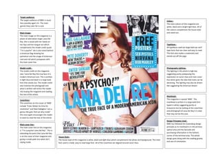
- 1. Target audience: The target audience of NME is music fans possibly aged 13+. The main genres they cater for is rock. Colour– The main colours of this magazine are white, black and a bright light blue. All of the colours complement the house style and stand out. Main image– The main image on this magazine is a photo of alternative singer Lana Del Rey. She is stood with her hands on her hips and her tongue out which complements the model credit quote “I’m a psycho” she is also stood behind a American flag showing her patriotism and the image of American rock and roll which juxtaposes with the main cover line. Typefaces All typefaces used are large bold san serif type fonts that are clear and easy to read. This font also makes a statement and stands out off the page. Model credit The model credit on this magazine says “Lana Del Rey the true face of a modern American icon. This is written in light blue and black in a large bold font that stands out. The model credit also matches the photograph and what is written will entice the reader into buying the magazine and reading the rest of the article. Photography Lighting– The lighting in this photo is high key suggesting purity juxtaposing the expression on Lana’s face and main cover line which gives the idea that looks can be deceiving. The lighting may also be dream like suggesting the American dream. Masthead– This magazine is named ‘NME’. The masthead is written in a large bold font typed in white suggesting purity or innocence but by looking at the coverlines and photograph of Lana Del Rey it is clear that may not be the case. Coverlines– The coverlines on this issuer of ‘NME’ include “Enter Shikari its time for revolution” and Noel Gallagher I am a genius like god, find out why inside” this once again encourages the reader to want to read the rest of the article. Main cover line– The main cover line on this magazine is “I’m a psycho! Lana Del Rey”. This is extending the point that Lana Del Rey is on the cover of their magazine and giving a sneak peek into what she’s saying inside. House Style– The house style of this magazine is white, black and light blue which complements the photo and background. The main font used is a bold, easy to read large font. All of the coverlines are aligned around Lana’s face. Design Principles Used NME has followed the Gutenberg design principle as its masthead is in the primary optical area and the barcode and purchasing information in the bottom corner of the terminal area. The whole design goes along with the reading gravity and axis of orientation.