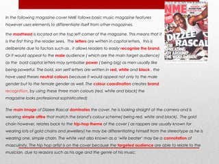
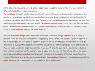
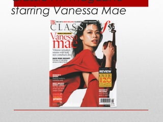
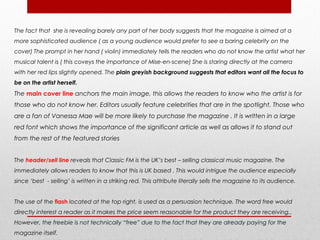
The magazine cover features violinist Vanessa Mae on the front. Key elements used to target the audience include the sophisticated layout, focus on classical music reviews and performances, and targeting of an older ABC1 demographic between ages 18-60 who enjoy classical music. The monotone color scheme and formal language and reviews aim to attract a mature audience interested in classical genre.
2. • NME (New Music Express), is a British based monthly magazine which was first
published on March 1952.
• The publication started off as a music newspaper .However, it gradually moved
toward a magazine format in the 1980s.
• It was one of the first British paper to include elements such as a singles chart and
in the 1970s it became the best-selling British music newspaper.
Statistical Information
• It was the first British paper to include a singles chart
Circulation
88,420
Readership
473,000
ABC1 Profile
68%
Median Age
29
Male 75%
Female 25%
3. Target audience Profile
I believe the magazine NME is directed at young
people in their teenage years up to the age of 25. I
have come to this conclusion due to the style of the
magazine. The bold texts and vibrant colours stand
out to attract those in their younger years due to the
fact that young people would need colours, images
and lots of writing to attract them, this would not be
a technique used in magazines aimed at older
people because they are more interested in the
stories the issue contains rather than it’s physical
appearance.
A magazine revolving around classical genre is an
example of a magazine targeted at older people.
This is portrayed through the sophisticated style and
writing opposed to the fun and quirky theme of this
cover. The informality in the writing makes it even
more obvious that it is aimed at younger individuals,
this because they are the type of people that would
go to events such as gigs and music festivals which
would mean that they would want to read up on the
latest gossip associated with their favourite bands
and artists.
The magazine costs £2.20 which is an affordable price
for all social class groups.
TARGET AUDIENCE OF THIS MAGAZINE
4. In the following magazine cover NME follows basic music magazine features
however uses elements to differentiate itself from other magazines.
the masthead is located on the top left corner of the magazine. This means that it
is the first thing the reader sees. The letters are written in capital letters, this is
deliberate due to factors such as , it allows readers to easily recognise the brand.
Or it would appeal to the male audience ( which are the main target audience)
as the bold capital letters may symbolise power ( being big) as men usually like
being powerful. The bold, san serif letters are written in red, white and black , the
have used theses neutral colours because it would appeal not only to the male
gender but to the female gender as well. The colour coordination creates brand
recognition, by using these three main colours (red, white and black) the
magazine looks professional sophisticated)
The main image of Dizzee Rascal dominates the cover. he is looking straight at the camera and is
wearing simple attire that match the brand’s colour scheme( being red, white and black). The gold
chain however, relates back to the hip-hop theme of the cover ( as rappers are usually known for
wearing lots of gold chains and jewellery) he may be differentiating himself from the stereotype as he is
wearing one, simple chain. The white vest also known as a ‘wife beater’ may be a connotation of
masculinity. The hip hop artist is on the cover because the targeted audience are able to relate to the
musician, due to reasons such as his age and the genre of his music.
5. He is smiling because it associates with the main article “ I’m spreading joy around the world,
man!”. He is used as a persuasion because fans of the artist will be encouraged to buy the issue
to learn more about the musician. By using the rule of thirds, it allows the artist to have eye
contact with the reader.
Another method of creating a brand identity is the typography used. There are various fonts and
sizes deliberately used for each feature. The font usually relates to the level of importance of the
featured story. E.g. The main featured story anchors the main image. This allows the readers to
know who the artist is. It is written in the biggest and boldest font to emphasise the domination
the article has on this issue. Editors usually feature celebrities that are in the spotlight. Those who
are a fan of Dizzee Rascal would be attracted to the big bold letters. The artist’s name and pull
quote are written in a different colour to the other features. This allows them to stand out and
shows their importance.
The use of a pull quote gives the reader a subtle insight about the contents of the article
however, editors do not usually give too much information so that the target readership would
buy it to find out more.
flashes are usually fun and exciting and would appeal to the reader (especially this target
audience as they are fairly young). The use of colloquial language ‘ wowee’ and ‘zowee’ make it
sound more interesting and relates back to the young target audience.
6. The header located above the masthead is probably the next most important featured story which in
this case is ‘’16 page autumn tour special !” it is written in a serif font which differentiates it from the rest
of the fonts and appears more sophisticated. The featured stories are all related back to music which
indicates the magazine’s only objective is to highlight the music industry. ( this contrast with other
magazines that include elements such as politics, fashion and movie/television programme reviews) The
footer, allows the readers to know who else is featured in the magazine( Jay-Z , Paramore …) By
featuring a combination of artists that categorise into different genres, it gives the magazine the
opportunity to attract a wider range of audience.
The sell/cover lines are essential to literally sell the magazine to the audience. It immediately
gives the readers an insight of the magazine and what articles it will contain
the urban background is full of graffiti. This represents the stereotype of the hip hop culture, as
this particular ethnic culture is associated with the gangster/ghetto lifestyle. However, the
colours create a vibrant and trendy atmosphere as the shades compliment the cover ‘s colour
scheme and the artist’s image(style) as well. Each of the colours have different connotations.
7. White symbolises purity and innocence, where as the colour black represents death and power.
These two colours may represent the stereotypical features of men and women ( hence making them
neutral colours)
The cover contains basic elements that any magazine would have including a barcode, issue date
and price ( which are all located at the bottom right corner) these are essential for any magazine
that wants to be sold. The price allows readers to know whether or not the publication is within their
price range, the date let’s them know how new the issue is. Over all the magazine would attract it’s
specific target audience successfully by using the appropriate conventions. However, because it is
aimed at a younger audience it may benefit from adding more images and featured articles.
8. The use of colloquial
language
The use of a young hip
artist.
Bold writing immediately
catches the eyes
Bright and vibrant
colours
Variety of featured
artists in the
magazine
The eye contact produced
through the rule of thirds
METHODS USED TO ATTRACT THIS TARGET
AUDIENCE ARE:
11. • Q magazine is a popular UK based music magazine. It was first
published in October 1986, and was found by David Hepworth
and Mark Ellen.
• It differentiated itself from other music press by having higher
quality standards of art and printing at this time.
• It was originally known as Cue magazine ( referring back to the
term cueing a record etc.) However, it may have been mistaken
for a snooker magazine.
• On their 200th issue the name was shortened to a single letter title,
due to the fact that it would be more prominent on newsstands.
13. In the following magazine cover Q follows basic music magazine features however uses elements to
differentiate itself from other magazines.
The masthead is hugely displayed on the top left corner of the cover, the large font used allows the
reader to immediately identify the magazine from far away. Since people read from left to right the
masthead would be the first thing they see. The colour red is striking and instantly catches the eye. The
selling line right underneath the masthead is: ‘ A different take on music’ is used as a USP (Unique selling
point) differentiating the publication and brand altogether from any other music magazine, as they
claim to have a diverse view on the music industry.
The one main main image here, dominates the cover. The whole image is sensual due to various
reasons. There is a long shot of the famous singer ( Lilly Allen) topless. The starlet is topless to appeal to
the male gender. The shot is of her back however, her face is tilted to face the camera, this may be
deliberate to represent the sophistication of the magazine , by not revealing too much of the artist (as
they say less is more). Her finger is positioned in her mouth and she is giving the camera a seductive
look which is supported by the bold grey eye shadow and the way her hair is hung off her shoulders.
She is dressed in black and silver clothing which compliments the colour of her hair (raven) and the
colours of the issue as a whole. She is surrounded by two panthers,. this conveys and relates back to the
erotic theme of the cover and may represent the singer’s alter ego.
14. Black panthers generally symbolise feminism, ferocity, power and heroism, this may symbolise the
fact singer as it takes bravery to be photographed topless. The symbolism of power is used by having a
female on the cover. Since men are usually associated with the word power or strength the magazine
may want to differentiate their brand from the gender stereotype.
The layout of the magazine is presented professionally and in a sophisticated manor , this indicates
that it is aimed at an older age group and is shown through elements such as the lack of images that
a younger audience would be more attracted too and even the fact that the starlet is shirtless. The
quality of the images are of high standards (as they want to maintain their award winning
photography). The plain grey background compliment the colour scheme and diverts all focus onto
the artist herself. It allows the words to stand out and would not distract audience from reading the
writing on the cover.
The theme of the issue also compliments the brands main colour scheme white, black and red. This is
one form of creating brand identity. The colour red generally associates with lust and beauty this
identifies with the theme of the cover. The colour black connotes ideas such as mystery,
sophistication and darkness. Here, the colour black represents the edginess of Lilly Allen, she however
contrast with the colour white used in the fonts. This is because white connotes purity, innocence and
virginity, here the singer stimulates the idea of darkness however, the look she is giving to the camera
looks slightly innocent.
15. The fact that the main cover story is written in black and white connotes that the singer is in limbo between
good and evil. The panther on the right is slightly covering the ‘L’ in her surname, this means editors are
confident that fans of the infamous artists would know her last name is ‘ALLEN’ even though it somewhat
looks the word ‘ALIEN’
The words ‘sexy beast’ in the cover lines are deliberately placed as they are associated with the panthers.
The word repetition of the word ‘wicked’ emphasises the ferocity of the singer. It is highlighted in red
because the colour red also connotes the idea of anger, rage and cruelty.
The layout of the magazine is presented professional manor , this indicates that it is aimed at an older age
group and is shown through elements such as the lack of images ( which younger audience would be more
attracted too )and even the fact that the starlet is shirtless. The quality of the images are of high standards
(as they want to maintain their award winning photography). The plain grey background compliment the
colour scheme and diverts all focus onto the artist herself. It allows the words to stand out and would not
distract audience from reading the writing on the cover.
The design of the page is simple yet sophisticated. There are various featured stories including ‘ How to buy
Queen’ and ‘ the 25 greatest rock movies’ ( presented in a form of a flash) this feature allows the
publication to reach out to a wider range of audience ( by attracting movie enthusiasts however, relating
it back to the music industry)
16. The typography used is another form of brand identity. The magazine uses various fonts and
sizes. The size is usually measured to the importance of the featured story. E.g. since the main
featured story is about Lily Allen her name is placed right in the mid centre of the cover and is
written in bold, capital letters that stand out. And then there are random font sizes and fonts
displayed on the top left corner of the magazine describing the featured stories.
The language used is proper and smooth which clearly indicates that they are aiming at an
older audience. The articles used are unbiased and can attract both sexes. As the genre of
the magazine is associated with rock these rock bands would be familiar to the target
audience. The fact that U2 and OASIS written in big, black and bold letters , immediately gives
the readers an insight of the magazine and the genre the issue will be focusing on.
There is no header located however, as usual the footer gives the readers and insight on other
articles featured in the magazine.
The cover contains basic elements that any magazine would have including a barcode, issue
date and price ( which are all located at the bottom right corner) these are essential for any
magazine that wants to be sold. The price allows readers to know whether or not the
publication is within their price range, the date let’s them know how new the issue is. Overall
the magazine successfully justifies what target audience they are aiming their publication at,
by using the appropriate elements such as language, layout, and colours.
18. In the following magazine cover Q follows basic music magazine features however uses
elements to differentiate itself from other magazines.
The masthead /title is located on the top left corner of the magazine however, is majorly
covered by a close up of the Bono. This suggests that editors at Q are very confident about
their brand recognition since almost half the title is missing.
the main and only image is a close up of the artist, Bono. He is wearing his signature
sunglasses which Bono fans would immediately distinguish . He is staring directly at the
camera with a serious somehow moody look on his face. The dominant image may represent
power as the singer does look slightly intimidating. Audience can only see a little more than
half of the singer’s face and the light is glistening off his shades, this makes it slightly harder to
identify the artist.
The only featured story ( aside from the footer) ‘ The man of the year Bono’ shows the
importance of the interview as it is the only one displayed. This makes the publication less
attractive as it is dull and boring and readers would expect more news from a monthly.
the pull quote is subtly displayed on the top right of the magazine ‘I’d be a good pope.’ the
simple sentence uses colloquial language as I’d is an informal way of saying I would.
19. The short sentence is quite strange and may be offending to religious readers, this may
persuade the readers to buy the magazine and to carry on reading the article.
The selling line ‘s main priority is to literally sell the magazine to the audience. ‘ The essential
music guide’ informs the readers that this magazine is a must-have to be connected to and
learn about latest news within the music industry.
The footer is subtly located at the bottom of the magazine in extremely small writing. This gives
the readers an insight of what else the magazine will be containing. ‘ all the month’s albums,
gigs movies & DVD’s reviewed and rated’ this suggests that they are trying to widen their
audience by reaching not only music fanatics but movie enthusiasts as well. The stars near
review adds a visual effect to the footer.
In general this cover lacks various conventions such as featured stories and puffs. This would
immensely affect the issue do to the fact that it would not catch the consumers eye and there
may be less sales compared to other months. The layout is monotonous and lacks specific
conventions to differentiate the magazine from any other. However, on a general note it does
follow the basic conventions of any magazine thus, less unique than competing music
publications.
21. The Classic FM Magazine was a UK based music monthly. It was the printed organ
of the British classical commercial music station Classic Fm. The magazine contained
features such as reviews of classical recordings and live performances and often
included tracks from recent releases on its cover disk.
Unfortunately, In January 2012 the magazine announced that it will be terminated the
last issue was published in March 2012
Classic FM’s core audience is 30+.
It attracts the largest upmarket audience in commercial radio: 69% of its audience are
ABC1.
Classic FM’s fresh approach to music encourages new audiences to experience and
enjoy the brand. They have begun to widen their target audience to classical
enthusiasts between the ages 18-60.
Classic FM’s passion is making classical music a part of everyone's lives, regardless of
Classic FM Information
age or background.
and Target Audience
22. In the following magazine ‘Classic FM ‘ follows the basic convents of a general magazine but specifically
Classical music.
The masthead is displayed in the centre top of the magazine in a serif font. The font however is quite slim
and does not dominate the page as much as it does on other magazine covers, this may represent the
stereotypical female audience. The word classic itself implies that the magazine is aimed at older
individuals. The fact that the masthead faintly hides the artists forehead suggests that the editors at classic
FM are not as confident about their brand’s awareness as other magazines are ( Q) So some of the Mise-
en-scene is easily spotted. The colour scheme is neutral, this would appeal to both male and female
readers. This is one form of creating brand identity. The colours are formed of black, white and red which
seem to be a popular choice for various magazines. The colour Red generally associates with ideas such
as lust and beauty .The colour black connotes ideas such as mystery, sophistication and darkness. Here,
the colour black is not as striking as the other colours as it is only used for the cover lines. The musician
however, seems to associate with the colour white. This is because white connotes purity, innocence and
virginity, here the singer stimulates the idea of purity as she looks quite angelic.
The medium shot of the artist dominates the whole page. Vanessa Mae is dressed in a flowy red dress., this
associates with the colour scheme of the magazine.
23. The fact that she is revealing barely any part of her body suggests that the magazine is aimed at a
more sophisticated audience ( as a young audience would prefer to see a baring celebrity on the
cover) The prompt in her hand ( violin) immediately tells the readers who do not know the artist what her
musical talent is ( this coveys the importance of Mise-en-scene) She is staring directly at the camera
with her red lips slightly opened. The plain greyish background suggests that editors want all the focus to
be on the artist herself.
The main cover line anchors the main image, this allows the readers to know who the artist is for
those who do not know her. Editors usually feature celebrities that are in the spotlight. Those who
are a fan of Vanessa Mae will be more likely to purchase the magazine . It is written in a large
red font which shows the importance of the significant article as well as allows it to stand out
from the rest of the featured stories
The header/sell line reveals that Classic FM is the UK’s best – selling classical music magazine. The
immediately allows readers to know that this is UK based . This would intrigue the audience especially
since ‘best - selling’ is written in a striking red. This attribute literally sells the magazine to its audience.
The use of the flash located at the top right, is used as a persuasion technique. The word free would
directly interest a reader as it makes the price seem reasonable for the product they are receiving,.
However, the freebie is not technically “free” due to the fact that they are already paying for the
magazine itself.
24. The design of the page is simple yet sophisticated. There are various featured stories including ’Classic
FM’s review Over 120 CD’s & DVD’s reviewed and rated’ ( presented in a form of a flash) this feature allows
the publication to reach out to a wider range of audience ( by attracting movie enthusiasts however,
relating it back to the music industry). This also allows the editors to add their own personal touch to the
issue by making sure the products are reviewed by Classic FM themselves. The issue also features other
various artists including Mario Lanza and Rach Ross Mozart. This allows readers to have a variety of
celebrities to read about . ‘ Full story nail-biting climax to Hall of Fame’ the article creates a suspenseful
vibe the words urge readers to carry on reading the article.
The Barcode is essential for every magazine that wants to be sold ! It allows the readers to know whether
or not the magazine is in their price range. It is a small box usually located at the bottom right of the page
( stirring away from the main image) the fact that the magazine costs £3.99 suggests that it is aimed at a
more sophisticated and older audience due to the higher price compared to other magazines.
Overall the magazine successfully conveys the appropriate conventions making it clear what target
audience they are aiming their publication at.