1. Magazine Content Page Analysis House Style
The house style of thismagazine wouldbe
redwhite andblack.The layoutof this
magazine isclutteredandit’snot
organized.Thisshowsthatmenreadthis
magazine because it’snotsmartlike other
magazinesare.
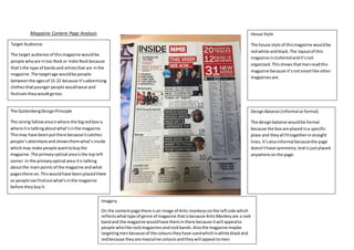
Imagery
On the contentpage there isan image of Artic monkeysonthe leftside which
reflectswhattype of genre of magazine thatisbecause ArticMonkeyare a rock
bandand the magazine wouldhave theminthere because itwill appealto
people wholike rockmagazinesandrockbands.Alsothe magazine maybe
targetingmenbecause of the colourstheyhave usedwhichiswhite blackand
redbecause they are masculine coloursandtheywill appeal tomen.
DesignBalance (informal orformal)
The designbalance wouldbe formal
because the box are placedina specific
place and theyall fittogetherinstraight
lines.It’salsoinformal becausethe page
doesn’thave symmetry,textisjustplaced
anywhere onthe page.
Target Audience
The target audience of thismagazine wouldbe
people whoare intoo Rockor Indie Rockbecause
that’sthe type of bandsand artiststhat are inthe
magazine.The targetage wouldbe people
betweenthe agesof 15-22 because it’sadvertising
clothesthatyoungerpeople wouldwearand
festivalstheywouldgotoo.
The GuttenbergDesignPrinciple
The strong fallowareaiswhere the bigredbox is
where itistalkingaboutwhat’sinthe magazine.
Thismay have beenputthere because itcatches
people’sattentionsand showsthemwhat’sinside
whichmay make people wanttobuythe
magazine. The primaryoptical areaisthe top left
corner.In the primaryoptical area itis talking
aboutthe mainpointsof the magazine andwhat
pagesthere on.Thiswouldhave beenplacedthere
so people canfindoutwhat’sinthe magazine
before theybuyit.