The document discusses the layout, design, imagery, and use of rules of thirds in two different music magazine styles - indie and rock.
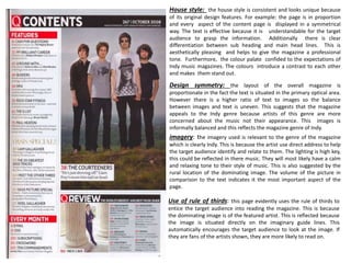
For the indie magazine, the summary notes its symmetrical design features clear headings, a professional tone through color palette and consistent house style. Imagery uses a calm rural setting reflecting the likely relaxing music style.
For the rock magazine, it has a less consistent untidy style breaking conventions to reflect the genre. Bold yellow color and mixed fonts add vibrancy. Imagery enhances the band through makeup, costumes and mixed lighting, promoting the traditional rock feel.


![As media analysis nme front cover [autosaved]](https://cdn.slidesharecdn.com/ss_thumbnails/asmediaanalysisnmefrontcoverautosaved-130317104942-phpapp01-thumbnail.jpg?width=640&height=640&fit=bounds)


