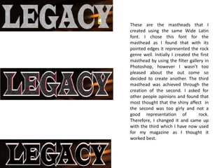
1. These are the mastheads that I
created using the same Wide Latin
font. I chose this font for the
masthead as I found that with its
pointed edges it represented the rock
genre well. Initially I created the first
masthead by using the filter gallery in
Photoshop, however I wasn’t too
pleased about the out come so
decided to create another. The third
masthead was achieved through the
creation of the second. I asked for
other people opinions and found that
most thought that the shiny affect in
the second was too girly and not a
good representation of
rock.
Therefore, I changed it and came up
with the third which I have now used
for my magazine as I thought it
worked best.