EPANDING THE CONTENT OF AN OUTLINE using notes.pptx
Radial analysis 2000
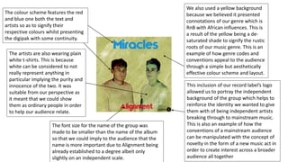
1. The colour scheme features the red
and blue one both the text and
artists so as to signify their
respective colours whilst presenting
the digipak with some continuity.
This inclusion of our record label’s logo
allowed us to portray the independent
background of the group which helps to
reinforce the identity we wanted to give
them with of being independent artists
breaking through to mainstream music.
This is also an example of how the
conventions of a mainstream audience
can be manipulated with the concept of
novelty in the form of a new music act in
order to create interest across a broader
audience all together
The font size for the name of the group was
made to be smaller than the name of the album
so that we could imply to the audience that the
name is more important due to Alignment being
already established to a degree albeit only
slightly on an independent scale.
We also used a yellow background
because we believed it presented
connotations of our genre which is
RnB with African influences. This is
a result of the yellow being a de-
saturated shade to signify the rustic
roots of our music genre. This is an
example of how genre codes and
conventions appeal to the audience
through a simple but aesthetically
effective colour scheme and layout.
The artists are also wearing plain
white t-shirts. This is because
white can be considered to not
really represent anything in
particular implying the purity and
innocence of the two. It was
suitable from our perspective as
it meant that we could show
them as ordinary people in order
to help our audience relate.
2. We featured the institutional information
on the back of the album so that we could
maintain a professional aesthetic to the
digipak. This also included the extended
version of the record label logo so that the
audience would fully understand the look
of the label in relation to the group and its
independent status. It therefore might
appeal to the audience because of the idea
of it being indie as well as a niche genre.
This would typically appeal to someone
who perhaps identifies as a ‘hipster’ due to
the music’s relatively unknown status at
this point.
The yellow background was retained to
act as a continuation from the front
cover to the back cover since it was a
simple convention of digipaks to follow.
Again this follows what we believe to be
the genre conventions and so would
likely appeal to the target audience
because of how it continues from the
front cover of the album.
Since there isn’t anything
else significant on the back
we thought that the track
titles needed to be simple
in order to stand out from
the background. Also since
it doesn’t directly relate to
one or both of the artists
we kept it black instead of
red or blue.
3. The font used for the inner sleeve was
different to that of the outer of the
album due to the original font being to
overpowering initially. Therefore we
decided to use something more subtle in
order not to detract from the
background image which is an extended
version of the front cover. We also
thought including the lyrics to the title
track would be effective seeing as this is
a convention of some digipaks that have
been produced.
The second inner sleeve
features the other half the
front image as well as the
casing for the CD. This is all we
felt was required because most
digipaks have a conventional
and simple disc casing.
For the spine we again followed the convention
of most digipaks as well as other types of media
like DVDs and video games. This was by having
the name of the album as well as the record
label as they are who produced it.