
Recommended
More Related Content
What's hot
What's hot (20)
Viewers also liked
Viewers also liked (19)
Similar to Preliminary Planning and Research
Similar to Preliminary Planning and Research (20)
Recently uploaded
Recently uploaded (20)
Preliminary Planning and Research
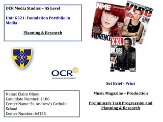
- 1. OCR Media Studies – AS Level Unit G321: Foundation Portfolio in Media Planning & Research Name: Claire Olney Candidate Number: 1186 Center Name: St. Andrew’s Catholic School Center Number: 64135 Set Brief - Print Music Magazine – Production Preliminary Task Progression and Planning & Research
- 2. Section 1) – Preliminary Task
- 3. Preliminary Task Progression– Evidence Front Cover Step-by-step Here is the template that I have used with a blue faded gradient and a blue and yellow border which is brand identity. I then inserted the St Andrew’s logo overlappin g the border, which is also a form of brand identity.
- 4. Here, I have created the masthead in my desired font which fits across the page in the way I want it to. After doing this, I inserted my barcode at the bottom right corner of the front cover.
- 5. Underneath the barcode I then placed in the magazine website link using the text tool and made it in my desired font and size. I then placed in the social media logos to represent the networks that the school magazine is active on.
- 6. This screenshot shows that I have created my strapline under my masthead, and I have inserted a smaller St Andrew’s logo along with the date and price of the magazine. I also placed a smaller version of the masthead down the side of the barcode. After this. I put a white box around the barcode and the content around it, to separate it from the image etc. I also inserted my main image after cropping out the background etc. and I have made it the right size.
- 7. After the main image had been inserted. I placed my main headline over the top of it in my desired font. The colours used for it are another form of brand identity for the magazine. I then created my layers for the puff promotion and put them all together in the circle. The yellow stands out and can also be associated with St Andrew’s.
- 8. I then made my first smaller cover line which reflects the brand identity through the colours. I made my second cover line which fits in line with the first cover line, using the same colours again so it is consistent.
- 9. The third cover line was then inserted in line with the others in the same colours. I lined them all up using the gridlines. My fourth and final cover line was inserted onto the other side of the main image, again in the desired colour. I placed it here because it fills up the blank space on the right side of the page.
- 10. After I had inserted all my cover lines, I decided to place in some images that related to some of the cover lines. This makes the page look more interesting and it gives more of an insight to the reader about what the article/interview is about and it may make them more familiar of what the article is based on, especially the logo for ‘Safe Drive Stay Alive’. Final Design
- 11. Preliminary Task Progression– Evidence Contents Page Step-by-step This is the layout of the page that I started with for my contents page, with the same border along the top and a yellow faded gradient. I also inserted some faint lines to separate the page up, which I replicated from my magazine of inspiration (Q). I then inserted my masthead, strapline and title ‘CONTENTS’ for my contents page, the layout was again, inspired by Q.
- 12. Here, I have then inserted the page number, website link and date along the bottom. I have also inserted a smaller version of the magazine logo and masthead for brand identity. I then made a blue circle with the shape tool and inserted the issue number which was inspired by my magazine of inspiration (Q).
- 13. I then made a box and called it features which is a header for all of the featured stories in the magazine. I also created boxes for each of the page numbers with them inside it. After this, I placed in the featured story titles which appear on the front cover of the magazine. They have been written in the same style as Q magazine.
- 14. Then, I wrote out the sublines and placed them underneath the titles in a smaller, lighter font so the titles stand out more. I also added an ‘A’ for ASPIRE which is a form of brand identity. After this, I inserted my editorial and put it in place using the pen tool. I also placed my editorial image of myself in as well as the drop capital.
- 15. In my editorial, I inserted my handwritten signature above my name, like a typical editorial, and I placed in a link to contact the editor as well as social media logos for contact. Then, I inserted my images for the contents page where I wanted them and in the right size. I made sure they were all lined up using the gridlines from the ruler tool.
- 16. Here, I have placed in boxes for the page numbers to go in, which link with the featured stories. They are a form of brand identity because they are the St Andrew’s blue. Inside the boxes, I inserted the page numbers in the boxes to link the images to the featured stories.
- 17. Finally, I have screenshotted my front cover and placed it on the contents page to represent which issue it is. I have added a shadow behind it to help it stand out more. I will need to update the screenshot if I make any alterations to my front cover. Final Design
- 18. Section 2) – Log Book
- 19. Music Magazine – Genre Research • Music magazines are usually dedicated to a particular genre of music. For example, Kerrang is a rock music magazine. They also celebrate other cultures of music along with genres. • Typically, they contain things such as news of new music, interviews with different artists and bands, photos, reviews of different songs/albums or concerts. • In the UK, music magazines used to be very popular to buy, but since the internet has grown so much, less people buy them in the present day because people can read up on music news etc. on the internet for free. • The most popular British music magazines are New Musical Express (NME), Q, and Kerrang. • The longest running music magazine of the UK is BMG (Banjo, Mandolin, and Guitar) which was founded in 1993. The magazine itself is mainly focused on musical instruments of all kinds and promoting them as opposed to music in general. http://www.bmgmagazine.net/ http://www.qthemusic.com/ https://en.wikipedia.org/wiki/Mu sic_magazine Sourced from:
- 20. Established Magazine for my Research Masthead Main Headline Cover lines Barcode/Price /Date/Issue Main Image Convergence Puff Promotion Cover lines Promotion
- 21. Magazine Conventions • Masthead – The masthead is bold and quite large so it stands out quite clearly against the background and the rest of the magazine conventions. It is also a different colour to the rest of the text on the front cover which creates an effective contrast. • Barcode – The barcode is displayed in the bottom left hand corner, making it more discrete; therefore making the main image stand out even more. Also, the barcode has a website along side it to allow readers easy access to the website. • Main Image – The main image is the underlay for all of the cover lines etc. but it overlaps the masthead and the cover line above it ‘The Stories of the Year’. The fact that the cover lines overlap and surround the main image makes him stand out even more. Extra emphasis is added to his face in particular because the cover line on his body written in red stands out and it leaves a lighter space around for his face. • Puff Promotion – The puff promotion in a red circle not only adds to the brand identity in terms of colour scheme, but it ties in well with the masthead because it nearly matches the size of it and it is white writing on a red background, therefore helping it to stand out more. The fact that it has been created in the same format as the masthead highlights its importance on the page. • Main Headline – The main headline is a bit larger than the other cover lines on the page and it has also been placed across the main image which puts further emphasis to it. The fact that his name has been written in red illustrates its importance on the page and it is also another example of brand identity. • Cover Lines – The cover lines have been neatly organised around the page. They are written in white which stands out over the underlapping layers. Also, the white is a form of brand identity as the masthead is written in white. The names of the featured people in the magazine have been written in a more bold, large size of text so they stand out more and draw people in to buy the magazine.
- 22. Target Audience – Katz, Maslow, Hartley and/or socio-economic needs I think that the target age for Q magazine is aimed at people aged from about 16-35 because of the advertisements and artists/bands that are featured inside. The target gender is mainly males because of the layout and the way that it is presented as it looks quite plain compared with a magazine targeted more to females. According to Katz’ theory, Q magazine attracts an audience through diversion. This means that the readers are able to immerse themselves within the content of the stories and interviews in the magazine, and Q magazine contains many interviews and stories to allow the reader to do that with ease. Also, from Katz’ theory, Q magazine will inform and educate the reader within the magazine which will attract the readers who are always wanting to gain knowledge of the things that they find interesting in the magazine. The audience of Q magazine could be classed as ‘social climbers’ in terms of Maslow’s Hierarchy of Needs because these kinds of people care about how they appear to other people socially so by reading a magazine such as Q magazine, they can boost their social status as it is such a popular magazine. In terms of socio- economic needs, the readers of Q magazine would probably mainly fall into the category ‘B’ which includes middle management, teachers, creative and media people e.g. graphic designers etc. I think this because of the fact that Q is a music magazine, music is a creative topic so people who have creative careers would probably find this kind of magazine very interesting to read. I also think that the students in the ‘E’ category would like this magazine since it is aimed at younger people. However, I do think that people in the other categories in between (C1, C2, D) would also have an interest in a casual music magazine like this that covers quite a wide range of genres. Potentially, some people in the ‘A’ category (higher management, bankers, lawyers, doctors and other professionals) may find some interest in this magazine due to the fact that it is quite formal and it covers such a variety of genres, but I don’t believe that people who fall into this category would be the main focus. What is the USP of this magazine? From the research completed into this media product, I think the USP is the promotion section which says ‘Essential! 50 Albums of 2014 – Your definitive must-hear list’. The reason I think this because of the language they have used to grab the reader’s attention in the first place. By using ‘Essential!’ to describe the 50 albums of 2014 which are listed inside the magazine, it makes reader’s feel like they need to buy it and read up on them to keep with the musical trends. Also, it is written in a bold, red circle which is very eye-catching for people looking at the magazine. I also think that where it says ‘Awards Special Edition’ underneath the masthead is another USP for this particular copy because it entices people to buy it since it is a one-of-a-kind edition of the magazine, so it is rare and there are no others like it.
- 23. Publisher Research • Bauer – “We think popular” slogan: This slogan connotes to pop music. Therefore meaning that people who like pop music will be drawn in to view the content displayed on their website as well as other things they have to offer. • Q Magazine: Bauer Media are the publishers of Q Magazine. In 2012, readership surveys estimated that it was read by 369,000 adults, which is 0.7% of the adult population. • Retail Outlets: Q Magazine is available in most shops that most other magazines are sold in, e.g. Supermarkets. Readership http://www.slideshare.net/jamiekessel10/media- publisher-research http://www.bauer.co.uk/we-think-popular
- 25. Conventions of a Music Magazine Masthead Straplin e Promotion/ Competition Main Image Main Headline Cover Lines Cover Lines Barcode/Price /Date/Issue Convergenc e
- 26. Magazine Conventions • Masthead – The masthead has been placed in the top left corner which draws attention to it whilst putting emphasis on the main image. It is in a bold, red font which is brand identity in terms of the red and it also stands out to the reader. • Barcode – The barcode is in the bottom right corner of the page in a white box which not only fits in with the black and white colour scheme (with the red writing), it is sectioned away so it doesn’t interfere with the main image. • Main Image – The main image is in black and white which stands out with the red writing but it is also a balance because it helps the red writing to stand out even more. Also, the cover lines surround his face and shoulders which put more emphasis on him and make him seem lighter, so his features stand out, thus making it more engaging for the reader. • Puff Promotion – The puff promotion is in a yellow circle which is a colour that has not been used on the page other than that so it stands out and it also adds importance to it because it is the only thing of that colour on the front cover. • Main Headline – The main headline has been neatly placed in the bottom left corner so it doesn’t cover the image to much and it looks very professional. The red over the black in the photo looks bold and it is a quote from Joe Strummer so it adds importance to it as it is in the same colour as the masthead. • Cover Lines – The cover lines have been placed tidily on the right side of the page and none of them overlap the main image but they stand out over the lighter parts of the background in the photo. The parts of importance in the cover lines have been written in a bold red font to put emphasis on them as they are the same colour as the masthead and it is also a form of brand identity.
- 27. Target Audience – Katz, Maslow, Hartley and/or socio-economic needs The target audience of NME magazine can be denoted as predominantly male because of the colours and layout of the magazine in general, however there will be females who read it. It is difficult to judge the target age by the front cover of this particular issue due to the fact that the main image is of an artist from a long time ago who is no longer alive, however, NME magazine’s main target audience is mainly for people in their late teens to mid thirties roughly. From looking at Katz’ Uses & Gratifications theory, I think that NME magazine attracts a target audience by informing and educating them with the content inside the magazine in which the reader consumes. Therefore, people who like to learn things from the magazines that they read will be the target audience for this particular magazine. The audience of NME magazine could be considered as ‘social climbers’ according to Maslow’s Hierarchy of Needs because they are conscious of their social status judging by what magazine they read, and NME is a popular magazine so this would be a good magazine for them to read. In terms of socio-economic needs, I think that NME would aim their magazine at a range of people in the socio-economic needs categories. I think the main ones would be ‘B’ which includes middle management, teachers, creative and media people e.g. graphic designers etc. I think this more because of the creative people are more so the type of people to read a magazine like this, as it is quite a creative magazine. I also think it could focus on people in the ‘E’ category because this includes people who are unemployed, students, pensioners and casual workers. I don’t think it would be suitable for pensioners but I definitely think it would be very well-suited to students because it appears to be aimed more for younger people through the content and layout. I do believe that NME magazine could be aimed for the categories between ‘B’ and ‘E’ (C1, C2, D) but not really ‘A’ because that category includes higher management, bankers, lawyers, doctors and other professionals, so I don’t really think they would be that interested in this type of magazine personally. What is the USP of this magazine? I think that the USP of this magazine is the fact that all of the important information is written in a bold, red font on the black and white background so it grabs the attention of the reader immediately. Also, the competition is on a yellow sticker which also stands out as an important piece of information.
- 28. Publisher Research • IPC Media is the publisher of NME Magazine. • NME is published under IPC’s ‘INSPIRE’ division. • They tend to focus on a male audience because it is mainly males who read NME Magazine as opposed to females. • 74% of the readers are male and 26% are female. The median age of readers is 23. The magazine’s readership is 325,000. • NME Magazine is sold in most shops that magazines are sold in such as Supermarkets, Newsagents etc. • IPC Media’s slogan is ‘Thirst for music’. The connotations of this are almost as if they need music for survival as hydration is a necessity . An alternative meaning of this slogan is that they are always open to new music so there is no particular genre that they are focused on.