9953330565 Low Rate Call Girls In Rohini Delhi NCR
Preliminary task and planning & research Joe Dolan
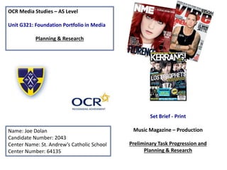
1. OCR Media Studies – AS Level
Unit G321: Foundation Portfolio in Media
Planning & Research
Name: Joe Dolan
Candidate Number: 2043
Center Name: St. Andrew’s Catholic School
Center Number: 64135
Set Brief - Print
Music Magazine – Production
Preliminary Task Progression and
Planning & Research
4. Firstly I set margins around my page
to give it some structure and it
allowed me to align text and images
more accurately
Giving it brand identity was
my next step e.g. colours
and symbols/logo
Inserting the Masthead font
was the next step
I then added the headline with
the subline and gave it some
social media links for example
Facebook & Twitter. I also
included the barcode and issue
price and linked the layers
together.
I then added in some of the
main headlines
When I added the main photo I
came to the conclusion the
original layout of the headings
was going to cause them to
overlap and make it look
unprofessional and unclear.
1. 2. 3.
6.5.4.
5. Decision at the End
I decided to fill in the dead space with a
bottom footer which filled in the space
and made use of the space
6. Final Front Cover Design
From my original feedback I
made my front cover more
accurate by using the margins
therefore making it more
professional as before it seemed
a lot of my text was not aligned
correctly. Also I linked some of
the layers which made it easier
to make alterations to my work
as I wouldn’t have to constantly
modify my layout.
8. Firstly I inserted margins to align my
work Then I added the social media
links, the brand identity for the
school from my previous front
cover and also St. Andrews
logo’s across the page.
I then focused on the editorial side
of the contents page and the
features surrounding an editorial
section e.g. the signature of which I
wrote and scanned in and also my
picture of which I got off the St.
Andrews website.
After the last process I included the main
picture of the main headline and did all the
headlines and caption included. I also
included a form of advertisement for a school
quiz club.
I then created the mask head and
finished all of my headings. I chose
this masthead because it is bold and is
clear to the reader.
1.
5.
4.
3.2.
11. Music Magazine – Genre research
• Production Process
• Date of Publication – The first thing that is done it to set the date the magazine will be published to the general
public. This will help with setting a schedule for the development.
• Managing the Schedule – You must have enough space in the schedule to fix any mistakes before the deadline.
• Editorial and Budgetary Decision – It is the editorial decisions which involved the content that is covered in the
next issue of the magazine. Once they have made the decisions they look at how much money is available for
them and how much should be spent in the production of the magazine.
• Content Acquisition – Probably the most important step because without content there would be no magazine.
There is in-house staff writers for the magazine and external writers that write about a specialist nature. There is
also artwork and illustrations and pictures in the magazine.
• Sub-Editing – This focuses on the quality control, it involves checking the accuracy of the facts, making sure words
are spelt correctly, property grammar and punctuation are used, make sure that the articles follow the house style
and work on the page layout.
• Page Layout – This person will correctly lay the articles out to put it together as a magazine using powerful
programs such as Desktop Publishing (DTP) or InDesign or Pagemaker to do this. The advertisers are also placed
into the content.
• Proof Reading – The editorial department will print a hardcopy of the magazine in order to read through it and to
find any mistakes. Any mistake that is spotted is quickly corrected, the editorial keeps proof reading until all the
team is satisfied there is no mistakes.
• Printing – The entire magazine is send to the printer, Pre-Press’ are printed to check all the colours and layout is
fine before printing hundreds or thousands of copies.
• Distribution – It is the final stage where the company packs the magazines and go to a warehouse to go to the
general public.
16 XXL 140.000 IDR
Rank Name Circulation Publisher
12. Established Magazine for my Research
The white background makes the
main picture very clear and helps
Robbie Williams stand out. The
Mast head is bright head which helps
it stand out from the bright
background.
The lighting is very high key of
which makes Robbie Williams hair
stand out and shows the font
standing out in correlation with
his hair. He is in front off
every layer apart from
his name that shows how
he is important and
stands out as opposed to
everything else.
The layout is very confusing as
there is a lot going on
therefore it makes it hard for
the main Heading to stand out
as all the headings are bright
and bold. It is represented in a
sarcastic cartoon theme
which suggests the story
surrounding him is sarcastic
and more comedy focused as
the picture is sardonic
expression.
The font used is bright,
bold and colourful but isn't
the same all over as it
changes in colour and size
which makes it
unprofessional but
acceptable as it is a ironic
front headline.
The costume used matches the colour
for some of the font colour used and
also the magazine brand identity which
is a good choice but not much of it is
being shown to the reader.
The biggest verbal code on this page is
‘Robbie’, which connotes the issue’s
main headline is going to be revolved
around him and some sort of ironic
saying. The inclusion of his name also
‘signifies’ (De Saussure) the ‘star appeal’
(Richard Dyer) he possesses.
Date/Issue/Price is shown next to the
barcode of which is placed in the bottom left
corner of the cover. This way it is completely
out of the way so it does not disrupt the
main image on the cover.
Katz inform and educate use of the EXCLUSIVE
allowing the audience to be aware off how this
magazine is a one off and shows Robbie Williams
as a star promoting the star appeal.
13. The target audience who purchase Q are stereotypically males with 68% of the consumers showing an interest in the
rock cultured magazine. The consumers aged 15-25 are from the socio-economic category A, B, C1 due to the fact that
the magazine is released on a monthly basis for £3.50 which would suggest a price some would imply as expensive and
to expensive intrinsic to their class. Most of Q’s magazine would have a ‘personal relationship’ (Theorist) due to the
artists releasing their personal statements causing them to become closer to the artist's and understand their
background rather than their musical information and career. They can also understand the artists fashion sense and be
more prone to buying clothes if their favourite artist is shown modelling clothes that look good on him/her. Q also
provides a variety of rock cultured music therefore incorporates the Maslow theory for example aesthetic needs that
helps the audience appreciate the genre they are more knowledgeable of as people are willing to purchase something
they know involves there type of music. I believe that Q magazine does not have a specific target audience and is
targeted for people of all ages including students and parents. Q Magazine may also target ‘Survivors’ (Maslow) who
wish to have security and a routine in their magazine and the content it will, consistently provide. The audience most
likely reader Q magazine for ‘diversion’ or to ‘inform and educate’ (Katz)
From the research completed into this media product, I think the USP is the fact that this issue of Q magazine is an
exclusive, wide targeted audience magazine. The people who are avid readers of Q magazine would be more tempted
to buy the magazine as it’s exclusive and has a great title and rhetorical question of which people wish to find the
answer too. The main image’s sarcasm may also make readers wish to see why he is showing that emotion and what his
quotes are about.
14. Publisher research
http://www.bauermedia.co.uk/brands/q
Q is published by Bauer Media, a media company that manages a portfolio of magazines,
digital products, radio and TV stations in local markets across the world.
Q mainly focuses on up and coming/well known rock and roll artists . Therefore their target
audience are people who enjoy reading about rock music. Readers are mainly teens/young
adults aged 15-25, and have enough money to buy the magazine each month.
Q magazine has a circulation of 48,353 copies distributed in January-July 2014. The
magazine also has 339,000 readers.
Q’s audience is younger and more affluent than any other music monthly. 97% of readers
rate Q as a quality magazine. In research it outperforms competitors on measures such as
best interviews, writing and awards winning photography.
15. Conventions of XXL
Cover lines- There are few cover
lines of which suggests that there
is stories within but by stating only
the name of the artists it build
suspense and makes the reader
want to purchase so they can find
out about these artists.
Masthead- The mast head is bold
and the colours work well in
standing out together but it is
slightly covered by the main image
suggesting this artist is more
important than the mask head.
Barcode- Allows the reader to
understand this is a business which
makes money out of magazines
therefore they are going to need to
purchase before they read.
Font- The font throughout the
Page is kept the same colour and
outlined on the headline but it
changes style when the artists
names are mentioned and
decreased in size.
Main image: The main image is clear
and stands out the most. It portrays
the artists fashion very well and makes
it clear to the audience his style.
Lighting-The lighting is dark and low
key of which portrays a night scene
and can show how the hip hop culture
revolves in the darkness.
Also having a popular male artists
helps to involve both male and female
fans.
Strapline- Within this magazine
the strapline is very subtle as the
font size is much smaller than the
Masthead and is located in a
position that is hard for the
reader to see.
Star Appeal- Kanye West is
shown as the star appeal in this
magazine as he is advertising his
fashion and links well with the
cover line towards him. The
colour scheme is also based
around him as well.
Issue/Date/Price- The issue, date and price is
presented inside the barcode. It gives the month
and year of October 2007 and states the issue as
96 and the price is presented there as well.
16. Target Audience and/or socio-economic needs
The target audience for name of magazine magazine can be denoted as young males from age 15-30 but can
also involve females just not as popular as the male interest in hip hop. This is for the E category as the
individual readers for this category would be younger and it is released 6 times per year therefore would be a
non frequent purchase of $5.00 which is above average for a magazine but its infrequent release settles the
overall cost.
Readers of XXL would have a personal relationship with the artists due to their age as most hip hop artists are
young therefore it can help the individual readers relate to the artists as they can understand at that age and
class. The reader could experience diversion as the fashion can attract the reader to change their approach to
fashion as they are fond of what their idol is wearing and chooses to be like them.
Katz theory can be used within this XXL Cover for example the audience is able to identify a role model that has
similar traits for example the fashion that Kanye is wearing within the magazine. This therefore helps the
audience aspire to be someone they see on the magazine e.g. Kanye West because they think he looks like
someone people look up too.
Maslow Theory- Can be linked with Esteem needs as if they are struggling with self confidence they are able to
be motivated by an idol such as Kanye West who they can look up too and more importantly achieve a role
model status.
From the research completed into this media product, I think the USP is that XXL magazine directors are able to
get in contact with some of the top celebrity artists therefore making it exclusive as they are able to provide
the reader with information towards the artists that they couldn’t get from other magazines. Also using an
artist on the front cover who is in the top charts makes it more appealing to the readers as they know they are
good at what they do and they want to know how they got there and what they are working on next. Stars
represent shared cultural values and attitudes, and promote a certain ideology of which in this XXL front cover
is ‘A decade of dominance’. Audience interest in the values promoted their 'star quality', and it is through
conveying these statements outside music that performers help generate a good perspective from the
audience they are performing to. Kanye’s star appeal initiate’s a fashion trend, with legions of fans copying his
hairstyle and vintage clothing approach.
17. Publisher research
XXL is an American hip hop website, published by Townsquare Media, founded in
1997.
• Then, visit their website and deconstruct the information you can find about the
target readership in terms of socio-economic needs, circulation etc.
• XXL mission is to take a mature real and intelligent approach to hip hop music. XXL
keeps up with hip hops energy and targets the people that live for urban music.
The general target audience for XXL magazine is 78% male readers, with the
median age of 27, and 44.7% college buyers, and 67% African Americans. Priced at
$5.99 XXL is the number 1 selling magazine on the newsstand which outsells
magazines like Rolling Stone, Vibe, and spin. The readers of XXL purvey hip hop
culture; consume music, and fashion and lifestyle on a level that defines logic. The
readers are either in clubs, online, onstage, and at shops (places they can gain or
access music from). XXL readers helped the magazine to become NO.1 most
influential brand in rap media. XXL is no.1 selling ABC audited music publication
sold worldwide and is the hip hops media brand.
http://XXL.com