
Recommended
Recommended
More Related Content
What's hot
What's hot (19)
Viewers also liked
Viewers also liked (13)
Similar to Preliminary Task and Planning & Research
Similar to Preliminary Task and Planning & Research (20)
More from Charliebatcheler456
Recently uploaded
Recently uploaded (20)
Preliminary Task and Planning & Research
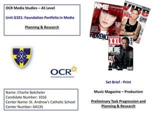
- 1. OCR Media Studies – AS Level Unit G321: Foundation Portfolio in Media Planning & Research Name: Charlie Batcheler Candidate Number: 1016 Center Name: St. Andrew’s Catholic School Center Number: 64135 Set Brief - Print Music Magazine – Production Preliminary Task Progression and Planning & Research
- 2. Section 1) – Preliminary Task
- 3. Preliminary Task Progression– Evidence Front Cover Step-by-step Step 1) I inserted some shapes to create a banner, then downloaded a font called Onyx from DaFont.com and used that to create the masthead, I used a blue gradient for the background Step 2) After this I inserted a barcode as is required for the sale of the magazine making it a staple convention
- 4. Step 3) I used TJ as the model for my front cover, I adjusted the hue and saturation of the image as it was quite dark and oddly coloured to begin with. Step 4) Here I’ve started making cover stories and presented them in the masthead font style in an alternative colour to the masthead to create a sense of identity for the brand, since St Andrews colours are already yellow and navy these are the colours I decided to use.
- 5. Step 5) Here I’ve added another cover story to fill some space on the page Step 6) Here I’ve made the placeholder for a puff promotion, a fairly common convention that advertises the chance to enter a competition, or other promotional event.
- 6. Step 7) Here I’ve entered text outlining the prize involved with the puff promotion, as well as drawing attention to it and explaining that there’s a chance to win. Often music magazines do this to promote a festivel or album, and my magazines of inspiration; NME and Kerrang do it quite often as it also works as an incentive to purchase the magazine to potential buyers viewing it in shops.
- 7. Step 8) Here I’ve made the placeholder for the main headline by inserting some shapes, in the house colour of yellow, which I saved as a swatch to improve workflow. Step 9) Ive completed the main headlines and added the verbal code ‘EXCLUSIVE’ as an incentive to read on or to buy the magazine. I also added another shape to act as a placeholder.
- 8. Step 10) Now I have incorporated a web address and have created a place holder for the barcode and issue information. Step 11) Here I have added the appropriate information as well as social media icons to show the brands online presence.
- 9. Finished cover Masthead The stroke effect makes it very visually impacting, drawing attention to other areas of the page, it also brings it out against a blue background and reinforces brand identity Cover stories I made these in the house yellow so that they were an alternative colour to the masthead, but still in the same font. The letters have been spaced slightly so that they are more readable, I made it so that the descriptions were all on the same line so they were coherent and purposeful Main headline These where typed onto placeholders so that they are different to cover stories, and more recognizable visually. On the ‘Sixth Form Style’ convention I have used the text edit tool to make a wave effect, then made a place holder for ‘With TJ Salango’ so it is clearly obvious Puff Promotion This was placed on a shape so it is obvious and occupies space nicely, its functional purposeful and I ensured that the text within the shape was on the same line and therefore easily readable and understandable, this is a good marketing technique and many magazines do it. Barcode This is a necessary convention for all magazines as it needs to show its publisher, release date and social media links as well as the price and the actual barcode.
- 10. Preliminary Task Progression– Evidence Contents Page Step-by-step Step 1) I started by creating a contents page header in the masthead font style, to reinforce the brand identity, as well as incorporating the schools logo, I also created two shapes as placeholders Step 2) I added the masthead to keep up brand awareness and to create routine, I also added a placeholder for the exclusive cover story as well as making the gap between the two shapes bigger.
- 11. Step 3) Here I’ve started adding cover stories Step 4) I’ve expanded on the cover stories to give a brief description of what they’re about, I’ve also written ‘EXCLUSIVE’ on its place holder
- 12. Step 5) Ive added a ‘Sections’ and ‘Features’ so that one can get an overview of what’s in the magazine, and added a shape to put the main headline story on. Step 6) I made a page number next to the masthead at the bottom, a convention that most magazines conform to.
- 13. Step 7) Here I have written and implemented an editorial, a common convention in the first issues of magazines alongside an editor photo and information, as well as a drop capital in the masthead font style. Step 8) I added the editors signature alongside his information and the editorial.
- 14. Step 9) For this step I filled the empty space with relevant stuff from every story and the page the story is on. Step 10) Similarly to step 9 I developed on the description of a cover story and added a photo to use up dead space
- 15. Section 2) – Log Book
- 16. Music Magazine – Genre research • Music Magazines have been prolific in England and English culture since the 1950’s. Famous Magazine NME began being printed in 1952 and is one of the first modern music magazines. • Before this there was a publication called Melody Maker, which began being printed in 1926, and rivaled NME for some time, before being absorbed by it in 2001 due to sales falling to websites and blogs that presented information freely instead of having to pay subscription. • Nowadays the top selling music magazine in the UK is Q with 158,271 subscriptions nationwide. • There were many more magazines than there are nowadays, but many folded in the 90’s due to the rise of the internet. • Top selling music magazines in the UK include: Mojo, The fly, Uncut, Kerrang, Classic Rock, Metal Hammer, Mixmag and Word.
- 17. Established Magazine for my Research Headline grabs peoples attention and helps the flow of the cover. It also gives information on the main story within the magazine, and reinforces the star appeal by giving more information on the involvement of the celebrity in that issue Cover Lines These can also work as incentives , as they give the reader an idea of the content of the magazine, and what it has to offer, without having to look in it. Incentive Gives people an overall reason to buy the magazine, if they weren’t planning to already Masthead Big and obvious, it lets the reader know what the magazine is, and it also helps the aesthetic flow of the magazine. Main Image This creates star appeal (David Bowie), which is a concept [theorized by Richard Dyer} which suggests that people are more likely to notice an buy a magazine if it has a recognizable, likeable, well known celebrity on the cover. It also implies that there is content within the magazine about the individual, meaning fans are more likely to buy it. Strapline Much like the masthead, it helps the magazine create an identity , but also helps the overall aesthetic and flow of the cover, as it draws attention away from the masthead, which grabs the attention initially, and then leads the readers attention towards the cover lines Barcode Although aesthetically unpleasant it is necessary for the sale of the magazine.
- 18. Target Audience – Katz, Maslow, Hartley and/or socio-economic needs Q magazine is mostly going to appeal to young, white males, as it generally covers rock and alternative music – a genre with a predominantly white male following; however the style of the magazine is more high brow than. They are most likely employed as a subscription is expensive and a luxury. According to Q’s readership profile, 71.8% of their readership is in the A, B or C1 category on the socio economic ladder. Source: http://www.bauermedia.co.uk/uploads/q.pdf What is the USP of this magazine? From the research I have done on this magazine I can see hat the USP is the incentive the magazine gives you to buy it, on the one in the previous slide this was the red circle that claimed there were 124 album reviews in the magazine making people want to buy it. There are other incentives to get people to buy it too, for example on the left hand side of the cover, there is a box that says ‘Rare interview and pictures’Also making people want to get it for that feature.
- 19. Publisher research Key areas to focus on: • Bauer – “We think popular” slogan – Connotations? • Readership profile of the magazine – Socio-economic needs, circulation figures etc. • Retail outlets the magazine is available in. - Monthly global print audience of over 120 m - Median age of 34 - ABC 1 profile is 71.8% - 70% of readers are in employment ‘We Think Popular’ This slogan suggests that Bauer media are good at appealing to the mainstream, and that whatever they make is popular. It also implies that bauer has somewhat of a monopoly over
- 20. Conventions of a Music Magazine Cover lines As well as obviously giving insight to stories within the magazine, they also work as an incentive because of this Masthead Large and obvious, draws attention to the magazine, in Kerrang’s case it is in a jagged and punky font, in order to suite the magazines aesthetic. Cover story Grabs attention and helps the aesthetic flow of the page, it also communicates the information of the story within Main Image Creates star appeal, also appeals to social climbers and explorers, social climbers as they are inspired to buy the magazine as there is a star on the cover, explorers as Black veil brides are known for being alternative Incentives These give the reader an incentive to buy the magazine, Kerrang, unlike others offers posters of bands featured in the magazine Barcode Aesthetically unpleasing but needed