FULL ENJOY - 9953040155 Call Girls in Laxmi Nagar | Delhi
Magazine pitch
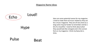
1. Magazine Name Ideas
Echo
Hype
Pulse
Loud!
Beat
Here are some potential names for my magazine.
I tried to make them all music related as they are
for a music magazine. They are all very short as a
long name may be harder to remember and be a
bit of a mouthful. I need to think about what
they would look like enlarged and in the correct
font on my magazine. I think my favourite is
Echo.
2. Echo
I have decided to call my magazine Echo. It is a music magazine which focuses mainly on pop music and popular artists in this genre. The
main target audience for my magazine would be teenagers to young adults (16-21). This is because my magazine’s content will talk a lot
about current and younger artists, that older people may not be familiar with, therefore a lot of these listeners may be students and
would be interested in social media and going out with friends in their spare time. It will likely be targeted at females because a lot of
mainstream artists are women themselves, for example Little Mix are a popular girl band that are regularly in the charts and their songs
will likely relate to women the most. Similar magazines could include Billboard and Q Magazine. These would be just a couple of my main
competition, as they both include a lot of pop music and popular artists unlike Kerrang which focuses mainly on rock/alternative music.
3. Here, there are examples of double page spreads from Billboard and Q Magazine. Although their
layouts are slightly different, they have similar conventions. For example they all have a large image
of the artists that take up most, if not, a full page. This quickly implies that the artists are important
and shows that the article is going to be focused on them. All articles have quite a lot of writing,
showing that this will be a detailed interview with the artist, or possibly a review of the artist’s
album. They all have pull quotes to draw the readers, although they are placed in different places
on the page. Q Magazine and one of the Billboard articles have a heading, whereas the other
Billboard does not. However, it includes other titles such as ‘Ariana’s Favourite Scary Movies’ and
‘Divas of Influence’ on the page. This could show that it is quite a fun interview. Billboard does not
have drop caps like Q, making Q look a lot more traditional. On the Nicki Minaj article, there are
small paragraphs with dark bold writing above them. This means it could be in interview, with the
questions in bold and the answers in regular writing.
Similar Products
4. Audience Research
This is Jake McMann. He is a 19 year old male and is a
student at Sunderland College. He enjoys going out and
seeing friends, and meeting new people. He has a part time
job and lives in his own house. He doesn’t read music
magazines but he loves listening to music, he mostly enjoys
pop music and listens to the charts. Some of his favourite
artists include Beyoncé, Adele and Lana Del Rey. I think Jake
would be part of my target audience for my magazine
because of his music preferences and his age. If I were to
base my magazine on him I would make sure it is not too
expensive as he lives independently and may not have lots
of money to spend on magazines.
The only original image I will be using for my double page
spread will be a picture of Jake to portray him as the author of
the article. I will take my images at Sunderland College in the
TV Studio to make sure my image looks professional. My image
will be a medium close up, so the clothing will not be a big
issue.
Photoshoot Planning
5. Flat Plans and Rationales
This is the flat plan for my double page spread. I have created this to give myself an idea of how I want my double page
spread to look, and where things will roughly go. I have decided to make my dominant image take up an entire page. I like
when magazines do this as I think it looks professional and it shows that the artist is important. I want my article to take
up most of the other page, with a pull quote and a title. I will likely use drop caps in my articles as I think this draws
attention and appears very demanding. I think a pull quote is a good idea as it gives the reader a taste of what the article
is about before they have even read it, this is so they can decide if they want to read the full article if they want if it
seems interesting. I will also have the page number and possible website links etc. at the bottom of the right page.
6. Font Ideas
I want my magazine to be quite sophisticated and
mature, therefore my font will have to be very tidy and
smart. It must be easy to read and easy on the eyes.
Here are some ideas I had for the font of my magazine. I
have written the name of my magazine in the different
fonts so I know what it will look like when it is on my
magazine. It may not be a good idea to have a cursive
font, as this may not be the easiest to read, therefore I
will probably not go with Snell Roundhand. I think
Nanum Myengjo and BatangChe are quite similar, and
are both very easy on the eyes and look very smart.
Apple Chancery is slightly cursive, so ay not be a good
choice although it looks very sophisticated. I think my
favourite is Nanum Myengjo and I will likely use this for
my magazine.
Echo – Seravek
Echo – Apple Chancery
Echo – Nanum Myengjo
Echo – Snell Roundhand
Echo - BatangChe
7. Colour Scheme
My magazine needs a colour scheme that will appeal
to my target audience. I think this means I should
have brighter and happier colours, as pop music is
generally cheerful and upbeat. Darker colours may
not match the genre of my magazine, but they may
come across as sophisticated depending on how
they are used. However, darker colours are more
associated with music like rock and metal. I think
bold colours might make my magazine look messy
and take the attention away from the article and the
image. I have decided to look at both typically male
and female colours. Since my magazine will be
mostly aimed at women sing the more female
colours will make more sense. I like the pink and
purple combination the best, and may use this for
my magazine colour scheme.