
Recommended
More Related Content
What's hot
What's hot (19)
Viewers also liked
Viewers also liked (11)
Similar to Style File
Similar to Style File (20)
Recently uploaded
Recently uploaded (20)
Style File
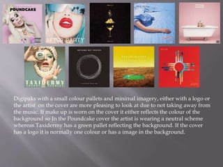
- 1. Digipaks with a small colour pallets and minimal imagery, either with a logo or the artist on the cover are more pleasing to look at due to not taking away from the music. If make up is worn on the cover it either reflects the colour of the background so In the Poundcake cover the artist is wearing a neutral scheme whereas Taxidermy has a green pallet reflecting the background. If the cover has a logo it is normally one colour or has a image in the background.
- 2. Albums with simplistic texts which are clearly presented on the page. Normally which contrasts or reflects the background. The text is quite often red or white which pops off the background.
- 3. The back of the digipak is normally either the same colour as the front such as Marina and the Diamonds, Froot album where the front has a portrait photo of her with purple and blue lighting in her hair on both sides of her head with a faded black background, the faded background follows round to the back and the colour of the album name is in stripes under each song name creating a small rainbow. But on her family jewels album the song names on the back are on top of a photo of her laying down, with the song titles following the wave of her hair. In the Bad Suns album, Language and Perspective there is a simple logo with an image in the background an the logo transfers to the background with the song names sitting in the back.
- 4. Fonts on albums are normally the same for the title and artist name , but the album name is normally smaller than the artist. The font is also very bold and in a colour which stands out against the backing photo.