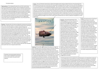
1. Filmposteranalysis.
Colours: The use of the blue couldconnote a sadnessthisheightenswhatisbeingrevealedinthe picture.The positioningof the
picture andthe blue colourscanconnote that she isdrowninginherthoughtswhichcan relate anissue thislinkstothe dramagenre
as it can be linkedtowhatsome youngpeople gothrough. The use of the blue colourcreatesa continuitywithinthe posterthiscan
connote the fact that she isso emersedbyherthoughtsandwhatis goingon withinherlife thisisfurtherhighlightedbythe use of
the two tone coloursthroughoutusedinthe title,waterandherface thiscan highlighttoan audience thatshe hastwodifferent
sidestoher. The fact that she isthe onlyone withinthe posterthatisof anothercolourhelpstohighlightherimportance andcan
extrapolate the factshe isthe maincharacter. The use of the blue andcool tone colourscouldimplythatthe filmisbasedarounda
drama and romance as thiscouldrepresentthe calmbutalsodarknesswithinarelationship. The usesof the coloursare importantas
theyhelptoemphasise the mysteryastowhyshe is layinginthe water.The use of the white/pinkcolourscanemphasise the ideaof
herbeingengulfedbyathoughtas the use of the stripescreate asky affectwhichcan relate toa daydreamlinkingbacktoa mental
healthissue.
Character: The positioningof the girl inthe
middle highlightsshe isthe maincharacterthe
use of the positioningdrawsthe audience’s
attentiontoherstraightaway thiscan highlight
that she isin distressorissufferingwhichis
furtherhighlightedbythe use of the water.The
use of the watersurrounding hercan helpto
showthe fact that she is distractedor
suffocatedwithsomething. Thisisfurther
extrapolatedbythe use of the shadowinthe
waterwhichisdarker thanthe restof the image
thiscouldenhance the fact thatshe isbeing
engrossedandmentallyattachedtosomething.
The title couldbe usedto showthe characters
namedthe fact that itis distortedintothe
waterand the coloursmatch it can helpto
heightenthe sadnessanddistractioninwhich
the character is engulfedby. The coloursused
for the textare also transitionedfromdarkto
lightenhancingthe ideaof howshe isimmersed
insomethingwhichcanhighlighttwosidesof
the story. Fromthe use of thisthiscan help
signifytothe audience thatsomethingis
fascinatingthe womanandalmostlike taking
overher life. The use of the positioningof her
headcan give the audience anideathatshe is
justabout stayingafloatasthisis all we can see
that isuprightenhancingthatshe may be
strugglingwithsomething.
Small text:The use of the small textgivesthe audience aninsightinto
whois starringinthe film.The coloursconform tothe posterhelpingto
keepa continuitywhichfurtherdrawsthe attentiontothe main
character inthe middle asshe isthe onlypart of the posterwithother
colours. The production companyisincludedatthe topthiscould show
importance of the companyfromthe textyoucan see that they are a
small scale companyshowingtheycreate independentfilms. Thiscould
be producedanindependentcompany. The use of the capital letters
and boldtextforthe namesof the actors can showthe audience that
theyare importantwithinthe film. The use of justtwonamescan show
the audience thatthe filmcan be basedaroundjusttwo charactersthis
couldhighlightanareaof struggle she seemstobe facing. The credit
blockhas beenusedtoshowotheractors and actresseswithinthe film,
it isalsousedto displaythe filmproductioncompanyadvertisingthe
productioncompanythiscouldmake audienceslookatotherwork
beencarriedoutby themand alsotargetpeople towatchthe filmif
theyhave alreadyexperiencedthere filmsbefore.
Target audience: Fromlookingatthe posterthe use of the neutral colours
and seriouspositioningof the characterI feel thisisgoingtobe aimedatan
oldertargetaudience aroundthe agesof 16 years.If thisfilmisbasedamong
a current issue ormental healthproblemwhichcanlinktothe drama genre
thenthiswill be anappropriate age groupas theywill be able tounderstand
the issuesrelated.ThiswouldfurtherlinktoBulmerandKatztheoryinwhich
it woulddivertthemfromdaytoday life. Asthere isnodistinctgender
colourtheme or genderconnotationsthisfilmcanbe aimedatboth genders.
Thisis because the use of the blue colouringandthe mainimage beinga
headinwater itgivesnoideological gendertheme,thiswill helpthe filmas
it will be basedtoa broad audience.
Narrative: The posterdoesnotreveal muchaboutthe narrative the onlything
that isclear isthat there maybe an issue withthe characterwhichisportrayed
thiscan linkto the drama genre as itcreatesa mysterylinkingtothe
conventionsof secrecyinwhichis shownthroughvariousdramafilms. The use
of the midclose upof the characters face clearlyshowsthe seriousand
dullnesswithinthe characterthiscanlinkto the narrative as itgivesthe
audience anideathatthe filmisgoingtobe basedaround a serioustopicand
can alsorelate to the ideaof her beingtrappedthe use of the dull face shows
no facial expressionwhichcouldhighlightshe isn’therownperson.The
coloursalsohelpenhance thisasthe blue can create sadness. The use of the
boldcapital textalsoshowsthatthe filmisbasedarounda seriousmatterasit
usessharpcorners andlookspowerful thisportrayedoverherlimpface could
implythatthere issomethingoverpoweringher. The use of the positioningand
colourswithinthe postercreatesanenigmainthe filmaswe are unware why
she islike thisandif it is forbad or good howeverthiswill engage the
audience drawingthemin.Thisisdone sopeople create theirown assumption
whichmakes themmore intriguedtowatchfurther.
The posteris putintoan portrait viewthisis
done inorderto highlightthe positioningof
womanwhichdrawsa focuspointtothe
audience.
Layout: The way the picture ispositioned
on the postercreatesa focuspoint
because there isonlyone picture this
helpsheightenthe factof the mysteryand
the ideaof a suffocation,thiscanbe linked
to the ideaof her beingalone and
sufferingbyherself.The waterlooks
blendedoutwhichcancreate a hazedfeel
thisworksnicelywiththe positioningof
the headin the waterheighteningthe idea
of beingsurroundedinsomething. DTP
wouldhave beenusedtocreate this affect
as the ‘water’representationcanbe
blurredoutusinga tool.The use of this
alsomakesit aestheticallypleasingtothe
eye.The advance intechnologyanduse of
DTP helpstoenhance certainaspectsof
the posterdrawingthe eye tothe face.
The use of thisenablesthe theme of films
to come across nicely andcolourscan be
usedand textcan be positionedto
enhance the theme of the filmforexample
fromthe use of DTP in thisposterithelps
to enhance the theme of beingengulfed
and maybe empoweredbysomethingelse.
The filmposterdoesnotlista website thiscouldbe because itisanindependentcompanyby
the use of the coloursusedand the focuson the girl I feel forthiscompanyitis mainlyabout
drawingthere audience intowatchingthe filmbymakingaposerthat standsout to the eye
intriguingthe audience towatchthe film.Ifeel thisissuccessful bythe colourstheyhave used
and the positioningof the girl.Byusingthe lightcoloursitis pleasingtothe eye asit blendsin
withthe background.I feel the uniquesellingpointof thisposteristhe factthat you are
immediatelydrawntothe characterinsteadof the name of the filmandothertextincluded.
Thismay be beneficialasitwill make the audience fascinatedtowatchthe film.