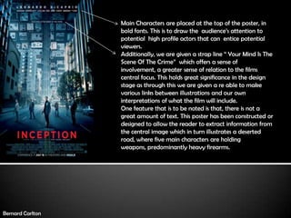
1. Main Characters are placed at the top of the poster, in
bold fonts. This is to draw the audience’s attention to
potential high profile actors that can entice potential
viewers.
Additionally, we are given a strap line “ Your Mind Is The
Scene Of The Crime” which offers a sense of
involvement, a greater sense of relation to the films
central focus. This holds great significance in the design
stage as through this we are given a re able to make
various links between illustrations and our own
interpretations of what the film will include.
One feature that is to be noted is that, there is not a
great amount of text. This poster has been constructed or
designed to allow the reader to extract information from
the central image which in turn illustrates a deserted
road, where five main characters are holding
weapons, predominantly heavy firearms.
Bernard Carlton
2. Looking at the colours used in the poster, it becomes
evident that their has been a great use of colour
correction to enhance the look and sharpness of the
surroundings (Buildings, Cars etc.) Nevertheless, it can
be understood that the colour blue denotes a sense of
calmness but the use of a strong and bold red for the
film title contrasts this and the denotations of red are
of danger, violence, bloody. From this, the audience
are drawn into a sense of controlled yet enticing
confusion and through such a thorough thought
processes into colour usage, leads to a more quality
body of work.
Moreover, the use of dark colours and the insipidness of
the enclosed buildings adds a sense of mystery, a
mystery that can only be understood when the film is
watched. This is another device that makes this poster
a quality and effective promotional tool.
Bernard Carlton
3. In all posters promoting a film, it is a
common theme that the credited
directors, actors, institutions are all placed at
the bottom of the posters. These include
institutions such as Warner Bros. Who are the
production company involved in the
production of Inception.
Furthermore, the fonts and size of fonts have
been critically selected and designed to suit
the appeal of the film making sure the main
focus of the film is not lost. It can be
understood that the choice of font holds
greatest significance as the message of the
film can be lost.
Bernard Carlton
4. Shot composition is very important in how the
characters, and the environment is structured. In this
poster, we can see that the main characters are small in
comparison to the surroundings. This can be seen or
interpreted in alternative ways. One of which is that the
focus of the film is the subjection of multiple dreams “layers”
& from this the surroundings become evermore important
than the actual characters. Also, close attention should be
given to the immediate background that features the roofs
of buildings. This has been taken from a scene in the film
and used to show how and what can be expected in the
film, a sense of manipulation and creative mass structures.
Nevertheless, the importance of image composition is
significant as this structures how text can be laid out and
how the poster is designed.
The release date, and screening venues such as IMAX
are the fundamental pieces of information
implemented in the poster to conclude the promotion
of the films release.
Bernard Carlton