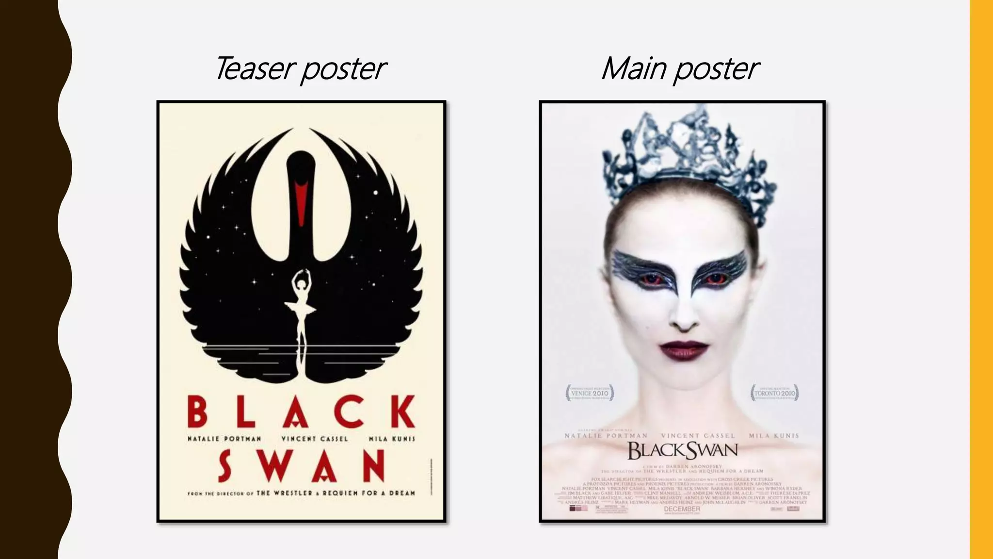
This document discusses film posters, including what they are, their purpose, and different types. It analyzes key elements that make film posters successful at attracting audiences, such as iconography, imagery, colors, and fonts that relate to the genre. Teaser posters are meant to hype audiences without revealing much information, while main posters reveal more like the release date and characters. Successful horror movie posters analyzed convey mystery through empty or isolated backgrounds, dull lighting, and a focus on a disturbing central image like a doll's face to provoke fear and suspense without explaining the full story.
3. WHAT IS A FILM POSTER?
A film poster is a promotional poster
used to advertise a film. A Film poster
is a creative and engaging way used
to provide the information needed to
the audience. The purpose of a film
poster is to create excitement and
attract audience attention to increase
the viewers. Furthermore a film
poster informs the audience for
important release dates and
information. In addition film posters
provide some indication about the
narrative to clearly make the genre of
the film stand out.
What is the different types of Posters ?
Teaser poster: A teaser poster is an early
promotional poster used to wet the
audiences appetite. It does not reveal
information or characters but used to hype
the audience to watch it.
Main poster: The main poster is the
original poster and it differs from the teaser
poster because it reveals and displays the
releasing date and the production company
name. In addition it reveals the main
characters which grabs the audiences
attentions and makes them want to watch
the film and name of the director.
4. WHAT MAKES A FILM POSTER
SUCCESSFUL ?For a successful movie poster, it should be grabbing the attention” of people
passing the poster and it is important because as a marketer you want as many
people to notice the film as possible.
Iconography• Identifying main themes in the film without actually telling the story
or revealing makes a good movie poster.
Using imagery can establish the film’s plot while looking iconic. The use of colours
and graphics the relates to the movie such as red for blood for horror movies.
Not revealing which excites the audience to watch it and grab their attention
Bold font and writing linked to the genre of the movie.
Tag lines or skylines to amuse the audience and give a slight hint e.g. “ Based on
a true story” for horror movies
Emotional development of characters displayed on poster e.g. for drama film
posters
6. The skyline shows that these two
films were excellent and attracted
many audiences and “ The
conjuring will be suspenseful and
good as they have same director.
The title of the film is at the top in
sharp black bold writing to make it
stand out and clear suitable for all.
The sharp edges of the title could
link to the film iconography used
such as a knife or a axe which
connotes murder
This sentence gives information
but not too revealing about the
genre/narrative. It adds suspense
and excitement to the poster
which scares and wets the
audience appetite. “ True” refers to
the films scenes as realistic and
haunted to engage the audience
and make them feel the films
spooky atmosphere.
The background image shows a tree
with no leaves and an isolated house
in a wood. This is common in horror
movies which gives a hint to the
audience about the genre. In addition
the reason for not using characters in
the image is to create tension and
keep the narrative mysterious and to
make it seem remote and empty with
no help from anyone. The use of a
hanging rope connotes death and
murder which adds suspense.
The Lighting in the poster is unclear
and foggy which suggests a sense of
mystery and dullness and the use of a
shadow without a human shows the
murder and death of a character.
The Layout of the poster is very
simple and clear. The emptiness of
the poster suggests inexplicable
motion and lifelessness. This adds
tension to the audience and
excites the audience to watch it
and reveal its secrets. If the poster
had many images on it , it would
seem messy and annoying for the
audience to view and read it.
The Billing and Release date
inform the audience when it is out
and the production name, and
help the audience identify
character names to create
audience excitement by known
characters used.
7. The skyline shows that these two
films were very successful in
attracting the audience and if you
watching them you'd be willing to
watch this one as well.
The Colours used are a flow of
saturation, bleak and lifelessness.
Uncommonly for a horror, the
colour red is not used however,
the colours grey black and white
connote sorrow. Using black tones
rather than red illustrates the
seriousness to the audience and
therefore would provoke a scare.
The Title is bright white and the
simplicity of the title stands out,
even though it fits in with the
colour scheme. The vibrancy of the
title creates illusion and confuses
the audience. White connotes
innocence, purity and peace which
contradicts with the genre and
narrative causing disorientation.
The Main image or the dolls face
is the main focus as its only visible
to us. The smile contradicts with
the poster and it connotes
happiness and love. However in
this case it represents supernatural
as the doll is not alive creating
suspense to the audience. The
eyes are staring directly at the
camera intimidating the audience.
In addition the doll is covered in
blood and scratches meaning
death or injuries.
The main image shows an
isolated girl from the back holding
a doll. This means that people
wont go near her as there is
something wrong. The rocking
chair connotes antiquity which
shows that the girl may be ancient
or cursed. The use of white
clothing for the doll and girl shows
the resemblance between them.
The colour white connotes peace,
innocence which is contrasting
with the genre and image.
The credit block is places in the
teaser as well as “Coming soon”.
This creates a mystery for the
movie and makes the audience
want to see the next poster.
8. EVALUATION
To evaluate I have learnt that to make a successful poster you need to
include such things as bold fonts that stand out, interesting backgrounds
colours that relate to the genre for example horror you use dark colours
such as black grey or red. In addition iconography is very important as it
intimidates the audience and creates a fearful effect. Furthermore, I have
developed me knowledge in knowing the difference between a teaser
poster and the main poster and the best ways to create suspense and
illusion in the posters to be able to have a wider audience.