
Recommended
More Related Content
What's hot
What's hot (18)
Viewers also liked
Viewers also liked (20)
Similar to Dark Gothic Makeup Implies a Celebrity's Hidden Dangerous Side
Similar to Dark Gothic Makeup Implies a Celebrity's Hidden Dangerous Side (20)
Recently uploaded
Recently uploaded (20)
Dark Gothic Makeup Implies a Celebrity's Hidden Dangerous Side
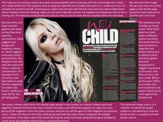
- 1. The make up and costume used is very dark ,sharp and gothic which contrasts with the natural light skin colour and stylish white hair. This could be used to imply the celebrity isn't all what she seems or is made out to be. For example she presents herself as being pure, sweet and innocent with her hair and pure and natural light toned colour. However the dark clothing, make up and roots imply the real her, the negative and dangerous side of her is coming out. This features could possibly be used as a hint or clue to what will be revealed within the interview. The colour scheme used within this double page spread is very unique as it doesn't always work well together, however this time the colour scheme has been used effectively together to imply the music genre of the magazine. From the colour scheme used you can tell the genre of the magazine is punk/rock music, I know this because the colour pink being used with the colour black juxtaposes the original connotations. It has been used in the sense that a good, pretty and clever girl(pink) has gone bad(black), in this sense she could be referred to as a punk/rock princess. Also the white and black contrast against each other as they have very opposite connotations. Black suggests evil, danger and negativity, where as white suggests innocence, purity and positivity. The designers have also took the amount of colour I used not consideration. For example there's less white used then black to imply that the negativity has taken over, there's hardly any hope left for this girl being good. The dominant image used is of a celebrity to attract the target audience, into wanting to read the article as she is a popular and well known actress . The masthead used is made up of two words “Wild Child” which are both write in different colours and fonts. The word Child has been printed in a large font and bolder writing and in white to stand out more against the word background to suggest importance to the word, that after all she is still just a child. Where as the word “wild is in a smaller font, not in bold text and doesn't stand out as much against the background. Also the dominant image fills up more than one of the pages in the double page spread to imply importance and that she is the man feature.