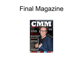
3. The Masthead
As you can see the Final magazine masthead
and the Prelim task masthead are completely
different, due to different factors.
Firstly the Prelim task was made using the
basic/ default text that was found on the
software, unlike the Final magazine masthead
which has a font style that has been specifically
selected due to its clean and bold look, that
suits the classical style.
4. The Final magazine masthead is also
over lapping the cover star and a
smaller banner. I feel this shows my
progress as I would have had no idea of
how to create a banner, let alone put
writing with in it.
5. My Preliminary Masthead showed
how inexperienced I was using the
various tools and software. For
example, the writing is not clear or
straight and the overlapping isn't clear
as the colour of the background is
fussy and unclear due to my amateur
photography skills.
6. Banner
There is a massive difference between my
banners: as shown above. As seen on the
left, my final magazine banner has a filled
the bottom of the page and fits in with the
colour scheme of the whole magazine.
Unlike the Preliminary task banner (or lack
of as shown) the final magazine banner
has shape to define it as a banner.
7. The banner on my final magazine highlights my
skills further, by the use of screen grabs of
various social media logos and a barcode. My
Preliminary task banner, has a screen grab but
only one which shows the confidence I had with
using them, and price tag, which was located on
the right hand side, it was also in a font colour
which doesn't go with the background (like the
Masthead). My price was also too much as I
hadn’t done enough TA research at this point.
9. In my preliminary task I used a
male model without any editing
due to my lack of knowledge
when editing. In my Final
magazine I used the same
model as he suited the look I
was trying to present. The
difference however, is that I
used various tools within Adobe
elements 11 to make his skin
tone brighter and used the
magic wand tool to edit out any
spots or red marks upon his
face and neck.
10. I also showed my development
when I used different poses
within the two magazines: in
my Preliminary task I used a
more serious image, but with
my research in the classical
music industry I found that the
emotion shown in most images
was more happy.
11. The Screen grab is from my Final
magazine and it shows a headline and
subheading. I didn't include a headline
or subheading on my preliminary task
and I believe this shows my
development. The heading is in the
colour that is represented throughout
the magazine.
12. Puffs
The puff that I have used is to list
various sections of my magazine.
This is a huge improvement from my
preliminary task as I have used a
high quality boarder, and also
through research I have chose to
use various different fonts so the
different section can stand out
individually.
13. Unlike my Final magazine, my preliminary
task didn't use any boarders or shapes to
create puffs, this shows my improvement
and knowledge of using shapes and and
how to present the different shapes.