2. In my preliminary task the photo has bad
composition, bad location and the models look out
of place, but when shooting for my music magazine I
took great time and effort in planning the
composition, location and costumes. The result was
a much better quality image and more interesting
and engaging front cover. In the Preliminary Task I
have used lots of similar colours which looks boring
and unappealing. Where as in my main task I have
used three main colours (black, whit, & yellow) that
all complement each other well. The Masthead on
my preliminary task despite suiting the theme of my
magazine it is very plain and boring. However the
masthead on my main task is a lot better . I have
used a faded , scratchy font that stands out and has a
rocky theme that will attract my target audience. The
Plugs used on the preliminary task are uninspiring
and don’t encourage the audience to read on but in
my main task the use of colour and secondary
images make it much more interesting for the reader.
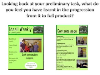
3. On my Preliminary Task I have used the same font as my
Masthead to link the pages together but it still looks boring
and unattractive. On my Main Task I have used the same
fonts that feature on my front cover, this works better as
they are interesting and attractive. The text is yellow, white
and black which links well with the other colours used
throughout and with my rock theme. On my preliminary task
I listed all of the articles and wrote a short paragraph about
it. Looking back this much detail wasn’t needed for a
contents page and it is better to just gave a brief description,
which is what I have done in my main task.The images used
on my main task have varied camera angles and shots,
include different models and different locations to attract
the reader to what is inside the magazine. Whereas my
preliminary task have very similar images with the same
models and this isn’t very effective.
4. I didn’t have any experience making a
Double Page Spread as we weren’t required
to make one for our preliminary task. I
continued with the colours I used in the rest
of my magazine colours black, white &
yellow and have used the column layout
that is found in most rock magazines. I used
a large image that has taken the whole left
side page whilst the other side has an
article on it. My lack of experience meant I
had to take inspiration from other
magazines like Kerrang & Q.
5. During this project I have learnt what makes for a professional and
successful magazine cover that would appeal to the public. I have also
learnt how to make good decisions on colour schemes that work well
together and compliment each other. I expanded my knowledge on
editing and camera technology which allowed me to create images of high
quality that look classy and professional. I have also learnt a lot about the
magazine industry and how much work goes into each part of the
magazine and how important it is to be constantly thinking about the
target audience. I have gained more of an understanding of codes and
conventions and what makes a successful magazine. This is clear from
comparing my preliminary task and my main task.