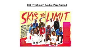
2. Basic Layout
The headline is placed covering the top third of both
pages. The by line is actually placed on the left third of
the first page. This is defying codes and conventions, as
this is quite unusual. The article content is on the right
third of the second page going down in a column. The
main image again is very significant and stound-out as it
covers the centre of the double page spread.
By-line
The by-line is again in that creative artsy
font as seen on the cover and on the
headline. This has been very common
throughout this issue. I believe the
creative font is to represent the
creativeness of the new artists. It’s in a
navy blue colour. The by-line is placed
on the left third of the double page
spread, which goes against typical codes
and conventions. The type size is bigger
than the text of the article but smaller
than the headline. Which could state it’s
importance is in between the two.
Headline
The headline is again that artsy font in a very light red colour
fading into a pink. This pink and red links to the box with the
article in and the border at the bottom. The ‘Sky’s’ and ‘Limit’ are
buzz words hence the big increase in size. XXL sees it as very key
to be noticed so that’s why it covers the top third of the double-
page spread.
Main Image
The picture is similar to the image on
the front cover and contents but
slightly different. Due to the increased
space of the double page spread they
aren’t in multiple rows like they were
before. This image is both a longshot
and a wide shot.
Article Content
The article content is placed in the
right third of the second page in a
column. The text is a very
contrasting colour to it’s background
so that it’s very clear. It’s about an
average type size, I would say about
size 10. This is following typical
codes and conventions. The type of
language is informal so the readers
can feel comfortable when reading
and don’t feel lecture or bored.
Colours
They have only really used two colours,
a very pale red and a pink which fade
into each other. They also have a light
yellow background but this doesn’t
stand out nowhere near as much. The
red/pink draws the reader to headline
and the article’s content.
Branding
XXL Magazine have used a form of
branding on all of their pages. They
have added their website (xxlmag.com)
in all corners of the pages.
Grab quotes
They haven’t used any grab quotes on this
magazine. Which defies codes and
conventions. Again this could be for
simplicity purposes which is typical of a hip-
hop magazine.
3. Overall impression
My overall impression of this is that it doesn’t
feel like a typical hip hop magazine. However
XXL often does try to differ themselves from the
rest. The reason I say it doesn’t feel like a hip
hop magazine is due to the bright yellow and
pinky colours, this are odd colours to put in a
magazine aimed at males. However, though
they have defied codes and conventions by
putting the by line and the article on complete
opposite sides of the double page spread, I like
it. Also they are very focused on the artists due
to the image taking up a very large proportion
of the double page spread. The headline is to
draw the reader in also as it takes up the top
third of the double page spread. Plus the way
they have branded themselves is good. They
have added it in the corners by the page
numbers. This doesn’t distract the reader from
the article, but when they look at the page
number they definitely notice it, due to it also
being in a bold font.