
Recommended
More Related Content
What's hot
What's hot (19)
Similar to Contents Page Analysis
Similar to Contents Page Analysis (20)
Recently uploaded
Recently uploaded (20)
Contents Page Analysis
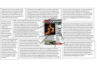
- 1. The contentwith inthe magazine issplitupintoseparate sectionsonthe contentspage thiswill make ita lot simplerforthe readertosee what isinthe magazine and assesswhatarticlestheymayhave an interestInreading. Thiswas achievedbyusingsubheadingsinwhiteona blackstripas a backgroundto make the title standout more. People maysee somethingthatwaswithinthe magazine advertisedonthe cover,andthiscouldbe the reasonthe boughtthe magazine.Nexttothe sectionsonthe contents it hasan arrow pointingtosome of them,thisarrow says “on the cover” thiswill enablepeople whoboughtthe magazine purelyforwhatwasadvertisedonthe coverto findthe sectionwithinthe magazinequickly.Theycan lookdownthe side of the page andread the titleswiththe arrows nexttothem,that waytheycan eliminate sections of the magazine theyare notinterestedinimmediately. Theyhave usedthe advertisementbox atthe bottomof the page topromote an NME subscription.Nmehave chosento make thisa stand outpointon the page as of course theywantto grab the reader’sattentionand informthemaboutthe subscriptionasthismaymake them,more money.Theyhave usedablackbox withbold yellowfont.Thisisthe onlyyellowonthe page which make sitstand outevenmore,andthe fact itis againsta blackBackgroundhighlightsthisfurther. One of the mainfeatureswithinthe magazineisthe ‘gigguide’informing people aboutupcominglivemusicevents.Thisissomethingthatpeoplemay be interestedinsotheyhave chosentopromote itcolouredinwhite ona redbackground.The onlyotherred on the page isin the masthead,andthe use of redisa traitto a lotof nme magazines,thisiskeepingupwiththe brand identityaswell as makingthisgigguide feature stand outonthe page. All the titlesonthispage (the main one andthe subtitles) are all inthe same font,thisisa common theme throughoutthe magazine asall titlesorimportanttextstaysin the same NME text,helpingtomaintainthe NMEbrandidentity. The use of the NME logoat the top of the page isalso usedthroughout the magazine,thisagainisto maintainbrandidentity. The page includesonlyone image.A large image inthe centre of the page,thishelps draw attentiontothe image andputs the readersfocuson the artistfeaturing.This may intrigue themandencourage themto readthe article aboutthe artist. The arctic monkeysare a band witha lotof fans,NME know that a lot of theiraudience are interestedinthem.Thiswas whytheyhave printedtheir name on the frontcover.But not onlyhave thatthey printedthe name ina larger bolderfonttothe textaround it sothat it standsout even more and grabs the reader’s attention. The main image on the page isof a live musicperformance (a gig).Thisis importantbecause it isone of the core brand valuesfor NME, to encourage and reviewgigs/live performances NME is musicmagazine forthe genre of indie rock music,the misenscene featuringwithinthe image onthispage isof an artistswithlonghair and a guitar.Both these featuresare typical of an artistsassociatedwiththisgenre,therefore this maintainsbrandidentityasthe theme of indie rock isevidentthroughoutthe magazine. The layoutof thispage isvery structured,this makesthe page simple toreadwhichisa feature that will please the targetaudience of men. The image on the page is slightlyoff centre to the left-handside of the page, thismeansthe viewerseye will be drawnto thisdue to the rule of thirds.
- 2. Thisis a contentspage froman issue of Q magazine. It isslightlydifferenttothe contentspagesproduced by NME so analysingitwill give me abitof variety. The contentspage fitsthe typical conventionsof aQ magazine,redisalwaysthe dominantcolourwithin these magazinesandthere isnochange withthis page.The bannerat the top iscolouredred,the titlesdownthe side andunderlinesinred,andthe t- shirtof the artistwho isa memberof the Foo Fightersisalsored.Keepingthe everpresenttheme of redhelpsfitQ’sbrandidentity. Thisissue of Q was a specificreleasefocusingonthe Foo Fighters,the fontcovercontainedanimage of the leadsingerandthere isa large sectionof the magazine dedicatedtothem. Thistheme is maintainedonthe contentspage aswell,the lead singeristhe mainfocusof the age and a large image of himisarrangedin the middle of the page with textto the side of him.As a readeropensthe magazine thisimage will catchtheireye straight away,therefore remindingthemthe foofighters feature withinthe magazine,thiscouldencourage the readerto read the article. An image of the magazinesfrontcoverat the top of the contentspage justto drawfurtheremphasis on the fact that thisparticularmagazine hasa focuson the Foo Fighters,thiswillinterestthe viewerencouragingthemtoturnto the article. Downthe side of the page isa listof featuringarticles, includingthe page numberinwhichtheyare onand a short descriptionunderneath.Thislistissplitupbythickboldred linesthatrun betweeneachtopicbetweenthe listedfeatures. Thisdoestwo things,itmakesita lot easierforthe readerto readthe listas itis all splitupand clearer.Italsohelps maintainthe Q brandidentityasitis anotherpointinwhich the colourred isfeaturedonthispage. Picturesof variousotherartists/bandsalsofeature onthe page, suggestingthatthere isdiversitywithinthe magazine regarding the bandsthe bands/artiststheyfocuson.Howeverthisone mainlyfocusedonthe footfighter,bythere isotheroptionsof topicsto readif someone maynotbe interestedinthe foo fighters,thisisall evidentonthispage. The iconographyof the electricguitarthat the artistshas over hisshoulderhasconnotationsof rockmusic,whichisthe genre of musicinwhichthe Foo Fightersworkin.He isalsowearinga plainredt-shirtwhichsupportsthe coloursscheme of onthe page,or red blackand white.Italsohelpsupholdthe Qbrand identityasthe colourredis usedintheirlogo. The layouton the page is a verystructuresand uniformed layout.Ithas a listof sell linesdownone side andimages aroundthe outside of the of the mainimage,thisenables the readerto see whatwill be featuringwithinthe magazine easilywithouthavingtoreadlarge blocksof text. The artist isnot lookingatthe camera (mode of address).The image isalsotakenfroma lowerangle lookingslightlyupathim,thisgiveshima sense of powerandthe fact he isn’tmakinglookingatthe camera as if he doesn’tcare,reflectshisarrogance,somethingoftenassociatedwiththe rock/indie rock culture.
- 3. The colour scheme withinthe page isthe colourscheme that isrecreated throughoutthe restof the magazine. Red, white andblackall contrastingcoloursso thatthe textstandsout againstthe backgroundandis easily readable forthe reader. The consistentuse of these colourshelpsmaintainthe brandidentityof the magazine as these coloursbecome associatedwiththe brandQ. The box downthe left handside featuringtopictitlesissplitup half way.The red,white andblacktheme isditchedandthe words‘oasisspecial’are used.Thiswill be due tothe factthat nme knowa lot of theirreaderswill be interestedinOasisand puttingtheirname ina separate box andusinga different colourmake it standout evenmore. Also, the use of the colourgoldwhichisoftenseenasa luxury/royalcolour supportsthe fact that oasisare such influential artistswithin thisgenre andare seenas legends.Theyneedtobe actively distinguishedfromeveryone else,therefore everyone else is listeddownthe side inthe colourblack,however,oasishave theirownbox and the onlygoldon the whole page isusedfor the fontof theirbandname and the page numberstheir contentfeatureson. The main image of the page is a photoof popularindie rockband,The Courteeners.It’sa large image andis the mainfocal pointof the page, whena viewerturnsontothe page itwill be the firstthingonthe page theysee,there isa white box overthe bottom lefthandside of the image that stateswhatpage contentinvolving the Courteenersison.Thismeansthatthe viewerswill be made aware of whatpage to turn to straightawayif theyare justlookingfor contenton the Courteener. Titlesforeachtopic that feature withinthe magazine are listeddownthe side.Blackisthe colourusedforthe text whichmakesitstand outdue to the factit ison a white background.The page numberthat thistopicfeatures on iswrittennexttothe title of the topic.It is writteninbold rednumbers,thisalsocontrastswiththe backgroundand the rest of the textmakingit standout andeasyfor the readerto see whatnumberiswithwhattitle. The headingsdownthe side are usedtoclearlyshowthe readerwhatexactlyisinthisparticular issue of the magazine.The white textof ‘everymonth’againstaredbackgroundis one of the standout featuresof the page and isusedto ensure thatthe readeris aware of what theycan expectfromeveryissue of the magazine.Thiswill helptointerestnewreadersintobuyingthe magazine againas theymaysee a feature theylike andlearnthatthiswill be aregularfeature. Q is well knownfortheirreviewsof notonlyupandcoming artistsbut alsoof exactinglybigartists.The reviewswithin the magazine maybe the prime reasonthatsome people buythe magazine.There isalarge box at the bottomof the page titled‘QReviews’, thisenablesthe viewerswhoare buyingthe magazine specificallyforthe reviewstoknow where toturn to straightaway.The reviewsare all listenas well,withapage numbernexttothemand a caption underneathaboutthe reviews,thiswill enavle the reaerto gainan understandingonotonlywhothe reviewisof but alsoof whatthe reviewisgoingtobe like,therfre theycan readthrough the whole box adecide whichonestheywant to readwithouthavingtoturn to everypage andhave a wuiclookat each reviewfirst.Thismakesthe magazine easiertoread forthe readerandwill ensure thattheyenjoy reaingthe magazine more.Thiswill meanthatthe chnaces of thembuyingthe magazine againare increasedasthey have enjyedwhattheyhave read.