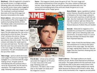
1. Masthead – (title of magazine) is situated in
the top left corner, it is bright and bold
following codes and conventions. Being in
the top left corner means when staggered
on the shelf the masthead is clearly seen.
The masthead is outlined making it
dominate at the top of the page and
becomes memorable to the reader.
Direct address – (the artist looks directly
at the audience) The artist engages the
audience by looking directly at them.
This follows codes and conventions and
so appeals to the reader.
Font – (style of text) the text follows codes
and conventions as it sticks to the colour
scheme of the cover page. The title fonts
are large, making them stand out. They are
bigger than the coverlines showing they are
more important.
Title – (related to the main image or main
topic) The title advertises the main artist,
attracting the artists fan base. The word
‘chief’ connotes the artist as being a
leader in the music industry. The quotes
also relate to the article inside. This is like
a teaser and makes the reader want to
turn over and read more. The title is larger
than the cover lines and names the artist
in the main image, this follows codes and
conventions. This will immediately catch
the eye of the reader.
Main image – (picture which dominates
cover page) The picture is of singer Noel
Gallagher. It is a mid shot with the singer
looking serious. He gives quite an
intimidating look and someone who is
not to be messed with, this fits with his
reputation. The image dominates the
page, following codes and conventions.
Barcode – (featured on magazine so it is
available for purchase) This is located in the
bottom right corner, following codes and
conventions. Its location means it is out of
the way and does not distract the reader
from important features.
Price & date – (shows price and how
up to date the magazine is) The price
is in clear view and on the cover
page, following codes and
conventions. The date is also in clear
view so the reader can easily see if
the magazine is recent.
Rule of thirds – (gives a guideline to where
certain features should be placed) The rule
is followed as the main image is placed in
the centre with coverlines on both left and
right. Also the masthead in the top left and
barcode in bottom right also follows the
rule. The audience focus on the important
features because of where they are located.
Target audience – The target audience are clearly
listeners of rock. All the artists featured are all famous
rock artists. The target audience for this particular issue
are 30-40 year olds as they were mostly active in the
1990s. The ethnicity of the target audience are mainly
white because the feature artist himself is white. Also
other artists mentioned in the magazine are also white.
Genre – The magazine clearly shows the genre of rock. The main image and
other artists mentioned are of the rock genre. The colour scheme of black and
red also show the genre. Black and red are typically associated with rock. The
serious and intimidating look of the artist also shows the genre as it is not
typically known as the ‘happy’ genre.
2. Date – (shows how up to date the magazine is)
Below main title. This follows codes and conventions
as it allows the audience to see if the magazine is
recent.
Page numbers – (numbers beside
page titles) These are placed on both
left and centre columns. They are all
the same colour, following the colour
scheme. The title and page number
are both the same font which follows
codes and conventions and shows
they’re both linked.
Font – (style of text) The masthead,
title and sub-title are the largest and
show dominance on the page. This
follows codes and conventions as this
is the most important text on the
page.
Layout – (how features on the page
are laid out) The rule of thirds is
followed as there are three distinctive
columns. The middle features the
main image and anchorage text. The
page titles then feature on the left and
middle. This follows codes and
conventions as the most important
information is in the centre of the
page. The band list is on the right
showing there is more content in the
magazine.
Main image – (picture which
dominates contents page) The image is
in the centre column making it the first
thing you see. It is clearly important
and something the magazine wants the
reader to take note of. The purpose of
the image is to remember the 10th
anniversary of the DJs death. The mise
en scene of the image shows a huge
record collection in the background.
The DJ was notable for this and this
also reinforces that this a music
magazine. It is a close up image and in
black and white. This not only matches
the colour scheme of the page but also
makes the photo look old fashioned.
This fits with the generation that he
was active in. The image also shows
the genre of rock as he was a notable
rock DJ.
Articles – (piece of writing) The articles are all music based and some link with the
front cover artist. The titles are short and snappy so the reader can quickly decide
whether they want to read this page. They are all the same size, font and colour
making the contents page look consistent and organised. This follows codes and
conventions as it doesn’t make the page look random and difficult to read.
Rule of thirds – (gives a guideline to
where certain features should be
placed) The rule is followed as the main
image is placed in the centre with
anchorage text below showing the page
it is linked to. Titles are on both left and
middle. Also the masthead in the top
left with ‘inside’ beside it also follows
the rule. The audience focus on the
important features because of where
they are located.
3. Main image – (picture which dominates page) This is of the artist on
the cover so follows codes and conventions. The image is in the centre
of the page showing its importance. The picture shows the artist on a
talk show clearly being interviewed. This also links with the point of
the article as this also is an interview. The artists clothes of black and
white also follow the colour scheme of the magazine.
Date/page no – These are placed in the corner of the page.
This follows codes and conventions as it allows the reader to
make sure they are reading the most recent issue.
Layout – (how features on
the page are laid out) The
interview is placed within
four columns. This follows
codes and conventions as
this is a typical magazine
feature. The main image
dominates the top centre
page. The title is the largest
text with the sub-heading
second. They are both
highlighted yellow showing
their importance. The far left
and far right see different
features. These are smaller
than the interview, showing
that they are additions to
the main article.
Colour scheme – (arrangement of colours on page) The
house style is followed as the colours used are the same
colours used on the front cover. This makes the magazine
familiar and sets its distinctive look. It also shows how
the pages are all linked, following codes and conventions.
Language – (the language of the text) ‘Noel Gallagher on everything’
suggests the singer is a know it all, fitting with his reputation. A
swear word is also present showing the singers rebellious side. This
also fits with the stereotypical look of rock as being a rebellious
genre.
Article – (piece of writing)
The article is a question
and answer. This is a
typical feature in a
magazine and a popular
format. It is easy to read
and follows codes and
conventions. Each
question is clearly
highlighted yellow, a
colour associated with
rock. The questions act as
sub-headings introducing
new sections.