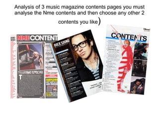
1. Analysis of 3 music magazine contents pages you must analyse the Nme contents and then choose any other 2 contents you like )
2. Contents page NME (SEPT 2009) ANALYSIS The date is in the banner with the masthead to show the date the magazine was published The sub headings are blocked out in to black boxes to match with the banner and masthead , keeping a colour theme thought out the whole magazine , also makes them more important N head sub heading there is a small sum up of the article, this is so the reader can quickly chose which article appeal to them, instead of going though it all . Follows the red black white theme Masthead is the same as front cover this repetition reminds the reader the name of magazine, this would this in readers mind and will make them associate, that style with a genre type and instantly know them magazine without having to look at front cover Bands are listed in red with page number in black this is to go with NME’s colour code The main image is of person, most likely to be of a image a person on tour ( most likely to be a singer ) standing out side a tour bus point up to it , image is bright and clear blue sky, gives feeling its at a festival is edited so it looks like a photograph. This is appropriate because as it gives an effect off being at a gig due to people usually taking photos when at a gigs/festivals and goes with the text as a touring special Introduction relates to the image this gives a running theme of the magazine. The text is from the editor, very informal as if he is directly talking to you , giving you pages to look at, almost like he is giving his favourite articles of the magazine. Shows the pervious edition and ways to buy it e.g. website , email phone number. This is so that if you missed an issue or collected them you can still buy that edition
3. ANALYSIS OF CONTENTS PAGE 2 Rock sound (November 2010) Main image is most dominate item on the page, this give the impression that he is the most important part of the magazine . The shows a picture of the lead singe of poppa roach. In this he is posing , giving a look of shock and surprise, this links to the quote at the bottom of the image, which mentions Justin Bieber and the fact he maybe be a closet Bieber fan , this would be a surprise to readers as he is associated with rock while Justin Beber is associated with pop. Mast head is very small compared to the size of it on the front cover. Follows the same font and colour style. Doesn’t mention that it is a contents page at all in masthead The date and issue number under masthead , so audience know which addition they have and need Sub headings , the first sub heading says main features, it is in a blue banner making it stand out form the other headings. The other sub headings are white matching the masthead with blue numbers next to them , sticking to a colour code of white and blue, each has small summery under it explaining the article to the reader
4. ANALYSIS OF CONTENTS PAGE 3 billboard(2009) Masthead, simple just says contents , its in a army font style, its big and bold, tells the reader clearly what this page is. Magazine title and date are placed in the top right hang corner, this is so they are out of the way and hardly noticeable Issue number so people know which magazine issue it is Main image is of hayley Williams Lead singer of paramore. The image takes up the centre of the page, as she is in a rock band she is dressed up as a sugar cane, celebrating Christmas in July , this shows rocks rebellious side., Smaller images which relate to the subheadings, each photo has its page number in the corner so you know which page the image belongs to as well The sub headings are smaller then the ones compared to NME and rock sound, each shows an part of the magazine such as Features, music etc. Under each sub heading there is a sort summery of what the articles are about, so readers can skip to the articles which appeal to them Some key words are highlighted in blue showing they are key to an article