1. The heading is clearly stated ‘CONTENTS’ this is
printed in contrasting colours red black and
white this makes the magazine looks more
professional and also gives it a more upper-
class feel.
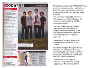
The use of two images adds structure to
the magazine and also breaks down the
amount of writing that is situated for
contextual purposes.
The main image is a group longshot
the colour scene throughout the
image is neutral each member of the
group represents different attributes
such as bewilderment confidence
focus etc…
‘oasis special’ is in gold showing the
importance and exclusivity of this
section.
Under each category the page numbers
of articles are marked clearly beneath
each heading to make the contents fit for
purpose; on each of these it also briefly
describes the articles purpose.
The contents of the magazine
contains a large amount of writing
appealing to the mature audience.
2. The whole theme is in Monochromatic
colouring: silver,white,black and grey makes
focus on the simplicity of the article and make
you understand the more mature image of the
entire magazine.
The main image is of a curvaceous
women contouring the main text
sectioning it
out from the rest of the contents page.
The heading is in bold san-serif font
which is white and is written on three
different lines which appears as if its
shaped like an arrow to make you
want to read onto the next page.
However underneath the heading
contents it says 1/3 which could
mean that this is one contents page
out of three this gives audience the
impression that the rest of the
magazine may be cluttered.
There is a discrete white out line of a ‘v’ in
the background imitating the title ‘VIBE’.
3. This contents page on this magazine has a
traditional layout and the images are
symmetrical to the text
The heading ‘CONTENTS’ is not very clearly
stated this could make the audience
confused to the angle this magazine is
supposed to aim to its audience.
The pictures all have numbers in the corners
of them in order to show which article
which image relates to.
All headings are bold and colourful in
order to entice the audience each of
these headings gives a brief blurb of the
interior of the magazine.
At the top of the page a preview of the
next issue of ‘mixmag’ is advertised in
order to promote the next issue to
ensure £££.
The style of the numbers are retro
in keeping with the dance theme
of the magazine.