
Recommended
More Related Content
What's hot
Similar to Research task 2c double page spread nme analysis - Corey Balsom
Similar to Research task 2c double page spread nme analysis - Corey Balsom (20)
Recently uploaded
Recently uploaded (20)
Research task 2c double page spread nme analysis - Corey Balsom
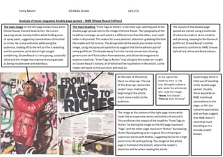
- 1. Corey Balsom AS Media Studies 13/11/15 Analysis of music magazine double page spread – NME (Dizzee Rascal Edition) The main image on the leftpage showsmusicartist Dizzee Rascal,frameddeadcenter.He isseen wearingcasual,trendyclotheswhile holdingacan of spraypaint,suggestingconnotationsof mischief or crime.He isalsoindirectlyaddressingthe audience,lookingoff tothe leftasif he is watching out forsomeone,sohe doesn’tgetcaught vandalising.DizzeeRascal isa veryyoung,successful artistand thisimage may representyoungpeople as beingtroublesome andrebellious. The main headline “FromTags to Riches”isthe most eye-catchingpartof the double page spreadnexttothe image of Dizzee Rascal.The typographyof the headline isstrange,aseachwordisa differentsize thanthe other,eveneach letterisdisjointed.Thismakesforaveryabstract,attention-grabbingtitlethat the readerwill fail tomiss.The designbehindthe wordsalsorelatestothe image,usingink/spraycansplotchestosuggestthatthe headlineispartof some graffiti art.Thisbreaksaway fromthe normal conventionof using genericsansserif fontstakenfromwebsites,andallowsthe magazine to expresscreativity."FromTagsto Riches”mayalsogive the readeran insight on Dizzee Rascal’shistory;all of whichwill be touchedoninthe article,sothe readerwill wanttofindoutmore andread on. The coloursof the double page spreadare varied,usingamultitude of colourstomake it seemcreative and pleasing,keepingtothe theme of graffiti art.Dizzee Rascal’sclothes alsoseemto conformto NME’shouse style of red,white andblackcolours. At the start of the article, there isa drop cap. The use of the dropcap catchesthe reader’seye,makingthe beginningof the article much more visible tothe audience. The image at the bottomof the right page showswhat lookslike anexpensivestereoandbottlesall aroundit. Thisreinforcesthe impactof the headline “FromTagsto Riches”byhavingthe image on the leftpage represent “Tags” and the other page represent“Riches”byshowing Dizzee Rascal gettingupto nogood,thenshowingan expensive stereowithbottles,suggestinghe hashita high pointinhislife withpartying.The image onthe article page is framedat the bottom,where the reader’s attentionwill be whenreadingthe article. To the rightof the headline,there is a By Line, tellingthe audience who wrote the articleand who made the images. “Words Tim Chester”, “Pictures Dean Chalkley” Surprisingly,there is little use of branding inthe double page spread.Usually, there wouldbe an NME masthead somewhere onthe page,so thiscan subvertexpectations and perhapssuggest that NME doesn’t needthatmuch brandingas itis alreadysowell known.