
Recommended
More Related Content
What's hot
What's hot (19)
Viewers also liked
Similar to Nme task 2c analysing double page spread
Similar to Nme task 2c analysing double page spread (20)
Recently uploaded
Recently uploaded (20)
Nme task 2c analysing double page spread
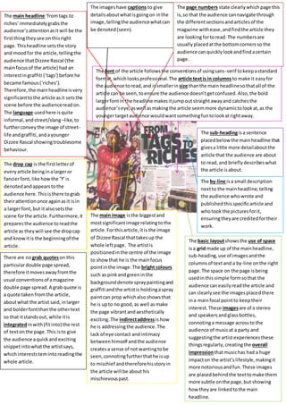
- 1. The basic layoutshowsthe use of space isa grid made up of the mainheadline, sub-heading, use of imagesandthe columnsof text and a by-line onthe right page.The space on the page isbeing usedinthis simple formsothat the audience caneasilyreadthe article and can clearlysee the imagesplacedthere ina mainfocal pointto keeptheir interest.These imagesare of a stereo and speakersandglassbottles, connotinga message acrossto the audience of musicat a party and suggestingthe artistexperiencesthese thingsregularly, creatingthe overall impressionthatmusichas had a huge impacton the artist’slifestyle,makingit more notoriousandfun.These images are placedbehindthe texttomake them more subtle onthe page,but showing how theyare linkedtothe main headline. The main headline ‘fromtags to riches’immediatelygrabsthe audience’sattentionasitwill be the firstthingtheysee onthisright page.Thisheadline setsthe story and moodfor the article,tellingthe audience thatDizzee Rascal (the mainfocusof the article) had an interestingraffiti (‘tags’) before he became famous(‘riches’). Therefore,the mainheadlineisvery significanttothe article asit setsthe scene before the audiencereadon. The language usedhere isquite informal, andstreet/slang–like, to furtherconveythe image of street- life andgraffiti,andayounger Dizzee Rascal showingtroublesome behaviour. The sub-headingisa sentence placedbelow the mainheadline that givesa little more detailaboutthe article that the audience are about to read,and brieflydescribeswhat the article isabout. The by-line isa small description nextto the mainheadline,telling the audience whowrote and publishedthisspecificarticle and whotook the picturesforit, ensuringtheyare creditedfortheir work. The drop cap is the firstletterof everyarticle beinginalargeror fancierfont, like howthe ‘Y’is denotedandappearstothe audience here.Thisisthere tograb theirattentiononce againasit isin a largerfont,but it alsosetsthe scene forthe article.Furthermore,it preparesthe audience toreadthe article as theywill see the dropcap and knowitis the beginningof the article. The main image isthe biggestand mostsignificantimage relatingtothe article.Forthisarticle,itis the image of Dizzee Rascal thattakesup the whole leftpage. The artistis positionedinthe centre of the image to showthat he is the mainfocus pointinthe image.The bright colours such as pinkandgreeninthe backgrounddenote spraypaintingand graffiti andthe artistis holdingaspray paintcan prop whichalso showsthat he is upto no good,as well asmake the page vibrantandaesthetically exciting.The indirectaddressishow he is addressingthe audience.The lack of eye contact andintimacy betweenhimself andthe audience createsa sense of not wantingtobe seen,connotingfurtherthathe isup to mischief andthereforehisstoryin the article will be about his mischievouspast. There are nograb quoteson this particulardouble page spread, therefore itmovesawayfromthe usual conventionsof amagazine double page spread.A grab quote is a quote takenfromthe article, aboutwhat the artist said,inlarger and bolderfontthanthe othertext so that itstandsout, while itis integratedinwith(fitinto) the rest of textonthe page.This isto give the audience aquickand exciting snippetintowhatthe artistsays, whichintereststemintoreadingthe whole article. The imageshave captions to give detailsaboutwhatisgoingon inthe image, tellingthe audiencewhatcan be denoted(seen). The page numbers state clearlywhichpage this is,so that the audience cannavigate through the differentsectionsandarticlesof the magazine withease,andfindthe article they are lookingfortoread.The numbersare usuallyplacedatthe bottomcornersso the audience canquicklylookandfindacertain page. The font of the article followsthe conventionsof usingsans-serif tokeepastandard format,whichlooksprofessional.The article textis in columns to make it easyfor the audience toread,and issmallerin size thanthe main headlinesothat all of the article can be seen,toensure the audience doesn’tgetconfused.Also,the bold largerfontin the headline makesitjumpoutstraightawayand catchesthe audience’seye,aswell asmakingthe article seemmore dynamictolookat,as the youngertargetaudience wouldwantsomethingfuntolookatrightaway.